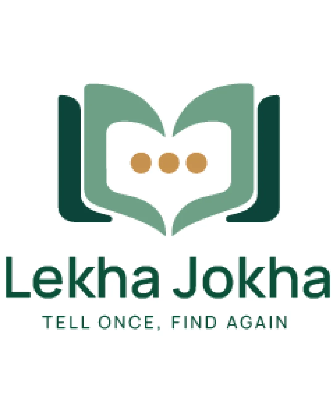
Lekha Jokha
TELL ONCE, FIND AGAIN logo review
4/5
Logo score
Logo review of

Lekha Jokha Tell Once, Find Again

A distinctive and relevant logo for an AI chat/knowledge product with strong textual clarity and a mark that benefits from minor scalability adjustment.

Combination Modern, Abstract Technology
5/5
Legibility
4/5
Originality
5/5
Misread
3/5
Balance
3/5
Scale
Your next steps

What to fix first

Focus on the changes that matter. Keep what makes the logo work.

1

Standalone mark

Test mark visibility at small sizes and consider simplifying the negative space shape.

Visible issue High priority Medium effort
Area to inspectApproximate location

The intricate negative space and overlapping book/chat motif may lose clarity at very small sizes.

How to check

Reduce mark to favicons/app icons to verify recognizability.

See the category review
2

Standalone mark

Adjust thickness or alignment of side bars for more even optical balance.

Optional refinement Medium priority Low effort
Area to inspectApproximate location

The L-like green bars on the sides are slightly heavier than the open book, creating minor visual weight imbalance.

How to check

Visually compare the side elements with the book silhouette.

See the category review
Detailed review

Logo performance breakdown

5/5

Brief & logo match

Based on your brief
Compared with

Whatsapp internal Ai and website

The logo’s motif and typography are highly fitting for an AI product involving chat and retrieval on a messaging platform.

  • Conversational AI Theme

    Mark’s chat bubbles and open book reinforce the idea of messaging, information retrieval, and recording, supporting AI for Whatsapp context.

  • Readability And Professionalism For Digital/AI Setting

    Typography and tagline are extremely clear, and the mark clearly signals digital knowledge/language, appropriate for a utility product.

5/5

Legibility

  • Main wordmark and tagline are perfectly clear.
4/5

Originality

  • Clever fusion of book and chat motifs.
4/5

Color harmony

  • Toned green and gold palette complements the tech/message concept.
  • Muted gold and greens are harmonious but lack vibrancy; slight contrast tweak may improve standout factor for digital usage.

    Optional refinement Standalone mark

    Try: Evaluate gold-dot and green tones for stronger contrast or more contemporary palette.

    Check: Test on default dark/light digital backgrounds.

Green#455F53
Light Green#80A592
Gold#B99356

Estimated colors. Use the original design file for exact values.

Create a full color palette using these colors

Create new palette
3/5

Balance alignment

  • Generally centered composition.
  • The L-like green bars on the sides are slightly heavier than the open book, creating minor visual weight imbalance.

    Optional refinement Standalone mark

    Try: Adjust thickness or alignment of side bars for more even optical balance.

    Check: Visually compare the side elements with the book silhouette.

    Area to inspectApproximate location
Uploaded logoAlignment guide overlay

Inspect spacing with the guide. Optical balance may differ from geometric centering.

3/5

Scalability

  • Simple color scheme; mostly bold forms.
  • The intricate negative space and overlapping book/chat motif may lose clarity at very small sizes.

    Visible issue Standalone mark

    Try: Test mark visibility at small sizes and consider simplifying the negative space shape.

    Check: Reduce mark to favicons/app icons to verify recognizability.

    Area to inspectApproximate location
Uploaded logo at 200 pixels wide
200 × 250 px
Uploaded logo at 100 pixels wide
100 × 125 px
Uploaded logo at 50 pixels wide
50 × 63 px

Compare the detail at different sizes. Labels show the full image dimensions.

5/5

Misinterpretations

  • No unintended dual meanings or negative shapes.
4/5

Symbol & text fit

  • Mark and wordmark align in digital and communication theme.

Black & white

Does the shape still work without color?

These tests are available only for logos uploaded in vector (SVG) format.

Background contrast

Find the surfaces where your logo stays clear.

These tests are available only for logos uploaded in vector (SVG) format.

Blur & silhouette

A 3px blur softens fine details so you can check whether the overall shape stays recognizable. If key gaps close or elements merge, the logo may rely too heavily on detail.

These tests are available only for logos uploaded in vector (SVG) format.

Try your own review

Wondering how your logo performs?

Get a clear logo score, key risks, and priority fix ideas before your client or audience sees it.

Review my logo