Wondering how your logo performs? 🧐
Get professional logo reviews in seconds and catch design issues in time.
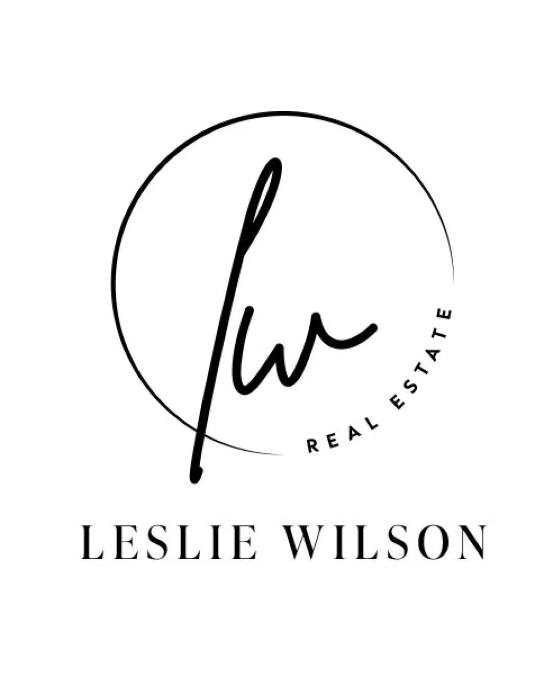
Try it Now!Logo review of LESILE WILSON, REAL ESTATE
 Logo analysis by AI
Logo type:
Style:
Detected symbol:
Detected text:
Business industry:
Review requested by Agentimage
**If AI can recognize or misinterpret it, so can people.
Structured logo review
Legibility
![]() Main wordmark LESLIE WILSON is clear and highly legible in a sophisticated serif typeface.
Main wordmark LESLIE WILSON is clear and highly legible in a sophisticated serif typeface.![]() The 'REAL ESTATE' descriptor has sufficient spacing.
The 'REAL ESTATE' descriptor has sufficient spacing.
![]() 'lw' monogram may be difficult to decipher at smaller sizes for unfamiliar viewers.
'lw' monogram may be difficult to decipher at smaller sizes for unfamiliar viewers.![]() 'REAL ESTATE' set in small, curved type may create legibility issues at reduced scale.
'REAL ESTATE' set in small, curved type may create legibility issues at reduced scale.
Scalability versatility
![]() Minimal, monochrome design retains clarity on larger applications like business cards or letterheads.
Minimal, monochrome design retains clarity on larger applications like business cards or letterheads.![]() Works in print and digital environments.
Works in print and digital environments.
![]() Thin script of monogram and circle may lose detail in small-scale use (e.g., favicon, embroidery).
Thin script of monogram and circle may lose detail in small-scale use (e.g., favicon, embroidery).![]() Curved 'REAL ESTATE' text will blur or become illegible very small.
Curved 'REAL ESTATE' text will blur or become illegible very small.
200x250 px
100×125 px
50×62 px
Balance alignment
![]() Well-centered and aligned elements.
Well-centered and aligned elements.![]() Circle frames the monogram, providing visual cohesion.
Circle frames the monogram, providing visual cohesion.
![]() Open end of the circle feels unfinished or imbalanced.
Open end of the circle feels unfinished or imbalanced.![]() Script monogram leans heavily to one side, causing slight visual imbalance.
Script monogram leans heavily to one side, causing slight visual imbalance.

Originality
![]() Personalized handwritten monogram adds unique character.
Personalized handwritten monogram adds unique character.![]() Minimalist aesthetic avoids typical real estate icon clichés.
Minimalist aesthetic avoids typical real estate icon clichés.
![]() Script monogram in a circle is a common trope among personal branding logos.
Script monogram in a circle is a common trope among personal branding logos.![]() No use of creative negative space or surprising elements.
No use of creative negative space or surprising elements.
Logomark wordmark fit
![]() Script monogram and classic serif wordmark create a sense of sophistication and professionalism.
Script monogram and classic serif wordmark create a sense of sophistication and professionalism.![]() Style match is coherent for a real estate agent brand.
Style match is coherent for a real estate agent brand.
![]() Scripts and serifs have a modern-traditional contrast that could be further harmonized with a subtle serif in the monogram.
Scripts and serifs have a modern-traditional contrast that could be further harmonized with a subtle serif in the monogram.![]() Slight mismatch in formality between playful script and formal serif.
Slight mismatch in formality between playful script and formal serif.
Aesthetic look
![]() Clean, uncluttered design.
Clean, uncluttered design.![]() Sophisticated and modern—well-suited for high-end real estate branding.
Sophisticated and modern—well-suited for high-end real estate branding.![]() Effective use of whitespace and minimalism.
Effective use of whitespace and minimalism.
Dual meaning and misinterpretations
![]() No inappropriate shapes or unintended connotations.
No inappropriate shapes or unintended connotations.
Color harmony
![]() Elegant black and white palette ensures timelessness and maximum versatility.
Elegant black and white palette ensures timelessness and maximum versatility.![]() Strong contrast enhances visual impact.
Strong contrast enhances visual impact.
Black
#000000
White
#FFFFFF