 View review
Logo score
Logo review ofLesile Wilson Real Estate
Review the detailed scores below to see what is working and what should be refined first.
Legibility
Originality
Misread
Balance
Scale
Detailed review
Logo performance breakdown
Legibility
![]() Primary wordmark 'LESILE WILSON REAL ESTATE' is clear and easy to read.
Primary wordmark 'LESILE WILSON REAL ESTATE' is clear and easy to read.![]() Use of all caps enhances straightforward legibility in the main text.
Use of all caps enhances straightforward legibility in the main text.
![]() The intertwining of the 'L' and 'W' in the monogram can cause momentary confusion, reducing instant recognition.
The intertwining of the 'L' and 'W' in the monogram can cause momentary confusion, reducing instant recognition.![]() Fine lines and varying stroke weights in the monogram may become harder to read at small sizes.
Fine lines and varying stroke weights in the monogram may become harder to read at small sizes.
Originality
![]() Custom integration of 'L' and 'W' monogram shows intent at personal branding.
Custom integration of 'L' and 'W' monogram shows intent at personal branding.![]() Minimal, tasteful serif execution avoids typical real estate clichés (roofs, buildings).
Minimal, tasteful serif execution avoids typical real estate clichés (roofs, buildings).
![]() Monogrammed initials are a common approach within premium-focused real estate branding.
Monogrammed initials are a common approach within premium-focused real estate branding.![]() No negative space utilized for smart symbolism or secondary meaning.
No negative space utilized for smart symbolism or secondary meaning.
Color harmony
![]() Classic black and white color scheme provides strong contrast and timelessness.
Classic black and white color scheme provides strong contrast and timelessness.![]() Single color ensures full compatibility across branding applications.
Single color ensures full compatibility across branding applications.
Black
#000000
White
#FFFFFF
Balance alignment
![]() The type arrangement is visually centered and maintains a sophisticated, balanced look.
The type arrangement is visually centered and maintains a sophisticated, balanced look.![]() Monogram is proportionately placed above the wordmark, maintaining classic vertical hierarchy.
Monogram is proportionately placed above the wordmark, maintaining classic vertical hierarchy.
![]() The intertwining of the 'L' and 'W' creates minor visual tension and a slightly uneven negative space.
The intertwining of the 'L' and 'W' creates minor visual tension and a slightly uneven negative space.![]() The stroke contrast between the monogram and wordmark is noticeable; some viewers may find the monogram slightly heavier.
The stroke contrast between the monogram and wordmark is noticeable; some viewers may find the monogram slightly heavier.

Scalability
![]() Monochrome palette allows for versatility across different backgrounds and media.
Monochrome palette allows for versatility across different backgrounds and media.![]() Would work well on business cards, print materials, and digital use when scaled moderately.
Would work well on business cards, print materials, and digital use when scaled moderately.
![]() Thin lines, especially in the monogram, may be lost at very small sizes (e.g., favicon, embroidery, or small merchandise).
Thin lines, especially in the monogram, may be lost at very small sizes (e.g., favicon, embroidery, or small merchandise).![]() Interwined letters may merge or become indistinct on smaller format applications like pens or lapel pins.
Interwined letters may merge or become indistinct on smaller format applications like pens or lapel pins.
200x250 px
100×125 px
50×62 px
Misinterpretations
![]() No apparent inappropriate or confusing visuals present.
No apparent inappropriate or confusing visuals present.![]() Monogram is abstract enough to avoid unintended symbolism.
Monogram is abstract enough to avoid unintended symbolism.
Symbol & text fit
![]() Serif typeface matches between monogram and wordmark, exemplifying brand coherence.
Serif typeface matches between monogram and wordmark, exemplifying brand coherence.
![]() Both elements feel related in weight and form.
Both elements feel related in weight and form.
![]() Wordmark is more traditionally readable and static compared to the more dynamic and complex monogram. Minor mismatch in energy.
Wordmark is more traditionally readable and static compared to the more dynamic and complex monogram. Minor mismatch in energy.
Presentation kit
Finalize and present this logo
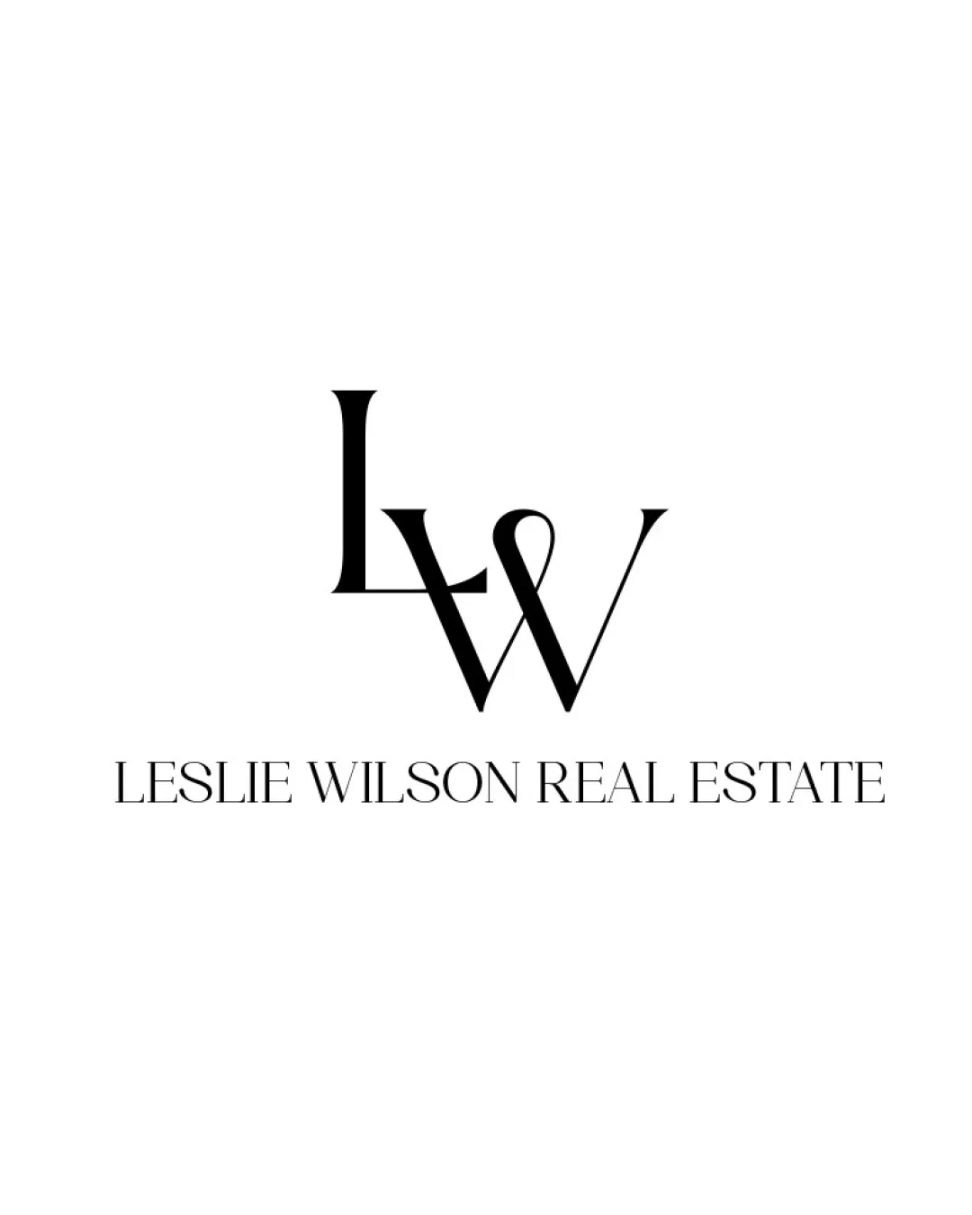
Logo description
This logo design features an intertwined 'L' and 'W' monogram, referencing the initials of Leslie Wilson and providing a strong sense of personal branding. The classic serif styling conveys professionalism, timelessness, and sophistication, aligning well with the upscale nature of the real estate industry. The monochrome black-and-white palette ensures maximum legibility and versatile application across both print and digital media. Below the monogram, the wordmark 'LESLIE WILSON REAL ESTATE' is typeset in a matching serif, reinforcing the high-end positioning of the business. This combination of minimalism, elegance, and clear hierarchy makes the identity suitable for business cards, signage, online profiles, and more. Overall, the design balances a sense of exclusivity with professional clarity, making it broadly appealing within the premium property sector.
Tips for the logo presentation
Mockup ideas
- Business card with embossed gold foil logo.
- Real estate yard sign featuring the monogram above contact info.
- Office window decal for a real estate agency.
- Elegant website header with the logo in the top nav bar.
- Branded document folder or letterhead with the monogram as a watermark.
- Luxury pen or gift item for client appreciation.
- Digital social media avatar using the monogram only.
Try your own review
Review my logo
Wondering how your logo performs?
Get a clear logo score, key risks, and priority fix ideas before your client or audience sees it.
Keep exploring


