Wondering how your logo performs? 🧐
Get professional logo reviews in seconds and catch design issues in time.
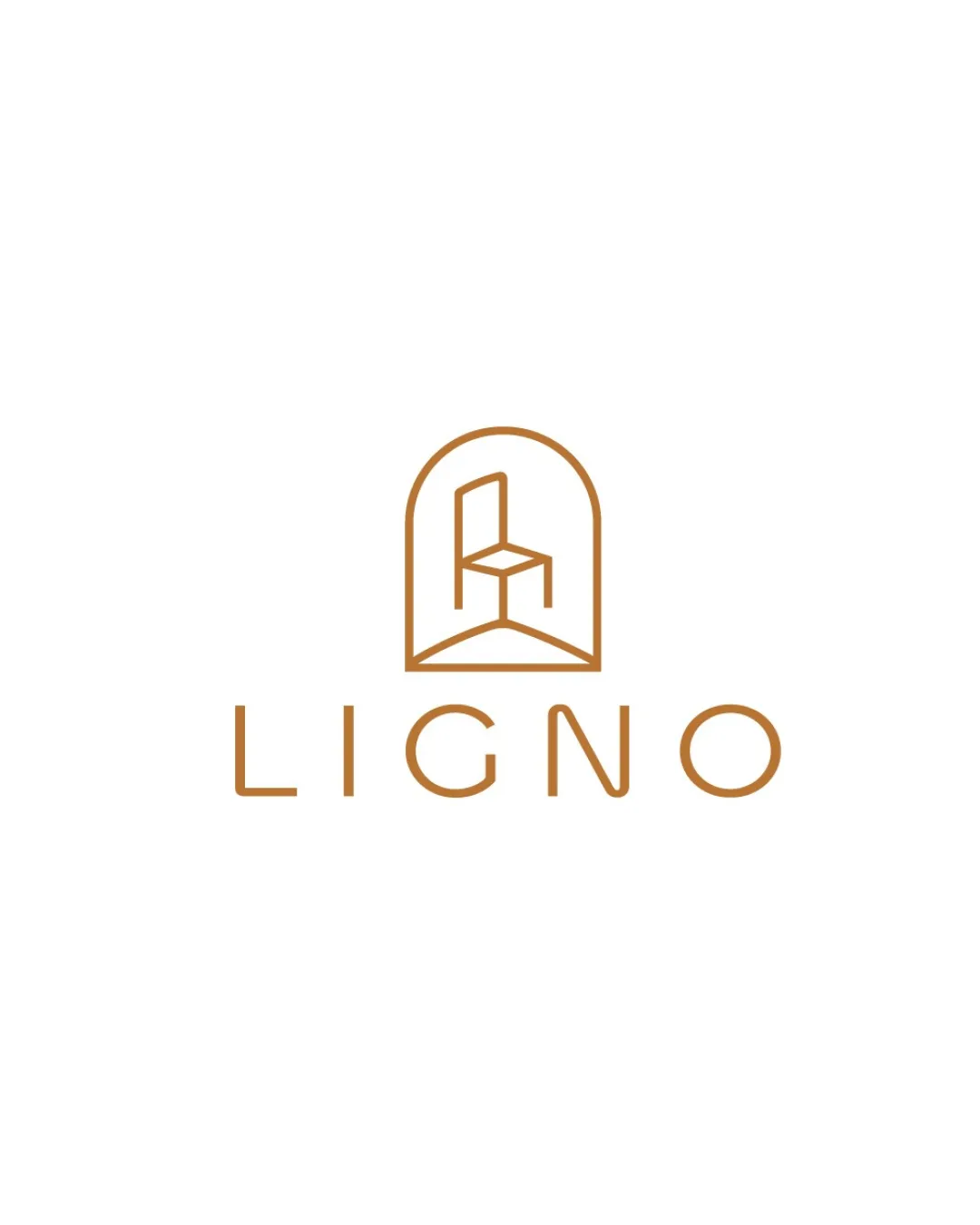
Try it Now!Logo review of LIGNO
 Logo analysis by AI
Logo type:
Style:
Detected symbol:
Negative space:
Detected text:
Business industry:
Review requested by Yeasin
**If AI can recognize or misinterpret it, so can people.
Structured logo review
Legibility
![]() Text is highly legible with excellent spacing and clean lines.
Text is highly legible with excellent spacing and clean lines.![]() Consistent stroke weight matches the symbol's minimalism.
Consistent stroke weight matches the symbol's minimalism.
Scalability versatility
![]() Simple lines and minimal detail ensure legibility when scaled down.
Simple lines and minimal detail ensure legibility when scaled down.![]() Works well on print, digital, and merchandise like business cards and packaging.
Works well on print, digital, and merchandise like business cards and packaging.
![]() Very thin lines of the chair symbol could become faint or disappear entirely at extremely small sizes, making embroidery or small favicons less recognizable.
Very thin lines of the chair symbol could become faint or disappear entirely at extremely small sizes, making embroidery or small favicons less recognizable.
200x250 px
100×125 px
50×62 px
Balance alignment
![]() Excellent centering between the symbol and wordmark.
Excellent centering between the symbol and wordmark.![]() Balanced visual weight between the icon and the text; neither overpowers the other.
Balanced visual weight between the icon and the text; neither overpowers the other.

Originality
![]() Use of a chair inside an arch shape is distinctive and directly references furniture.
Use of a chair inside an arch shape is distinctive and directly references furniture.![]() Geometric abstraction of the chair offers some creative identity.
Geometric abstraction of the chair offers some creative identity.
![]() Chairs are a common furniture symbol, so while the execution is stylish, the concept isn't wholly unique.
Chairs are a common furniture symbol, so while the execution is stylish, the concept isn't wholly unique.
Logomark wordmark fit
![]() Stroke weight, color, and geometric style are perfectly matched.
Stroke weight, color, and geometric style are perfectly matched.![]() Cohesive visual language between the logomark and wordmark.
Cohesive visual language between the logomark and wordmark.
Aesthetic look
![]() Refined minimalist expression with ample white space.
Refined minimalist expression with ample white space.![]() Sophisticated color palette enhances the premium feel.
Sophisticated color palette enhances the premium feel.
Dual meaning and misinterpretations
![]() No inappropriate or confusing shapes appear; design intention is clear.
No inappropriate or confusing shapes appear; design intention is clear.
Color harmony
![]() Restrained use of a single accent color with high contrast on a white background.
Restrained use of a single accent color with high contrast on a white background.![]() Color association (warm brown) is fitting for the furniture industry.
Color association (warm brown) is fitting for the furniture industry.
copper
#B0732E
white
#FFFFFF


