Wondering how your logo performs? 🧐
Get professional logo reviews in seconds and catch design issues in time.
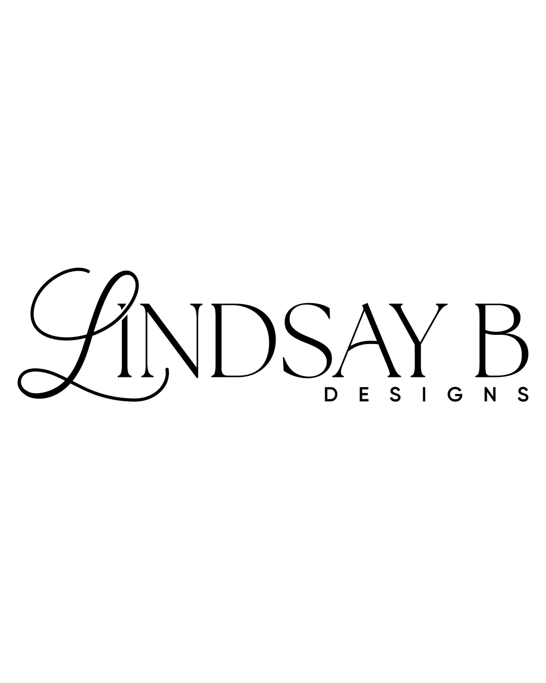
Try it Now!Logo review of LINDSAY B DESIGNS
 Logo analysis by AI
Logo type:
Style:
Detected text:
Business industry:
Review requested by LindsayBD19
**If AI can recognize or misinterpret it, so can people.
Structured logo review
Legibility
![]() Primary text is generally legible with clear, well-spaced serif characters.
Primary text is generally legible with clear, well-spaced serif characters.![]() The 'DESIGNS' subtext is crisp and modern, easy to read at smaller sizes.
The 'DESIGNS' subtext is crisp and modern, easy to read at smaller sizes.
![]() The script 'L' is overly decorative, making it slightly hard to decipher at a glance, especially at small sizes.
The script 'L' is overly decorative, making it slightly hard to decipher at a glance, especially at small sizes.![]() Contrast between the ornate 'L' and the rest of the text may hinder quick brand recognition.
Contrast between the ornate 'L' and the rest of the text may hinder quick brand recognition.
Scalability versatility
![]() Wordmark style ensures reasonable versatility across digital and print applications.
Wordmark style ensures reasonable versatility across digital and print applications.![]() Simple color palette aids adaptability on monochrome backgrounds.
Simple color palette aids adaptability on monochrome backgrounds.
![]() The intricate flourishes on the 'L' may lose clarity in small-scale uses like business cards, apparel embroidery, or favicons.
The intricate flourishes on the 'L' may lose clarity in small-scale uses like business cards, apparel embroidery, or favicons.![]() Long horizontal orientation may not fit well in square or compact spaces like app icons or tight signage.
Long horizontal orientation may not fit well in square or compact spaces like app icons or tight signage.
200x250 px
100×125 px
50×62 px
Balance alignment
![]() The remaining letters are vertically aligned and evenly spaced.
The remaining letters are vertically aligned and evenly spaced.![]() Subtext 'DESIGNS' is well centered underneath the main mark.
Subtext 'DESIGNS' is well centered underneath the main mark.
![]() The sweeping descender and ascender of the 'L' create a visual imbalance on the left side, drawing the eye disproportionately.
The sweeping descender and ascender of the 'L' create a visual imbalance on the left side, drawing the eye disproportionately.

Originality
![]() Custom flourished 'L' gives the brand a distinctive and high-end feel.
Custom flourished 'L' gives the brand a distinctive and high-end feel.![]() Pairing calligraphic and serif typefaces adds personality.
Pairing calligraphic and serif typefaces adds personality.
![]() Ornate script-and-serif mashups are somewhat common in boutique branding.
Ornate script-and-serif mashups are somewhat common in boutique branding.![]() No unique symbols or negative-space creativity to set it apart further.
No unique symbols or negative-space creativity to set it apart further.
Aesthetic look
![]() Clean, elegant, and professional aesthetic.
Clean, elegant, and professional aesthetic.![]() Effective contrast between fonts produces a sophisticated, luxe vibe.
Effective contrast between fonts produces a sophisticated, luxe vibe.
![]() Ornamentation of the 'L' slightly interrupts an otherwise minimal visual—may polarize responses based on taste.
Ornamentation of the 'L' slightly interrupts an otherwise minimal visual—may polarize responses based on taste.
Dual meaning and misinterpretations
![]() No obvious double meanings or inappropriate associations present.
No obvious double meanings or inappropriate associations present.
Color harmony
![]() Classic black-on-white ensures maximum readability and timeless appeal.
Classic black-on-white ensures maximum readability and timeless appeal.![]() Minimal palette avoids unnecessary distraction and supports brand versatility.
Minimal palette avoids unnecessary distraction and supports brand versatility.
Black
#000000
White
#FFFFFF


