Slightly simplify the geometric ticket mark for optimum clarity at tiny sizes.
Critical for responsive and versatile application without losing concept.
Improves legibility in digital thumbnails and print.
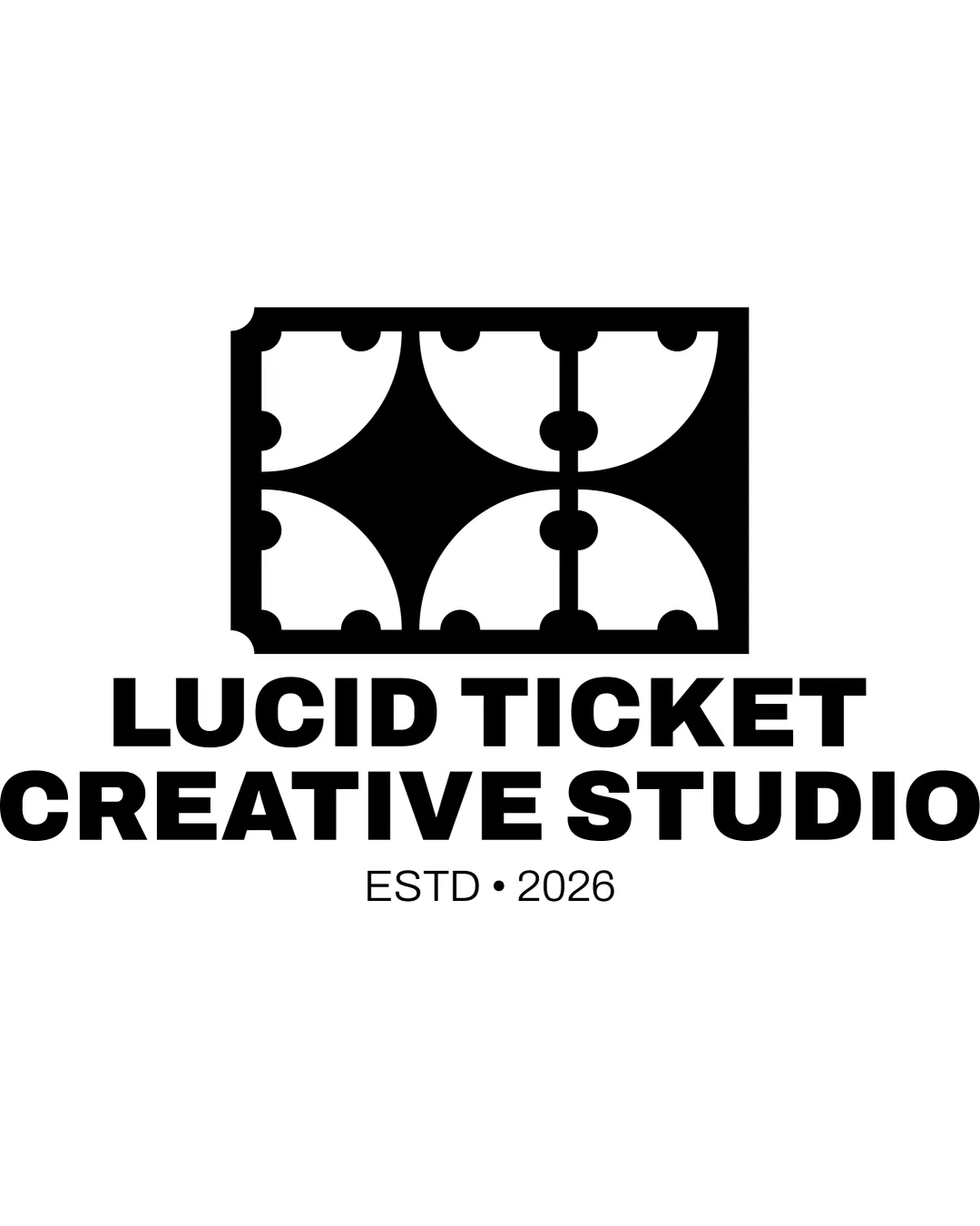
Distinctive, clear, and relevant combination mark—minor refinement will maximize performance across applications.
Focus on the changes that matter. Keep what makes the logo work.
Critical for responsive and versatile application without losing concept.
Improves legibility in digital thumbnails and print.
Logo uses a bold, clear layout with a memorable, abstracted ticket mark that fits the studio's focus on clarity and strategy.

Inspect spacing with the guide. Optical balance may differ from geometric centering.
Get a clear logo score, key risks, and priority fix ideas before your client or audience sees it.
More credits needed
Add credits to continue without losing your work.
Then $7/month. Cancel anytime.
Essential logo review with AI
Estimated progress