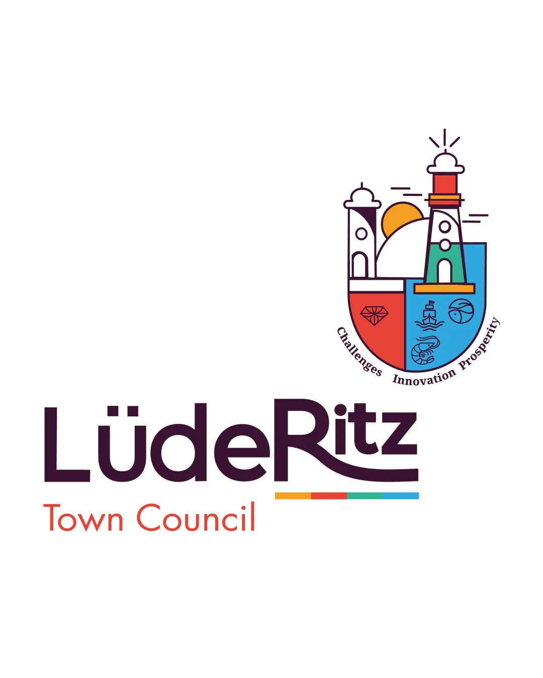
LüdeRitz Town Council Challenges Innovation Prosp.. logo review
4/5
Logo score
Logo review of

Lüderitz Town Council Challenges Innovation Prosp..

A vibrant, distinctive town council logo showcasing local landmarks and values, with strong execution but some scalability caution.

Combination Mark Modern Illustrative Emblem With Wordmark Government/public Sector
4/5
Legibility
4/5
Originality
5/5
Misread
4/5
Balance
3/5
Scale
Your next steps

What to fix first

Focus on the changes that matter. Keep what makes the logo work.

1

emblem details

Check emblem reproduction at small size and simplify tiny elements if needed.

Worth testing High priority Medium effort
Area to inspectApproximate location

Fine emblem icons (waves, diamond, ship) may lose clarity at small scale.

How to check

Preview or print at business card size to assess emblem icon clarity.

See the category review
2

tagline around emblem

Test tagline readability when the logo is scaled down and consider increasing font size or offering a version without the tagline for small use.

Optional refinement Medium priority Low effort
Area to inspectApproximate location

Curved tagline text is small and may become hard to read at reduced sizes.

How to check

Print or display the logo at small sizes and verify tagline legibility.

See the category review
Detailed review

Logo performance breakdown

4/5

Brief & logo match

Based on an inferred industry
Compared with

Municipal government or public sector body likely seeking community, trust, and locality cues.

The mark and wordmark convincingly convey a civic identity focused on locality and progress.

  • Civic Representation

    Emblem and municipal wordmark communicate official and local character effectively.

  • Modern, Trustable Image

    Illustrative shield and approachable type deliver a forward, welcoming image appropriate for a council.

4/5

Legibility

  • Main wordmark is highly readable
  • Letterform choices are clear and distinctive
  • Curved tagline text is small and may become hard to read at reduced sizes.

    Optional refinement tagline around emblem

    Try: Test tagline readability when the logo is scaled down and consider increasing font size or offering a version without the tagline for small use.

    Check: Print or display the logo at small sizes and verify tagline legibility.

    Area to inspectApproximate location
4/5

Originality

  • Distinctive illustrative emblem blending local context
  • Unique wordmark character and underline
5/5

Color harmony

  • Palettes are vibrant and well-coordinated
  • Red, blue, yellow, and green reinforce civic, community values
DarkPurple#532C47
Red#EA473B
Blue#1E9DDB
Yellow#F9B120
Orange#E35D32
Green#56B874
OffWhite#F6E6D9

Estimated colors. Use the original design file for exact values.

Create a full color palette using these colors

Create new palette
4/5

Balance alignment

  • Wordmark and emblem sit harmoniously
  • Color stripe adds visual anchor
  • Prominent swoop under 'Ritz' may slightly disrupt weight balance with 'Lüde'.

    Optional refinement wordmark lower stroke under 'Ritz'

    Try: Fine-tune the baseline stroke or spacing to ensure visual balance across wordmark.

    Check: Visually compare left and right weight/distribution in the wordmark.

Uploaded logoAlignment guide overlay

Inspect spacing with the guide. Optical balance may differ from geometric centering.

3/5

Scalability

  • Emblem is detailed and colorful
  • Wordmark remains clear at small sizes
  • Fine emblem icons (waves, diamond, ship) may lose clarity at small scale.

    Worth testing emblem details

    Try: Check emblem reproduction at small size and simplify tiny elements if needed.

    Check: Preview or print at business card size to assess emblem icon clarity.
    Area to inspectApproximate location
Uploaded logo at 200 pixels wide
200 × 250 px
Uploaded logo at 100 pixels wide
100 × 125 px
Uploaded logo at 50 pixels wide
50 × 63 px

Compare the detail at different sizes. Labels show the full image dimensions.

5/5

Misinterpretations

  • No unintended shapes or misreadings detected
4/5

Symbol & text fit

  • Mark and wordmark feel integrated both stylistically and conceptually

Black & white

Does the shape still work without color?

These tests are available only for logos uploaded in vector (SVG) format.

Background contrast

Find the surfaces where your logo stays clear.

These tests are available only for logos uploaded in vector (SVG) format.

Blur & silhouette

A 3px blur softens fine details so you can check whether the overall shape stays recognizable. If key gaps close or elements merge, the logo may rely too heavily on detail.

These tests are available only for logos uploaded in vector (SVG) format.

Try your own review

Wondering how your logo performs?

Get a clear logo score, key risks, and priority fix ideas before your client or audience sees it.

Review my logo