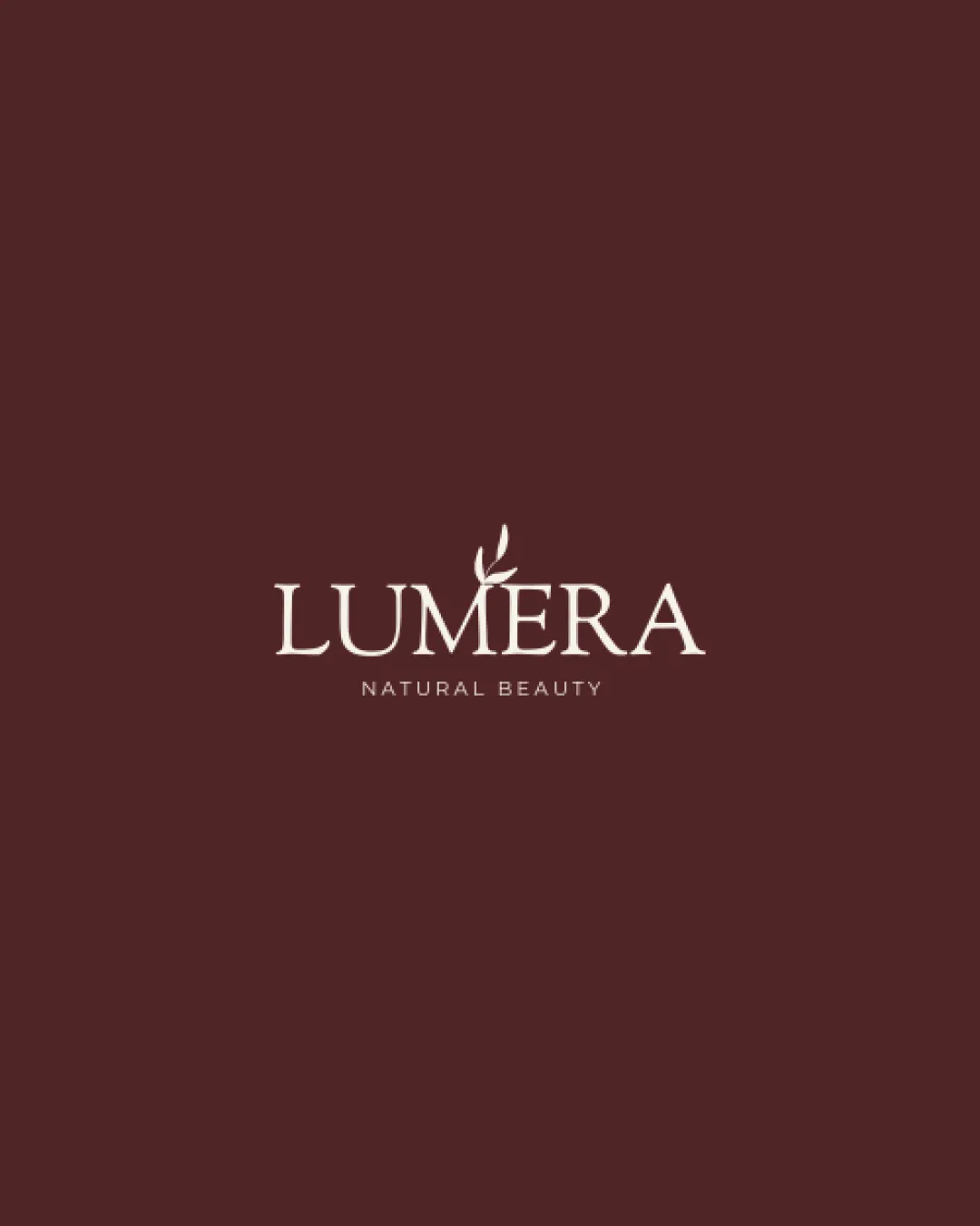
LUMERA
NATURAL BEAUTY logo review
4/5
Logo score
Logo review of

Lumera Natural Beauty

A refined and on-brief wordmark with a well-integrated natural accent, needing small-scale optimization.

Wordmark Classic With Natural Accent Beauty And Cosmetics
4/5
Legibility
4/5
Originality
5/5
Misread
4/5
Balance
3/5
Scale
Your next steps

What to fix first

Focus on the changes that matter. Keep what makes the logo work.

1

Standalone mark (leaf accent and tagline)

Test legibility at various small sizes.

Worth testing High priority Low effort
Area to inspectApproximate location

The small size and fine lines of the leaf and tagline could become illegible at reduced scales.

How to check

Print or display at intended small uses to verify clarity.

See the category review
2

Standalone mark (above E in LUMERA)

Explore alternate proportions or centering of the leaf to maintain harmony.

Optional refinement Medium priority Low effort
Area to inspectApproximate location

The leaf protruding above the 'E' breaks the otherwise level wordmark cap height, which may slightly disrupt vertical balance.

How to check

Test alternate placements for visual equilibrium.

See the category review
Detailed review

Logo performance breakdown

5/5

Brief & logo match

Based on your brief
Compared with

Brand Beauty and Cosmetics

The logo convincingly expresses natural beauty and sophistication for a beauty brand.

  • Nature/natural Theme

    Leaf detail on 'E' supports a natural positioning for a beauty brand.

  • Sophistication And Elegance

    Classic serif type and muted palette evoke quality and refinement.

4/5

Legibility

  • Elegant, clear wordmark at medium and large sizes.
4/5

Originality

  • Leaf motif smartly integrated into the wordmark.
  • Classical typography with subtle modern twist.
4/5

Color harmony

  • Minimal and refined color palette suits a beauty brand.
Dark Red#5C2929
Light Cream#F2E8E0

Estimated colors. Use the original design file for exact values.

Create a full color palette using these colors

Create new palette
4/5

Balance alignment

  • Centered alignment with visual interest from the leaf accent.
  • The leaf protruding above the 'E' breaks the otherwise level wordmark cap height, which may slightly disrupt vertical balance.

    Optional refinement Standalone mark (above E in LUMERA)

    Try: Explore alternate proportions or centering of the leaf to maintain harmony.

    Check: Test alternate placements for visual equilibrium.

    Area to inspectApproximate location
Uploaded logoAlignment guide overlay

Inspect spacing with the guide. Optical balance may differ from geometric centering.

3/5

Scalability

  • Serif details and leaf add character.
  • The small size and fine lines of the leaf and tagline could become illegible at reduced scales.

    Worth testing Standalone mark (leaf accent and tagline)

    Try: Test legibility at various small sizes.

    Check: Print or display at intended small uses to verify clarity.
    Area to inspectApproximate location
Uploaded logo at 200 pixels wide
200 × 250 px
Uploaded logo at 100 pixels wide
100 × 125 px
Uploaded logo at 50 pixels wide
50 × 63 px

Compare the detail at different sizes. Labels show the full image dimensions.

5/5

Misinterpretations

  • No obvious confusion or secondary readings.

Black & white

Does the shape still work without color?

These tests are available only for logos uploaded in vector (SVG) format.

Background contrast

Find the surfaces where your logo stays clear.

These tests are available only for logos uploaded in vector (SVG) format.

Blur & silhouette

A 3px blur softens fine details so you can check whether the overall shape stays recognizable. If key gaps close or elements merge, the logo may rely too heavily on detail.

These tests are available only for logos uploaded in vector (SVG) format.

Try your own review

Wondering how your logo performs?

Get a clear logo score, key risks, and priority fix ideas before your client or audience sees it.

Review my logo