Wondering how your logo performs? 🧐
Get professional logo reviews in seconds and catch design issues in time.
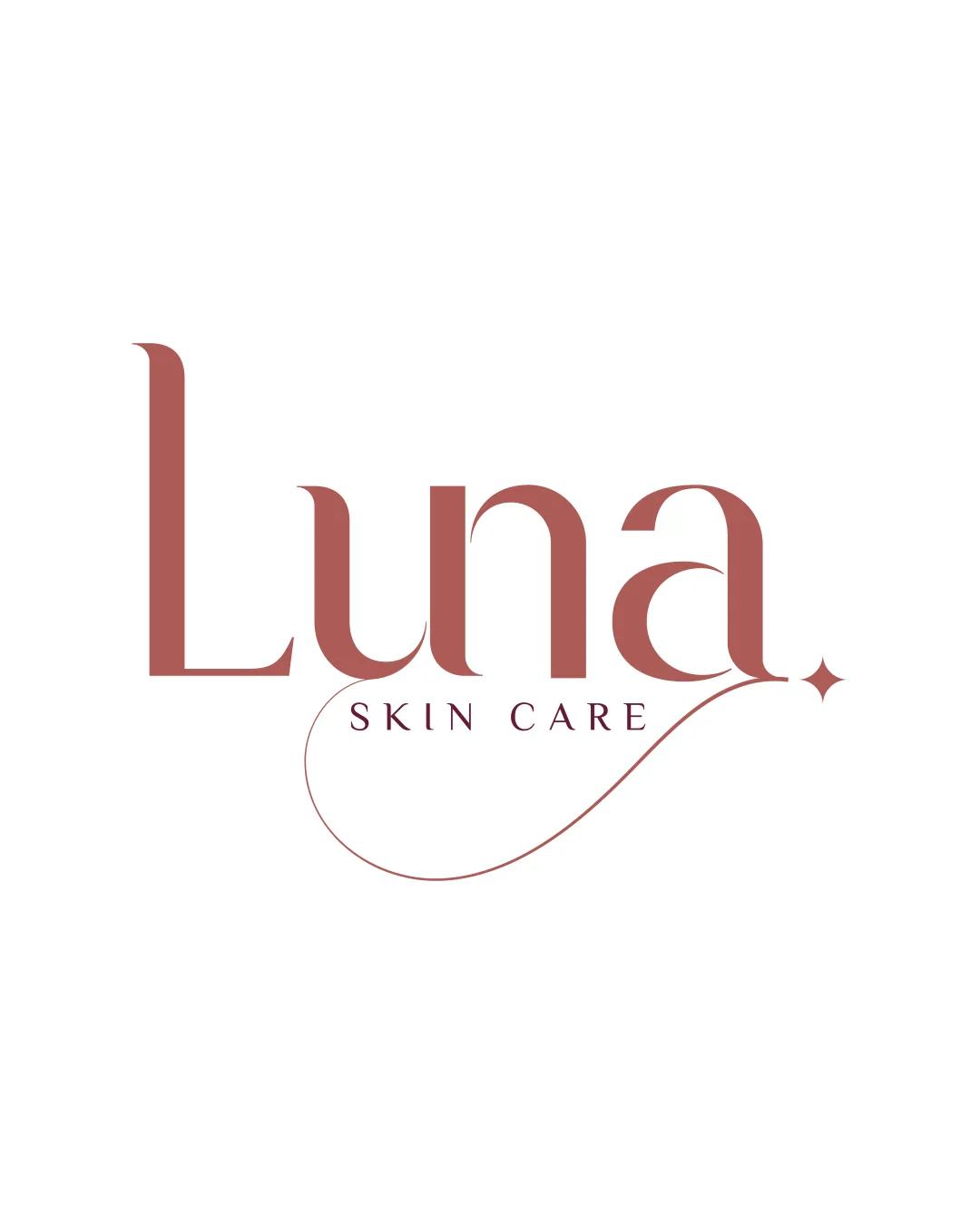
Try it Now!Logo review of Luna Skin Care
 Logo analysis by AI
Logo type:
Style:
Detected symbol:
Detected text:
Business industry:
Review requested by Mufeesdesigner
**If AI can recognize or misinterpret it, so can people.
Structured logo review
Legibility
![]() Clear serif font
Clear serif font![]() Elegant line work
Elegant line work
![]() Delicate embellishments might reduce clarity at small sizes
Delicate embellishments might reduce clarity at small sizes
Scalability versatility
![]() Works well on packaging and online
Works well on packaging and online
![]() Thin lines may lose clarity on small-scale applications like business cards
Thin lines may lose clarity on small-scale applications like business cards
200x250 px
100×125 px
50×62 px
Balance alignment
![]() Visually balanced layout
Visually balanced layout![]() Symmetrical composition with embellishments
Symmetrical composition with embellishments
![]() Minor alignment issues with embellishments and text
Minor alignment issues with embellishments and text

Originality
![]() Unique serif typeface
Unique serif typeface![]() Elegant modern aesthetic
Elegant modern aesthetic
![]() Common wordmark style for the cosmetics industry
Common wordmark style for the cosmetics industry
Aesthetic look
![]() Sophisticated and clean look
Sophisticated and clean look![]() Appealing color choice
Appealing color choice
![]() Simplicity may border on generic
Simplicity may border on generic
Dual meaning and misinterpretations
![]() No inappropriate symbolism detected
No inappropriate symbolism detected
Color harmony
![]() Consistent use of color
Consistent use of color![]() Harmonizes with the elegant style
Harmonizes with the elegant style
Copper
#A65A55


