Wondering how your logo performs? 🧐
Get professional logo reviews in seconds and catch design issues in time.
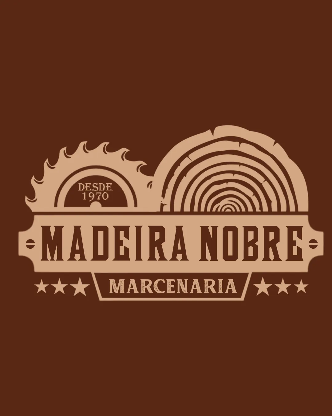
Try it Now!Logo review of MADEIRA NOBRE, MARCENARIA, DESDE 1970
 Logo analysis by AI
Logo type:
Style:
Detected symbol:
Detected text:
Business industry:
Review requested by Walter_marques_3
**If AI can recognize or misinterpret it, so can people.
Structured logo review
Legibility
![]() Main text ('MADEIRA NOBRE') is highly legible due to bold, high-contrast font.
Main text ('MADEIRA NOBRE') is highly legible due to bold, high-contrast font.![]() Supporting text ('MARCENARIA') is clear and sufficiently large.
Supporting text ('MARCENARIA') is clear and sufficiently large.![]() Good contrast between light lettering and dark background.
Good contrast between light lettering and dark background.
Scalability versatility
![]() Emblematic design is suitable for signage, store fronts, and packaging.
Emblematic design is suitable for signage, store fronts, and packaging.![]() Clear at moderate-to-large sizes, suitable for branded uniforms or vehicles.
Clear at moderate-to-large sizes, suitable for branded uniforms or vehicles.
![]() Complex outlines and small details (wood rings, saw teeth, tiny 'DESDE 1970' text) may lose clarity when scaled down or embroidered.
Complex outlines and small details (wood rings, saw teeth, tiny 'DESDE 1970' text) may lose clarity when scaled down or embroidered.![]() Logo may become busy and illegible as a small icon or favicon.
Logo may become busy and illegible as a small icon or favicon.
200x250 px
100×125 px
50×62 px
Balance alignment
![]() Centralized composition with symmetrical text placement.
Centralized composition with symmetrical text placement.![]() Balanced weight distribution between saw blade and wood rings.
Balanced weight distribution between saw blade and wood rings.
![]() Slight visual tension with differing curvatures and sizes between the saw and wood log illustration.
Slight visual tension with differing curvatures and sizes between the saw and wood log illustration.

Originality
![]() Creative integration of circular saw and wood grain, directly referencing carpentry.
Creative integration of circular saw and wood grain, directly referencing carpentry.![]() Vintage badge style conveys tradition and expertise.
Vintage badge style conveys tradition and expertise.
![]() The use of saw blades and wood rings is common in woodworking logos, but the arrangement is a bit more distinctive than standard clipart-based marks.
The use of saw blades and wood rings is common in woodworking logos, but the arrangement is a bit more distinctive than standard clipart-based marks.
Logomark wordmark fit
![]() Typography, colors, and illustration style feel cohesive and unified.
Typography, colors, and illustration style feel cohesive and unified.![]() Logomark and wordmark blend seamlessly, consistent with the vintage woodwork theme.
Logomark and wordmark blend seamlessly, consistent with the vintage woodwork theme.
Aesthetic look
![]() Vintage badge gives a professional, trustworthy look.
Vintage badge gives a professional, trustworthy look.![]() Monochromatic brown palette enhances the woodwork theme and visual harmony.
Monochromatic brown palette enhances the woodwork theme and visual harmony.
![]() Some elements (saw teeth, multiple stars, detailed wood rings) introduce visual clutter, reducing elegance.
Some elements (saw teeth, multiple stars, detailed wood rings) introduce visual clutter, reducing elegance.
Dual meaning and misinterpretations
![]() The imagery aligns clearly with the intended industry; no inappropriate or misleading forms present.
The imagery aligns clearly with the intended industry; no inappropriate or misleading forms present.
Color harmony
![]() Limited, harmonious palette referencing natural wood tones.
Limited, harmonious palette referencing natural wood tones.![]() Excellent contrast ensures clarity and professionalism.
Excellent contrast ensures clarity and professionalism.
SaddleBrown
#6A3D25
Tan
#D2A476


