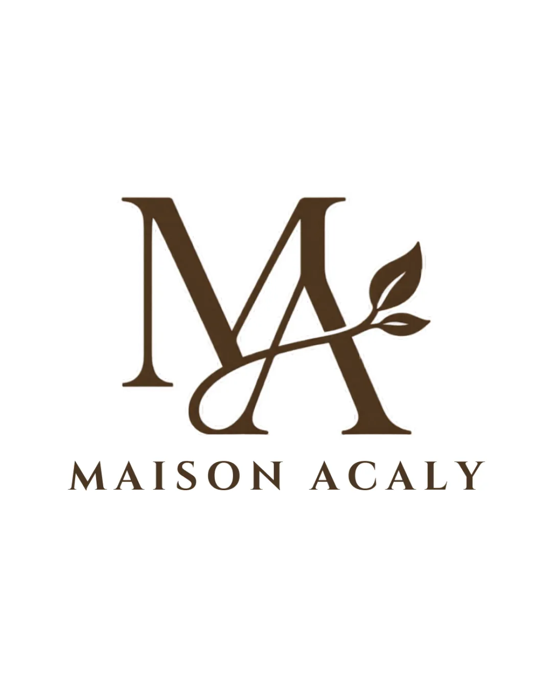
MAISON ACALY logo review
4.5 / 5
Logo score

Logo review ofMaison Acaly

Review the detailed scores below to see what is working and what should be refined first.

Combination Mark Classic, Serif, Botanical Hospitality
5/5
Legibility
4/5
Originality
5/5
Misread
4/5
Balance
4/5
Scale
Review next
Detailed review

Logo performance breakdown

5/5

Legibility

Checkmark icon Text is highly legible with a clean serif typeface.
Checkmark icon Capitalized, evenly spaced letters enhance readability.
4/5

Originality

Checkmark icon The integration of the leaf into the monogram adds a touch of unique flourish.
Checkmark icon Botanical reference is elegantly incorporated with the letterform.

Warning icon Monogram-with-leaf treatment is seen in luxury and botanical brands, making it less groundbreaking though still refined.

5/5

Color harmony

Checkmark icon Single neutral color palette communicates sophistication and remains versatile.
Checkmark icon Color choice fits the luxury/nature positioning.

Saddle Brown
#56381A

White
#FFFFFF

4/5

Balance alignment

Checkmark icon Monogram is generally well-proportioned and visually centered above the wordmark.
Checkmark icon Wordmark is aligned and spaced evenly below the logomark.

Warning icon The flourished leaf element skews the visual weight slightly to the right, making the composition feel marginally right-heavy.

logo 200x250 pixels scalability test alignment grid overlay
4/5

Scalability

Checkmark icon Monogram and wordmark are bold and simple enough to remain clear in small sizes.
Checkmark icon Minimal color palette aids in versatility across different mediums.

Warning icon The fine detail in the leaf and the intersecting lines of the monogram may become less clear on very small applications such as favicons or small embroidery.

logo 200x250 pixels scalability test

200x250 px

logo 100x125 pixels scalability test

100×125 px

logo 50x62 pixels scalability test

50×62 px

5/5

Misinterpretations

Checkmark icon No inappropriate dual meanings or suggestive shapes detected.
Checkmark icon Brand message is clear and aligns with the natural/luxury concept.

5 / 5

Symbol & text fit

Checkmark icon Serif typeface matches the traditional feel of the monogram.
Checkmark icon Visual harmony between the wordmark and the logomark.

Try your own review

Wondering how your logo performs?

Get a clear logo score, key risks, and priority fix ideas before your client or audience sees it.

Review my logo