 View review
Logo score
Logo review of
Maison Sol, Boutique Hotel
Review the detailed scores below to see what is working and what should be refined first.
Legibility
Originality
Misread
Balance
Scale
Detailed review
Logo performance breakdown
Legibility
 Primary name 'Maison Sol' uses a clean, elegant serif font. Text is distinct and prominent.
 Lower tagline 'Boutique Hotel' could become illegible at smaller sizes due to thinness and reduced contrast. Letter spacing in 'Maison Sol' may be inconsistent when scaled down.
Originality
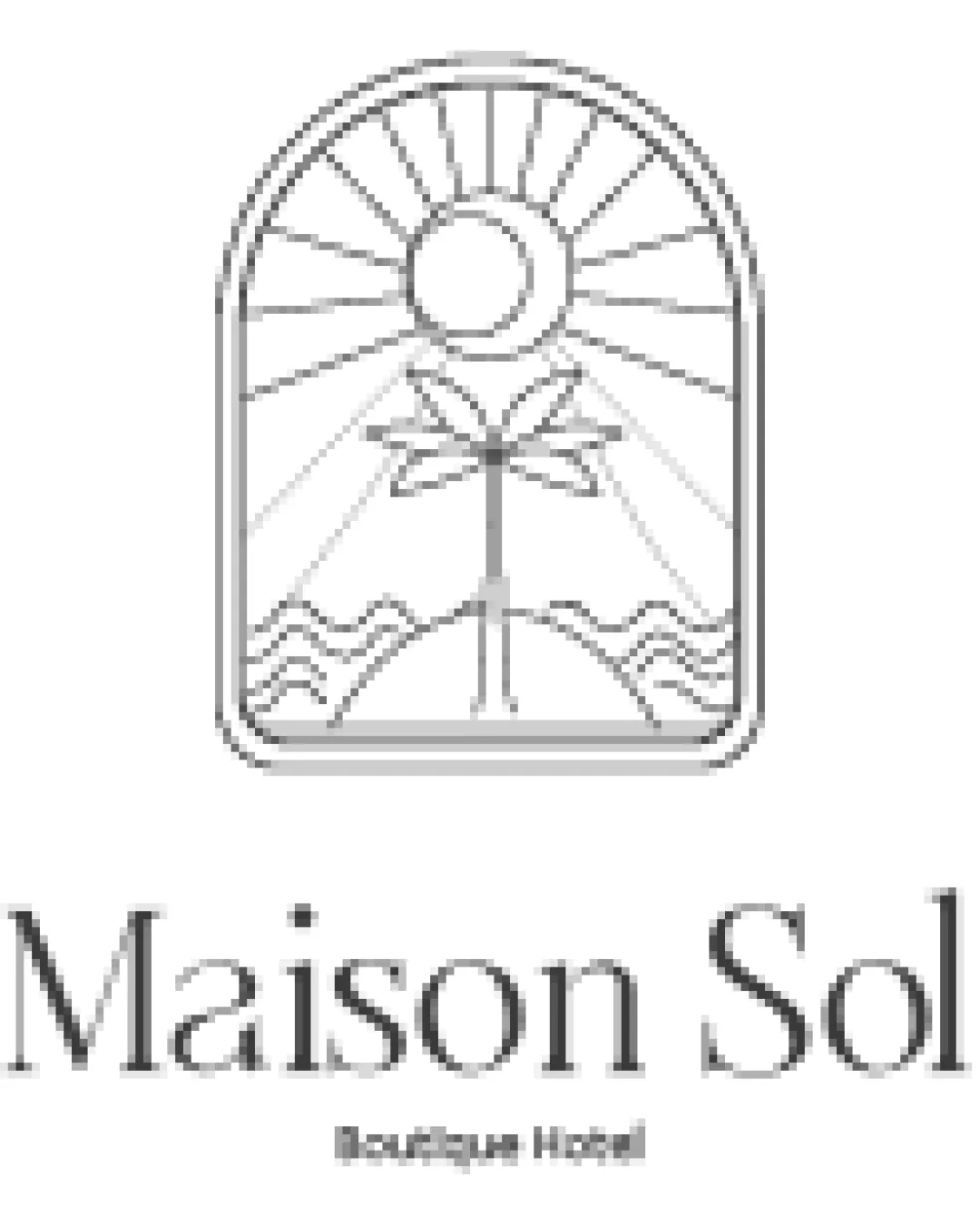
Window-sun-palm motif is less common and builds a distinctive boutique/hotel vibe. Cohesive integration of multiple environment-related elements.
Palm tree + sun + wave motif is often used in hospitality, especially in tropical contexts, making the core theme somewhat familiar.
Color harmony
Monochrome palette ensures harmony and adaptability to various surfaces.
White
#FFFFFF
Black
#000000
Balance alignment
Overall logo feels vertically centered under the arch. Wordmark and symbol are aligned cohesively and symmetrically.
Tagline alignment could be further refined to match the width of the main name for a tighter look.

Scalability
Minimalist line-art illustration is relatively simple and can scale moderately well. Arched frame helps contain detail.
Thin lines within the symbol may disappear at small sizes—fine detail is likely to be lost in embroidery, favicons, or small merchandise. Tagline will be unreadable in small format applications like pens or pins.
200x250 px
100×125 px
50×62 px
Misinterpretations
No inappropriate shapes or unintended double-meanings.
Symbol & text fit
Line-weight of the illustration matches well with the serif elegance of the wordmark.
Both elements feel cohesive, reinforcing an upscale boutique feel.
Try your own review
Review my logo
Wondering how your logo performs?
Get a clear logo score, key risks, and priority fix ideas before your client or audience sees it.
Keep exploring