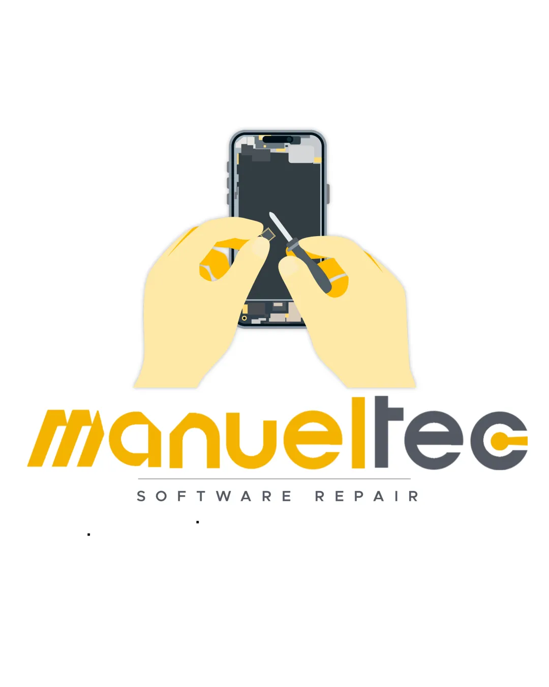
ManuelTeC SOFTWARE REPAIR logo review
2.8 / 5
Logo score
Logo review of

Manueltec Software Repair

Current asset functions and clearly communicates domain but needs simplification and refinement for a distinctive, professional brand.

Objective AI feedback. Your creative decision.

Combination Mark Semi-illustrative, Modern Tech Tech Repair
3.5/5
Legibility
2.5/5
Originality
4/5
Misread
3/5
Balance
2.5/5
Scale
Action plan

What to fix first

The most important fixes to handle before polishing the full presentation.

1

Redesign the main symbol as a minimal, geometric icon representing repair (e.g., outlined smartphone with subtle tool or gesture).

High priority

Removes over-illustration, solving scaling and premium style issues.

Impact: Elevates Modernity, Scalability, And Professional Perception. · Effort: Medium

2

Refine the wordmark for greater simplicity and consistency—limit stylized effects; ensure 'tec' and 'c' remain crisp at all sizes.

Medium priority

Clearer text is vital for brand strength in digital and print.

Impact: Enhances Clarity And Premium Styling Across Uses. · Effort: Low

Detailed review

Logo performance breakdown

3.5/5

Legibility

Checkmark icon Wordmark is mostly clear and readable.
Checkmark icon Contrast between yellow/gold and dark gray maintains visibility.

Warning icon The stylized letters and color split in 'tec' could impair quick reading, especially at smaller sizes.

2.5/5

Originality

Checkmark icon Directly communicates smartphone repair.

Warning icon Style is somewhat generic for tech repair; resembles stock illustration rather than a distinctive icon.
Warning icon Heavy illustration limits uniqueness in crowded sector.

3.5/5

Color harmony

Checkmark icon Yellow/gold and gray palette is appropriate for tech and has premium intent.

Warning icon Hand shade and phone details add minor palette noise; simplification would help.

Yellow
#FFD966

Gold
#FFC000

Dark Gray
#58595B

White
#FFFFFF

Your palette is close. Refine the color roles and combinations before updating the logo.

Build brand colors
3/5

Balance alignment

Checkmark icon Central arrangement establishes hierarchy from image to text.

Warning icon Upper illustration is visually heavy, making layout top-heavy.
Warning icon Spacing between symbol and wordmark could be refined for cohesion.

logo 200x250 pixels scalability test alignment grid overlay
2.5/5

Scalability

Checkmark icon Simple wordmark colors can scale down.

Warning icon Detailed hands, phone, and tools illustration will lose clarity at small sizes; logo is not effective as a small icon.
Warning icon Thin elements in illustration risk blurring.

logo 200x250 pixels scalability test

200x250 px

logo 100x125 pixels scalability test

100×125 px

logo 50x62 pixels scalability test

50×62 px

4/5

Misinterpretations

Checkmark icon No obvious negative or ambiguous readings.

3 / 5

Logo structure & brief match

Checkmark icon Symbol is on-theme and matches wordmark intent.

Warning icon Mismatch in visual density: illustration is more detailed than minimal wordmark.

Checkmark icon Modernity/minimalism: Logo uses a current palette, but the oversized illustration is not minimal and undermines a premium, simple look.
Checkmark icon Legibility: Major wordmark is mostly readable, yet stylization creates minor hurdles and illustration impedes small use.
Checkmark icon Symbol Simplification: Symbol is clear but over-detailed for versatile or modern use.
Checkmark icon Premium/tech Identity: Palette and geometric wordmark help, but hand-drawn style holds logo back from a high-tech, premium visual identity.

Try your own review

Wondering how your logo performs?

Get a clear logo score, key risks, and priority fix ideas before your client or audience sees it.

Review my logo