Wondering how your logo performs? 🧐
Get professional logo reviews in seconds and catch design issues in time.
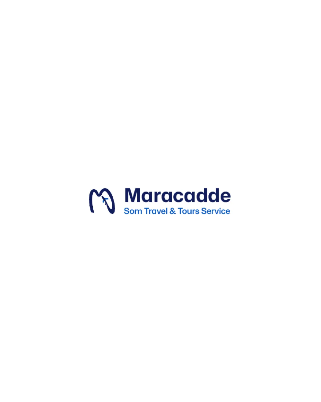
Try it Now!Logo review of Maracadde, Som Travel & Tours Service
 Logo analysis by AI
Logo type:
Style:
Detected symbol:
Negative space:
Detected text:
Business industry:
Review requested by Wacdi
**If AI can recognize or misinterpret it, so can people.
Structured logo review
Legibility
![]() Main brand name 'Maracadde' is clear and easy to read.
Main brand name 'Maracadde' is clear and easy to read.![]() Supporting tagline uses a clean sans-serif font with high contrast on white.
Supporting tagline uses a clean sans-serif font with high contrast on white.
Scalability versatility
![]() Logo uses bold lines and two main colors, likely to scale well for print and digital.
Logo uses bold lines and two main colors, likely to scale well for print and digital.![]() Works well for applications like website headers, travel agency signage, and large-format print.
Works well for applications like website headers, travel agency signage, and large-format print.
![]() Small text in the tagline may become less legible in very small sizes such as favicons or embroidery.
Small text in the tagline may become less legible in very small sizes such as favicons or embroidery.![]() The airplane detail inside the mark could be lost at reduced scales.
The airplane detail inside the mark could be lost at reduced scales.
200x250 px
100×125 px
50×62 px
Balance alignment
![]() Logo mark and wordmark are visually balanced with aligned baselines.
Logo mark and wordmark are visually balanced with aligned baselines.![]() Proportions between symbol and company name feel harmonious.
Proportions between symbol and company name feel harmonious.

Originality
![]() Clever use of airplane silhouette within the 'M' form, utilizing negative space.
Clever use of airplane silhouette within the 'M' form, utilizing negative space.
![]() Abstract airplane in 'M' shape is somewhat generic in the travel sector.
Abstract airplane in 'M' shape is somewhat generic in the travel sector.![]() Concept is executed cleanly but not highly distinctive compared to top industry competitors.
Concept is executed cleanly but not highly distinctive compared to top industry competitors.
Logomark wordmark fit
![]() Styles match well, with a modern geometric approach.
Styles match well, with a modern geometric approach.![]() Color scheme between symbol and wordmark is cohesive.
Color scheme between symbol and wordmark is cohesive.
Aesthetic look
![]() Minimalistic, professional, and visually appealing.
Minimalistic, professional, and visually appealing.![]() Good use of whitespace and clean geometry.
Good use of whitespace and clean geometry.
![]() Overall look is slightly generic and lacks an immediately memorable quality.
Overall look is slightly generic and lacks an immediately memorable quality.
Dual meaning and misinterpretations
![]() No inappropriate symbols or dual-meaning misinterpretations detected.
No inappropriate symbols or dual-meaning misinterpretations detected.
Color harmony
![]() Palette is limited to two well-coordinated blue tones and white, offering a professional and trustworthy impression.
Palette is limited to two well-coordinated blue tones and white, offering a professional and trustworthy impression.![]() High contrast ensures visual clarity across applications.
High contrast ensures visual clarity across applications.
Pickled Bluewood
#14286B
Curious Blue
#196BCC
White
#FFFFFF


