MARANATHA logo review
3/5
Logo score

MARANATHA

Essential logo review

Visually bold concept held back by readability and balance issues when applied to tshirts.

Combination Classic Serif With Abstract Overlay Apparel
2/5
Legibility
4/5
Originality
3/5
Balance
3/5
Scale
@creative953631
Your next steps

What to fix first

Focus on the changes that matter. Keep what makes the logo work.

1

Wordmark and symbol overlap

Reduce overlap or adjust opacity/placement so all letterforms remain clear.

High priority Visible issue Medium effort

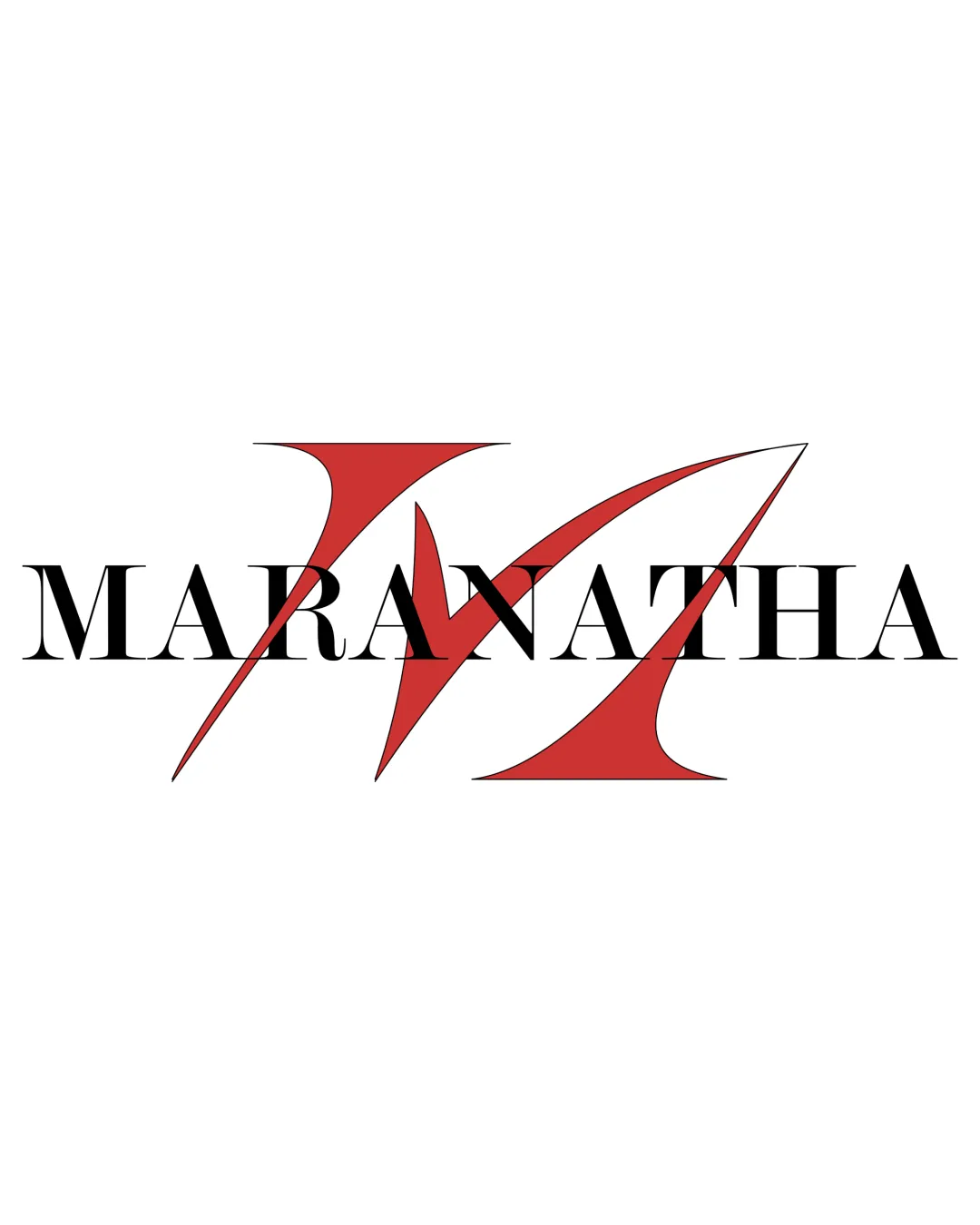
The large red 'M' overlaps with and partially obscures several letters in 'MARANATHA,' reducing wordmark clarity, especially at smaller sizes.

See the category review

2

Entire logo artwork

Test logo at small size and adjust line thickness or spacing as needed.

Medium priority Worth testing Medium effort

Fine lines of the serif type and interaction with the bold 'M' may lose clarity or merge when scaled for small prints, such as on tshirts.

See the category review
Detailed review

Logo performance breakdown

3/5

Brief & logo match

Stands out visually for apparel, but legibility reductions create partial fit for tshirt use.

2/5

Legibility

  • The large red 'M' overlaps with and partially obscures several letters in 'MARANATHA,' reducing wordmark clarity, especially at smaller sizes.

    Visible issue Wordmark and symbol overlap

    Try: Reduce overlap or adjust opacity/placement so all letterforms remain clear.

4/5

Originality

  • Distinctive use of overlapping letterform and abstract symbol.
4/5

Color harmony

  • Classic black and red palette creates strong contrast.
Black#000000
Red#C73C35

Estimated colors. Use the original design file for exact values.

Create a full color palette using these colors

Create new palette
3/5

Balance alignment

  • Wordmark and symbol integration is visually striking.
  • The red 'M' feels visually dominant and off-centered, creating a slight imbalance relative to the wordmark.

    Optional refinement Wordmark and standalone mark composition

    Try: Adjust scale or centering of the 'M' relative to the wordmark to achieve a more balanced composition.

Uploaded logoAlignment guide overlay

Inspect spacing with the guide. Optical balance may differ from geometric centering.

3/5

Scalability

  • Large, bold symbol is visible at range.
  • Fine lines of the serif type and interaction with the bold 'M' may lose clarity or merge when scaled for small prints, such as on tshirts.

    Worth testing Entire logo artwork

    Try: Test logo at small size and adjust line thickness or spacing as needed.

5/5

Misinterpretations

  • No unintended readings from negative space.
3/5

Symbol & text fit

  • Symbol directly relates to brand initial.
Try your own review

Wondering how your logo performs?

Get a clear logo score, key risks, and priority fix ideas before your client or audience sees it.

Review my logo