
onilaine logo logo review
4.4/5
Logo score

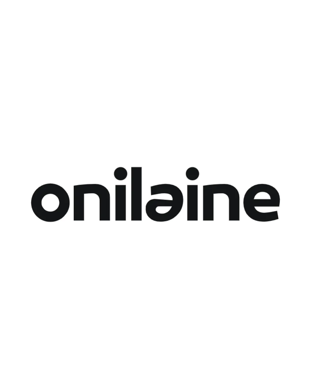
onilaine logo

Essential logo review

Strong, distinctive wordmark with effective balance and legibility; unique character modification elevates memorability while retaining clarity.

This wordmark shows strong execution, supported by distinctive construction and text readability.

Wordmark Geometric Sans-serif Consulting/branding
4/5
Legibility
4/5
Originality
5/5
Balance
5/5
Scale
@cchaendepe
Your next steps

What to fix first

Focus on the changes that matter. Keep what makes the logo work.

1

middle letter 'a'

Retain unique letter treatment but confirm it does not hinder recognition at small sizes.

Medium priority Optional refinement Low effort

The use of a reversed or stylized 'a' adds character and uniqueness to the wordmark, supporting memorability.

How to check

Ensure the modified 'a' reads clearly as intended and does not cause confusion.
See the category review
Detailed review

Logo performance breakdown

5/5

Brief & logo match

The wordmark's modern geometry and unique touches convincingly express the goals of a distinctive, memorable brand consultancy seeking leadership and long-term value.

5/5

Balance alignment

  • Even spacing and visual weight across characters create a harmonious wordmark.
Uploaded logoAlignment guide overlay

Inspect spacing with the guide. Optical balance may differ from geometric centering.

5/5

Scalability

  • Bold, simplified forms maintain clarity across sizes and print methods.
5/5

Misinterpretations

  • No plausible dual readings or misinterpretations detected.
4/5

Legibility

Available in Advanced logo reviews
4/5

Originality

Available in Advanced logo reviews

Black & white

Does the shape still work without color?

Preparing artwork...

Background contrast

Find the surfaces where your logo stays clear.

Compare the mark and lettering on each surface.

Blur & silhouette

A 3px blur softens fine details so you can check whether the overall shape stays recognizable. If key gaps close or elements merge, the logo may rely too heavily on detail.

Original
3px blur

Look for clear separation between shapes and a distinctive outline.

Try your own review

Wondering how your logo performs?

Get a clear logo score, key risks, and priority fix ideas before your client or audience sees it.

Review my logo