wordmark spacing
Adjust kerning between all characters for more even visual rhythm.
Spacing between the 'P', popcorn 'O', and adjacent characters is inconsistent, leading to a slight imbalance in the logo's flow.
See the category review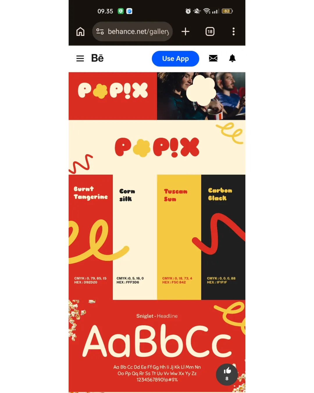
A bold, playful logo suited for a popcorn brand, with high legibility and color appeal; key improvement is kerning for balanced rhythm.
This wordmark shows solid execution, supported by text readability and clarity at smaller sizes; improving distinctiveness is the clearest next step.
Focus on the changes that matter. Keep what makes the logo work.
wordmark spacing
Spacing between the 'P', popcorn 'O', and adjacent characters is inconsistent, leading to a slight imbalance in the logo's flow.
See the category reviewThe logo uses a popcorn-shaped 'O' and vibrant colors, directly connecting to popcorn and fitting the upbeat snack brand context.
Estimated colors. Use the original design file for exact values.
Create a full color palette using these colors
Create new paletteSmall details/negative spaces within the popcorn glyph may merge or lose clarity at very small sizes.
Get a clear logo score, key risks, and priority fix ideas before your client or audience sees it.
More credits needed
Add credits to continue without losing your work.
Then $7/month. Cancel anytime.
Essential logo review with AI
Estimated progress