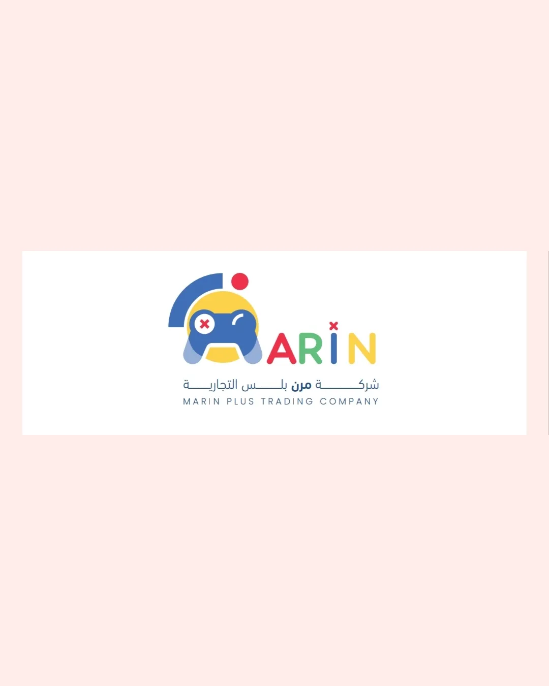
MARIN PLUS TRADING COMPANY logo review
3.3 / 5
Logo score
Logo review of

Marin Plus Trading Company

Functional, playful, and broadly appealing, but not distinctive or tightly resolved enough for high-level presentation.

Combination Mark Playful Geometric Retail/trading (possibly Gaming-related)
4/5
Legibility
3/5
Originality
5/5
Misread
3/5
Balance
3/5
Scale
Action plan

What to fix first

The most important fixes to handle before polishing the full presentation.

1

Slightly simplify small details within the controller mark for better clarity at small sizes.

High priority

Prevents information loss and keeps mark readable as a small icon.

Impact: High · Effort: Medium

2

Refine vertical and horizontal spacing between logomark and type to achieve better visual balance.

Medium priority

Improves cohesion and overall professionalism.

Impact: Medium · Effort: Low

Detailed review

Logo performance breakdown

4/5

Legibility

Checkmark icon Main English text is clear and readable
Checkmark icon Distinctive coloring for each letter improves recognition

Warning icon The stylized 'I' with an asterisk may cause minor confusion

3/5

Originality

Checkmark icon Playful 'face + controller' mark is moderately creative

Warning icon Controller symbol and colorful sans-serif letters are fairly common in youth-oriented logos

4/5

Color harmony

Checkmark icon Colors are vibrant and work well together for a playful look

Warning icon Full palette could be overwhelming or hard to reproduce in monochrome

San Marino
#3256A6

Gorse
#F5D94D

Mandarin Red
#E84242

Shamrock
#39BE54

Your palette is close. Refine the color roles and combinations before updating the logo.

Build brand colors
3/5

Balance alignment

Checkmark icon Elements are generally well centered and appear visually cohesive

Warning icon Uneven spacing between logomark and wordmark; the graphic feels slightly top-heavy

logo 200x250 pixels scalability test alignment grid overlay
3/5

Scalability

Checkmark icon Basic shapes and solid color areas support scaling

Warning icon Details in the game controller and small elements like asterisks may get lost at small sizes

logo 200x250 pixels scalability test

200x250 px

logo 100x125 pixels scalability test

100×125 px

logo 50x62 pixels scalability test

50×62 px

5/5

Misinterpretations

Checkmark icon No inappropriate or offensive secondary readings detected

Beta

No AI design signals found

Likely designed by a human

Design is coherent and deliberate, with logical construction and no clear generative artifacts.

  • Consistent geometry in shapes and letters
  • No malformed or illogical elements visible

Visual assessment; not definitive proof of authorship.

4 / 5

Logo structure & brief match

Checkmark icon The mark and wordmark share a consistent playful style and color palette

Checkmark icon Youth Appeal: Bright, playful colors and game controller motif suit a youth or gaming-oriented audience.
Checkmark icon Retail/trading Presence: The logo does not directly communicate a trading/retail theme but emphasizes the playful aspect.

Try your own review

Wondering how your logo performs?

Get a clear logo score, key risks, and priority fix ideas before your client or audience sees it.

Review my logo