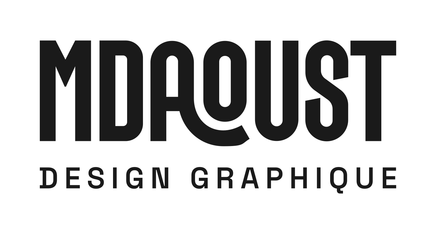
MDAOUST
DESIGN GRAPHIQUE logo review
4/5
Logo score
Logo review of

Mdaoust Design Graphique

A stylish, well-executed geometric wordmark with strong personal identity that could benefit from minor refinements for optimal uniqueness and utility.

Wordmark Modern Geometric Sans-serif Graphic Design / Creative Services
4.5/5
Legibility
3.5/5
Originality
5/5
Misread
4/5
Balance
4/5
Scale
Your next steps

What to fix first

Focus on the changes that matter. Keep what makes the logo work.

1

wordmark MDAOUST

Explore a subtler signature or custom tweak for the primary letter connections to lift distinctiveness.

Visible issue Medium priority Medium effort
Area to inspectApproximate location

The connection and stylized forms for 'A','O','U' introduce a recognizable identity, but their treatment is similar to trendy geometric logotypes, offering moderate originality for the category.

How to check

Compare against leading design studio logos for differentiation.
See the category review
2

wordmark MDAOUST

Print and digitally test at favicon/business card size to verify clarity.

Worth testing Medium priority Low effort
Area to inspectApproximate location

The intricate A-O-U curve may be less crisp at very small sizes or low-resolution reproduction.

How to check

Check if the curved connection retains legibility at 12pt and below.

See the category review
Detailed review

Logo performance breakdown

4/5

Brief & logo match

Based on your brief
Compared with

Graphix designer seeking a fresh, modern, name-focused personal logo with mint accent typically used in branding.

Good alignment with personal designer branding and industry conventions, with room to boost uniqueness.

  • Personal Branding / Name Emphasis

    The custom 'MDAOUST' wordmark makes the designer's name the focal point, supporting the brand as a design professional.

  • Modern Creative Industry Style

    The geometric, playful style reflects current design trends and creative sector expectations.

4.5/5

Legibility

  • Highly readable text, even with custom letterforms.
3.5/5

Originality

  • Recognizable letterplay sets it apart from generic sans-serif marks.
  • The connection and stylized forms for 'A','O','U' introduce a recognizable identity, but their treatment is similar to trendy geometric logotypes, offering moderate originality for the category.

    Visible issue wordmark MDAOUST

    Try: Explore a subtler signature or custom tweak for the primary letter connections to lift distinctiveness.

    Check: Compare against leading design studio logos for differentiation.

    Area to inspectApproximate location
4/5

Balance alignment

  • Visually playful composition; contemporary weight.
  • The merging 'AOU' creates a visual dip, which, while intentional and playful, sets a lower horizontal axis than 'M' and 'ST', slightly affecting overall evenness.

    Optional refinement wordmark MDAOUST

    Try: Test a variant with a less pronounced curve or adjusted spacing between A and O for optical balance.

    Check: Review at small and large sizes for horizontal flow and negative space consistency.

Uploaded logoAlignment guide overlay

Inspect spacing with the guide. Optical balance may differ from geometric centering.

4/5

Scalability

  • Clean single-color treatment aids adaptability.
  • The intricate A-O-U curve may be less crisp at very small sizes or low-resolution reproduction.

    Worth testing wordmark MDAOUST

    Try: Print and digitally test at favicon/business card size to verify clarity.

    Check: Check if the curved connection retains legibility at 12pt and below.

    Area to inspectApproximate location
Uploaded logo at 200 pixels wide
200 × 250 px
Uploaded logo at 100 pixels wide
100 × 125 px
Uploaded logo at 50 pixels wide
50 × 63 px

Compare the detail at different sizes. Labels show the full image dimensions.

5/5

Misinterpretations

  • No unintended or awkward alternate readings.

Black & white

Does the shape still work without color?

Preparing artwork...

Background contrast

Find the surfaces where your logo stays clear.

Compare the mark and lettering on each surface.

Blur & silhouette

A 3px blur softens fine details so you can check whether the overall shape stays recognizable. If key gaps close or elements merge, the logo may rely too heavily on detail.

Original
3px blur

Look for clear separation between shapes and a distinctive outline.

Try your own review

Wondering how your logo performs?

Get a clear logo score, key risks, and priority fix ideas before your client or audience sees it.

Review my logo