MDS INGENIERIE logo review
3.2/5
Logo score
Logo review of

Mds Ingenierie

A competent and industry-appropriate logo that requires mark simplification and minor balancing for stronger impact.

Combination Bold Geometric With Architectural Motif Engineering/construction
4/5
Legibility
3/5
Originality
5/5
Misread
3/5
Balance
3/5
Scale
Your next steps

What to fix first

Focus on the changes that matter. Keep what makes the logo work.

1

Roof window mark

Increase window size or simplify detail to improve clarity at reduced scales.

Visible issue High priority Low effort
Area to inspectApproximate location

The small house window detail within the roof may become unclear or unrecognizable at smaller sizes.

How to check

Test window legibility at small sizes.

See the category review
2

Overall lockup

Slightly adjust the red roof's thickness or orientation to improve left-right weight balance.

Optional refinement Medium priority Low effort

The red roof angle and black letter forms create slightly unequal visual weight to the left, making the logo feel marginally unbalanced.

How to check

Check logo for improved optical balance.

See the category review
Detailed review

Logo performance breakdown

4/5

Brief & logo match

Based on an inferred industry
Compared with

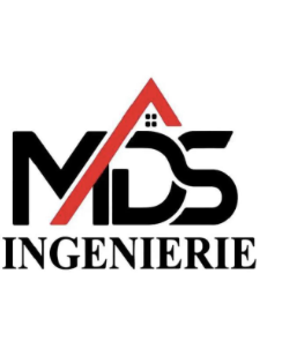
Logo appears suited for an engineering or construction business, referencing these through roof and house imagery.

The logo addresses its apparent industry but employs common motifs that limit uniqueness.

  • Architecture/Engineering Motif

    The roofline and window motif clearly reference construction or engineering.

  • Brand Name Visibility

    MDS and INGENIERIE are prominent with no legibility issues.

4/5

Legibility

  • Text is clear and readable.
  • Distinct separation between MDS and INGENIERIE.
3/5

Originality

  • Letter integration with a roof concept.
  • The roof-with-window icon is a familiar motif within engineering and construction branding, limiting memorability despite the custom 'MDS' arrangement.

    Optional refinement Standalone mark & integration

    Try: Explore subtle mark or letterform tweaks for stronger differentiation.

    Check: Assess revised mark for increased distinctiveness.

4/5

Color harmony

  • Contrasting red and black create strong visual impact.
Black#000000
Red#D32F2F
White#FFFFFF

Estimated colors. Use the original design file for exact values.

Create a full color palette using these colors

Create new palette
3/5

Balance alignment

  • Roof integrates well visually with letters.
  • The red roof angle and black letter forms create slightly unequal visual weight to the left, making the logo feel marginally unbalanced.

    Optional refinement Overall lockup

    Try: Slightly adjust the red roof's thickness or orientation to improve left-right weight balance.

    Check: Check logo for improved optical balance.

Uploaded logoAlignment guide overlay

Inspect spacing with the guide. Optical balance may differ from geometric centering.

3/5

Scalability

  • Simple bold lines aid reproduction.
  • The small house window detail within the roof may become unclear or unrecognizable at smaller sizes.

    Visible issue Roof window mark

    Try: Increase window size or simplify detail to improve clarity at reduced scales.

    Check: Test window legibility at small sizes.
    Area to inspectApproximate location
Uploaded logo at 200 pixels wide
200 × 250 px
Uploaded logo at 100 pixels wide
100 × 125 px
Uploaded logo at 50 pixels wide
50 × 63 px

Compare the detail at different sizes. Labels show the full image dimensions.

5/5

Misinterpretations

  • No obvious risk of negative interpretation.
4/5

Symbol & text fit

  • Roof form is well integrated with the wordmark.

Black & white

Does the shape still work without color?

These tests are available only for logos uploaded in vector (SVG) format.

Background contrast

Find the surfaces where your logo stays clear.

These tests are available only for logos uploaded in vector (SVG) format.

Blur & silhouette

A 3px blur softens fine details so you can check whether the overall shape stays recognizable. If key gaps close or elements merge, the logo may rely too heavily on detail.

These tests are available only for logos uploaded in vector (SVG) format.

Try your own review

Wondering how your logo performs?

Get a clear logo score, key risks, and priority fix ideas before your client or audience sees it.

Review my logo