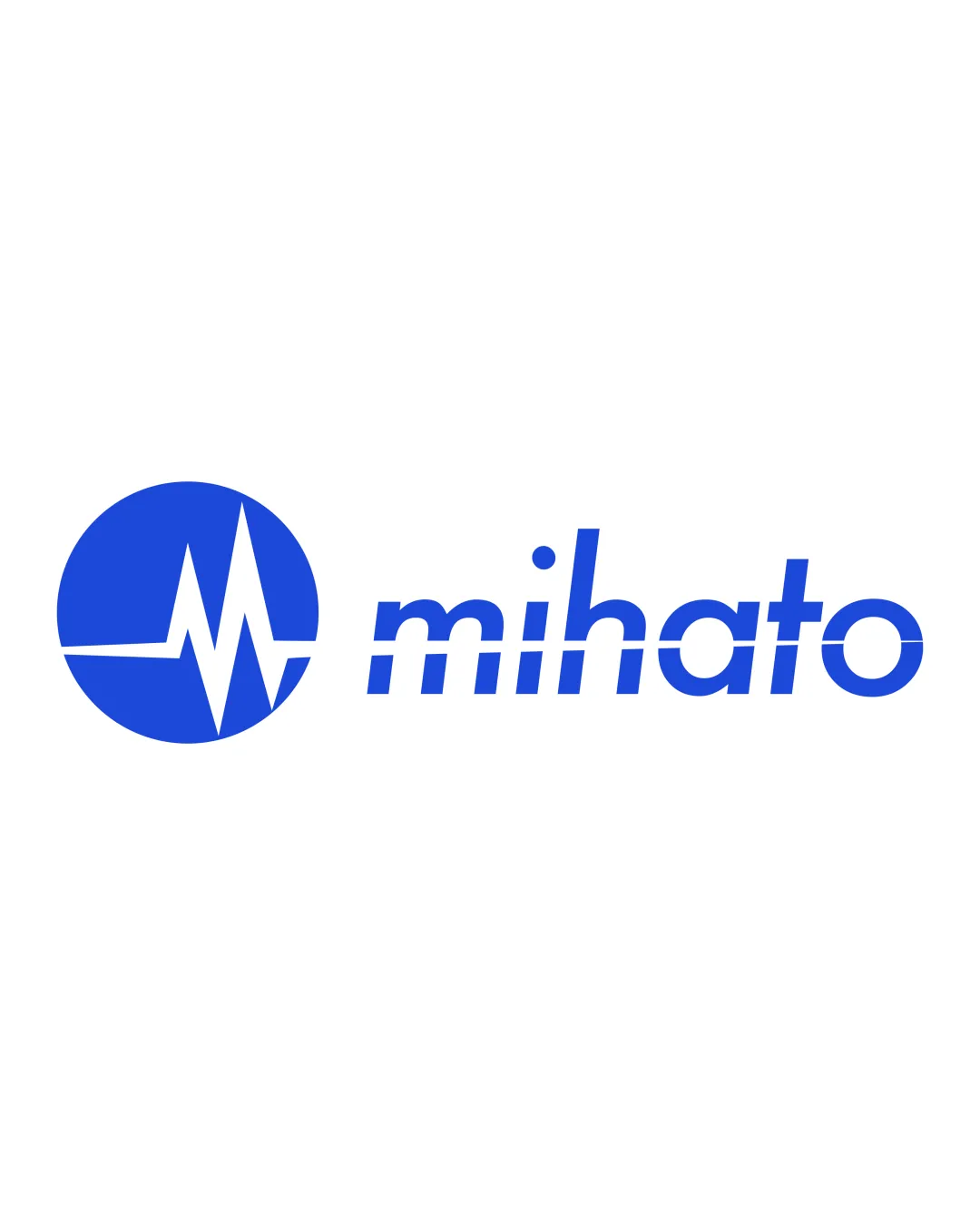
mihato logo review
4.0 / 5
Logo score
Logo review of

Mihato

A strong, polished, and relevant health-tech logo with minor opportunities to refine clarity and balance.

Combination Mark Modern Healthcare Tech Healthcare
4.5/5
Legibility
3.5/5
Originality
4.5/5
Misread
4/5
Balance
4/5
Scale
Action plan

What to fix first

The most important fixes to handle before polishing the full presentation.

1

Consider softening the integration of the line motif through the wordmark for better clarity.

Medium priority

Horizontal line through all letters is a strong motif but disrupts some letterforms and optical balance.

Impact: Improves Legibility And Mitigates Minor Visual Distraction. · Effort: Medium

2

Test thin elements for small-scale and screen rendering.

Low priority

Thin ECG lines risk disappearing at small sizes or low resolution.

Impact: Ensures Critical Mark Details Remain Clear In All Practical Uses. · Effort: Low

Detailed review

Logo performance breakdown

4.5/5

Legibility

Checkmark icon Wordmark is clean and highly readable.
Checkmark icon Geometric sans-serif type enhances clarity.

Warning icon Horizontal line through wordmark slightly disrupts the 'a' and 'o'.

3.5/5

Originality

Checkmark icon Clean execution with relevant medical motif.
Checkmark icon Distinct from generic medical crosses.

Warning icon ECG wave in a circle is a somewhat common healthcare visual trope.

4.5/5

Color harmony

Checkmark icon Blue evokes trust and competence; suitable for healthcare.
Checkmark icon Strong contrast against white background.

Blue
#2566E6

White
#FFFFFF

Your palette is close. Refine the color roles and combinations before updating the logo.

Build brand colors
4/5

Balance alignment

Checkmark icon Good proportional balance between mark and wordmark.
Checkmark icon Aligned baseline and cap height with mark and text.

Warning icon The horizontal line in the mark and text may throw off optical balance slightly.

logo 200x250 pixels scalability test alignment grid overlay
4/5

Scalability

Checkmark icon Simple geometric forms scale well.
Checkmark icon Minimal details retain legibility at small sizes.

Warning icon Thin ECG line may blur in very small or low-res usage.

logo 200x250 pixels scalability test

200x250 px

logo 100x125 pixels scalability test

100×125 px

logo 50x62 pixels scalability test

50×62 px

4.5/5

Misinterpretations

Checkmark icon ECG waveform is universally understood in medical contexts.

Beta

No obvious AI design signals

No visible generative artifacts detected

No obvious visual artifacts associated with AI generation were detected.

  • Geometric precision
  • Consistent line weight and color

Visual assessment; not definitive proof of authorship.

4 / 5

Logo structure & brief match

Checkmark icon ECG motif echoed in both mark and wordmark for strong cohesion.

Warning icon Shared line motif is slightly over-integrated, creating minor visual distraction.

Checkmark icon Industry Relevance: The ECG motif and blue color are highly relevant to healthcare and health-tech sectors.
Checkmark icon Modern Appeal: Minimal, geometric style and type convey technological sophistication.

Try your own review

Wondering how your logo performs?

Get a clear logo score, key risks, and priority fix ideas before your client or audience sees it.

Review my logo