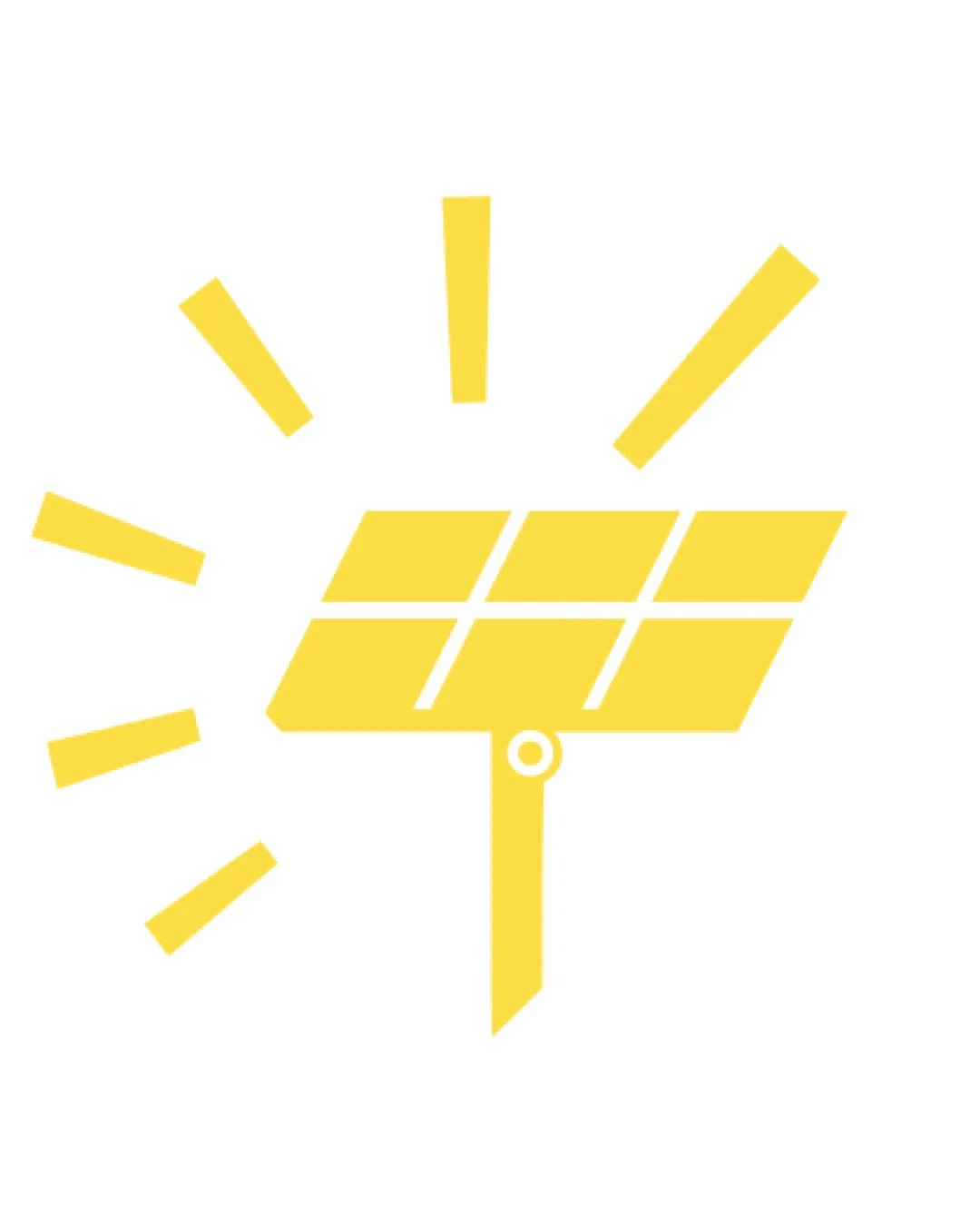
Stylized solar panel with radial lines suggesting .. logo review
3/5
Logo score
Logo review of

Stylized Solar Panel With Radial Lines Suggesting ..

A functional and readable solar panel icon with rotational cues, but lacks distinctiveness to stand out in the solar sector.

Pictorial/abstract Minimal Geometric Symbol Solar/energy Technology
3/5
Originality
5/5
Misread
3/5
Balance
3/5
Scale
Your next steps

What to fix first

Focus on the changes that matter. Keep what makes the logo work.

1

Standalone mark

Refine or abstract the form to produce a more unique silhouette or interpretation.

Visible issue High priority Medium effort
Area to inspectApproximate location

The mark is visually clear but uses generic solar panel shapes and radial lines, a common approach for the sector.

How to check

Review similar solar/energy logos for differentiation.

See the category review
2

Standalone mark

Test logo at small sizes and consider slightly thickening or simplifying the rays.

Optional refinement Medium priority Low effort
Area to inspectApproximate location

Thin radial lines around the panel may lose clarity or disappear at small sizes.

How to check

Print and screen-test at favicon scale (16-32px).

See the category review
Detailed review

Logo performance breakdown

4/5

Brief & logo match

Based on your brief
Compared with

Icon for solar panel company; rays signify panel's ability to rotate, with a circle as a sun tracker.

Logo shows solar functionality and movement as described, but template-like form limits brand uniqueness.

  • Solar Technology Reference

    Symbol directly references solar panels in a highly recognizable way.

  • Tracking/rotation Aspect

    Radial lines and offset circle communicate intended panel movement and sun-tracking function.

3/5

Originality

  • Solar panel and rotation concept directly depicted.
  • The mark is visually clear but uses generic solar panel shapes and radial lines, a common approach for the sector.

    Visible issue Standalone mark

    Try: Refine or abstract the form to produce a more unique silhouette or interpretation.

    Check: Review similar solar/energy logos for differentiation.
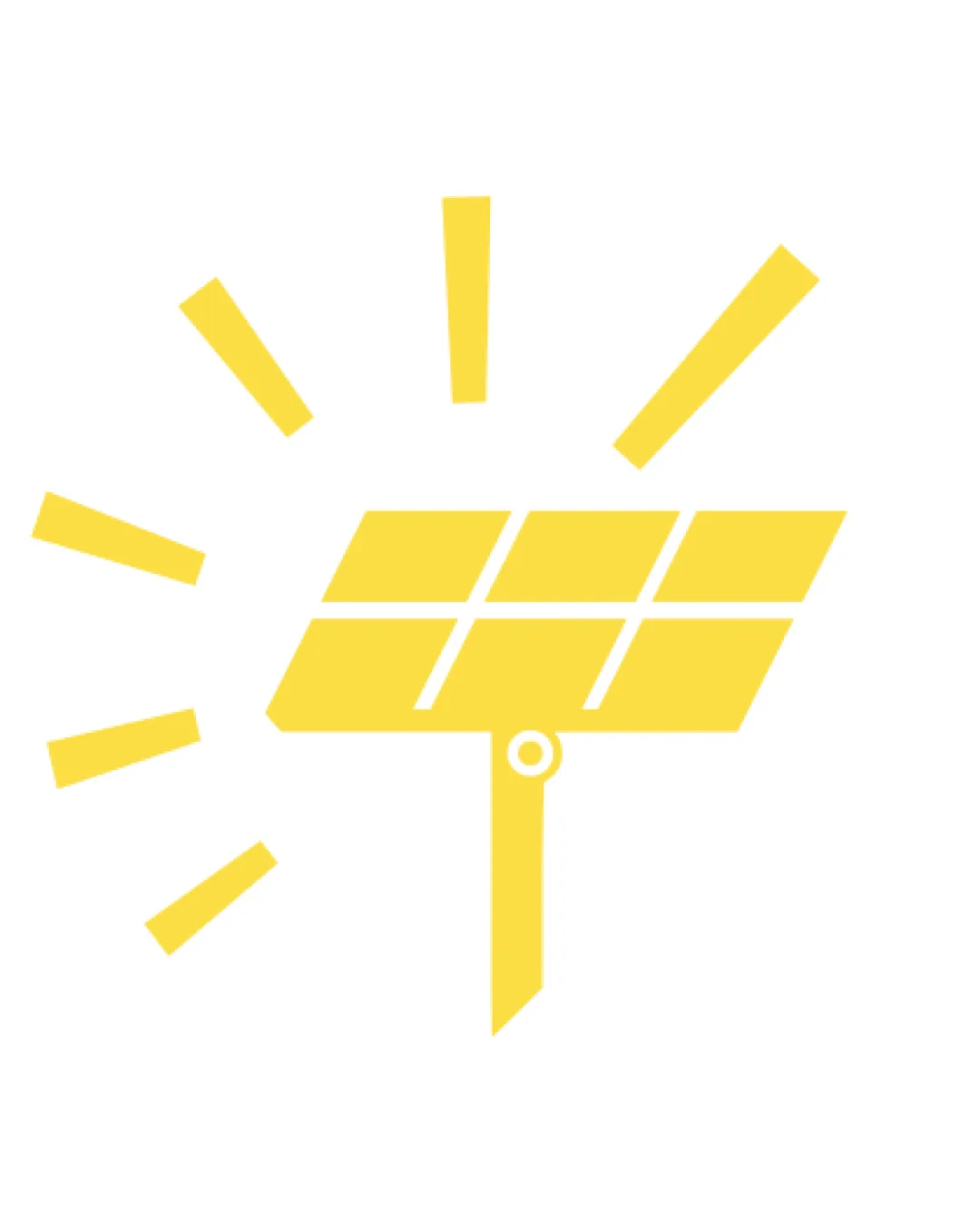
    Area to inspectApproximate location
3/5

Balance alignment

  • Clear geometric layout.
  • Slight visual heaviness to the lower right due to the angled 'stand' and off-center tracking circle.

    Optional refinement Standalone mark

    Try: Adjust geometry or circle position for better visual balance if possible.

    Check: Invert and mirror logo to test perceived weight balance.

Uploaded logoAlignment guide overlay

Inspect spacing with the guide. Optical balance may differ from geometric centering.

3/5

Scalability

  • Simple shapes support moderate reduction.
  • Mostly bold geometry.
  • Thin radial lines around the panel may lose clarity or disappear at small sizes.

    Optional refinement Standalone mark

    Try: Test logo at small sizes and consider slightly thickening or simplifying the rays.

    Check: Print and screen-test at favicon scale (16-32px).

    Area to inspectApproximate location
Uploaded logo at 200 pixels wide
200 × 250 px
Uploaded logo at 100 pixels wide
100 × 125 px
Uploaded logo at 50 pixels wide
50 × 63 px

Compare the detail at different sizes. Labels show the full image dimensions.

5/5

Misinterpretations

  • No unintended negative readings detected.

Black & white

Does the shape still work without color?

These tests are available only for logos uploaded in vector (SVG) format.

Background contrast

Find the surfaces where your logo stays clear.

These tests are available only for logos uploaded in vector (SVG) format.

Blur & silhouette

A 3px blur softens fine details so you can check whether the overall shape stays recognizable. If key gaps close or elements merge, the logo may rely too heavily on detail.

These tests are available only for logos uploaded in vector (SVG) format.

Try your own review

Wondering how your logo performs?

Get a clear logo score, key risks, and priority fix ideas before your client or audience sees it.

Review my logo