 View review
Logo score
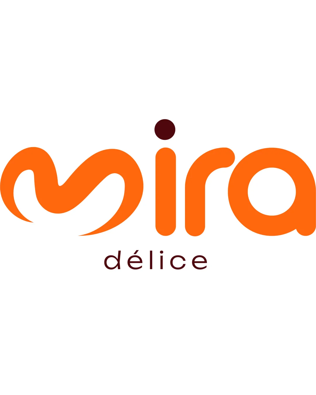
Logo review ofMira Délice
Review the detailed scores below to see what is working and what should be refined first.
Legibility
Originality
Misread
Balance
Scale
Detailed review
Logo performance breakdown
Legibility
![]() The majority of the letters are clear and easy to read.
The majority of the letters are clear and easy to read.![]() Color contrast between orange and white background is strong.
Color contrast between orange and white background is strong.
![]() The stylized 'm' could be mistaken for other forms by some viewers due to its abstract design.
The stylized 'm' could be mistaken for other forms by some viewers due to its abstract design.
Originality
![]() The script style and especially the 'm' adds uniqueness.
The script style and especially the 'm' adds uniqueness.![]() Combination of playful swirls and modern sans-serif letters is distinctive.
Combination of playful swirls and modern sans-serif letters is distinctive.
![]() Swirled letter constructs are seen frequently in food/ice cream/bakery branding, making it less original in this niche.
Swirled letter constructs are seen frequently in food/ice cream/bakery branding, making it less original in this niche.
Color harmony
![]() Color palette is limited to two well-paired tones—orange and maroon—which work harmoniously.
Color palette is limited to two well-paired tones—orange and maroon—which work harmoniously.![]() Good contrast between wordmark and subtitle.
Good contrast between wordmark and subtitle.
Orange
#FF8000
Dark Red
#5C2322
White
#FFFFFF
Balance alignment
![]() Good horizontal alignment of primary wordmark and tagline.
Good horizontal alignment of primary wordmark and tagline.![]() Proportion between 'mira' and 'délice' is mostly well considered.
Proportion between 'mira' and 'délice' is mostly well considered.
![]() Dot above the 'i' is quite large compared to the rest of the letters and can draw too much attention.
Dot above the 'i' is quite large compared to the rest of the letters and can draw too much attention.

Scalability
![]() The bold and simple shapes retain clarity at most sizes.
The bold and simple shapes retain clarity at most sizes.![]() No excessive detail ensures decent scalability.
No excessive detail ensures decent scalability.
![]() The thin, lowercase "délice" text may lose readability on very small formats like business cards or product tags.
The thin, lowercase "délice" text may lose readability on very small formats like business cards or product tags.
200x250 px
100×125 px
50×62 px
Misinterpretations
![]() No inappropriate or misleading dual meanings detected in the shapes.
No inappropriate or misleading dual meanings detected in the shapes.
Try your own review
Review my logo
Wondering how your logo performs?
Get a clear logo score, key risks, and priority fix ideas before your client or audience sees it.
Keep exploring


