What to preserve
The logo is an abstract, calligraphic monogram rendered in a single red line, incorporating both geometric and organic flourishes, suggesting modernity and sophistication.
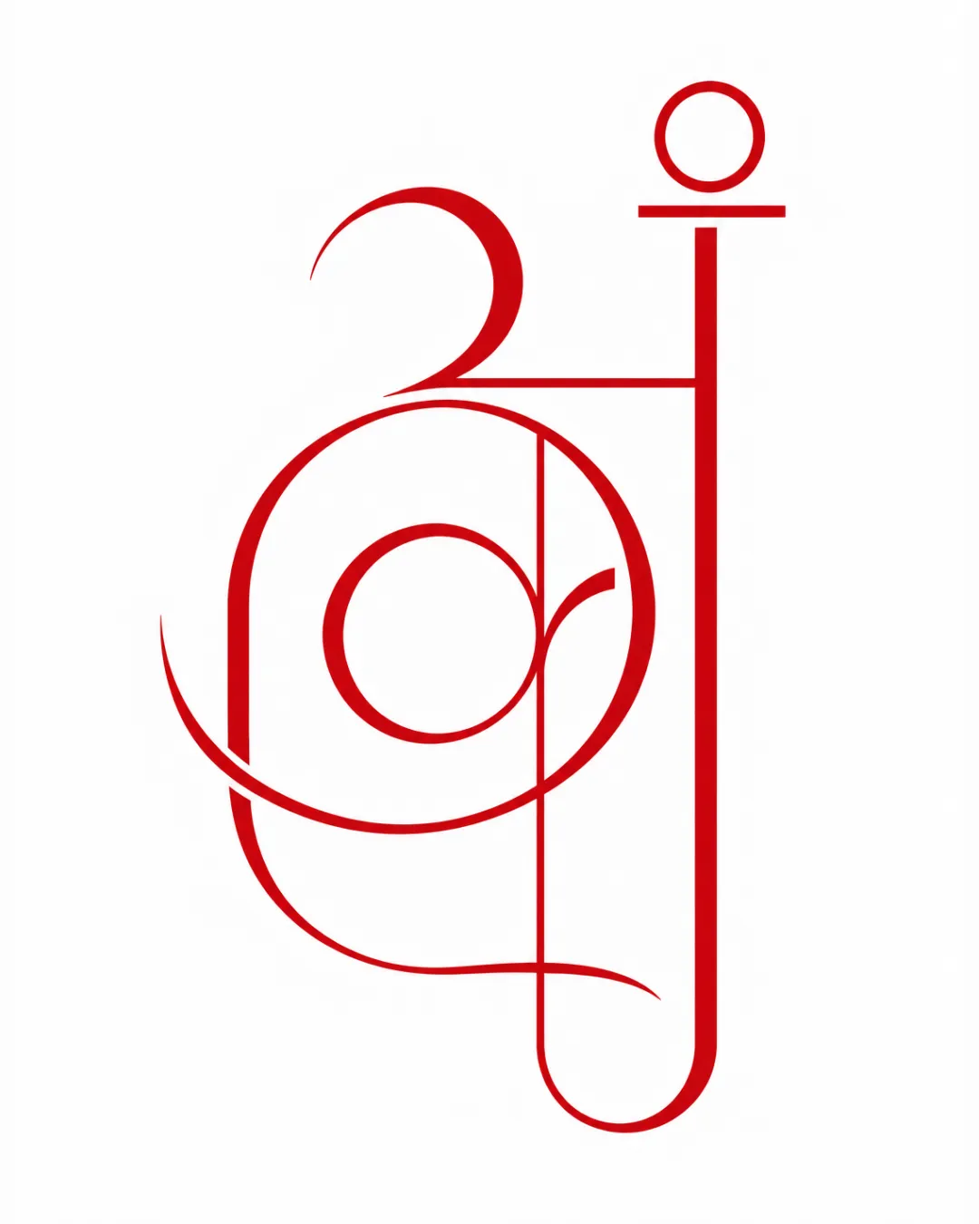
A visually arresting, original monogram logo well-suited to luxury fields. With minor typographic refinement to improve clarity, this would be a highly professional, memorable brand mark.
Focus on the changes that matter. Keep what makes the logo work.
The logo is an abstract, calligraphic monogram rendered in a single red line, incorporating both geometric and organic flourishes, suggesting modernity and sophistication.
The current form is almost unreadable, which limits versatility and recognition.
Enhances accessibility and brand recognition.
The ornate, monogram-centric style is highly suited to fashion or luxury branding.
Estimated colors. Use the original design file for exact values.
Create a full color palette using these colors
Create new palette
Inspect spacing with the guide. Optical balance may differ from geometric centering.
Get a clear logo score, key risks, and priority fix ideas before your client or audience sees it.
More credits needed
Add credits to continue without losing your work.
Then $7/month. Cancel anytime.
Essential logo review with AI
Estimated progress