Wondering how your logo performs? 🧐
Get professional logo reviews in seconds and catch design issues in time.
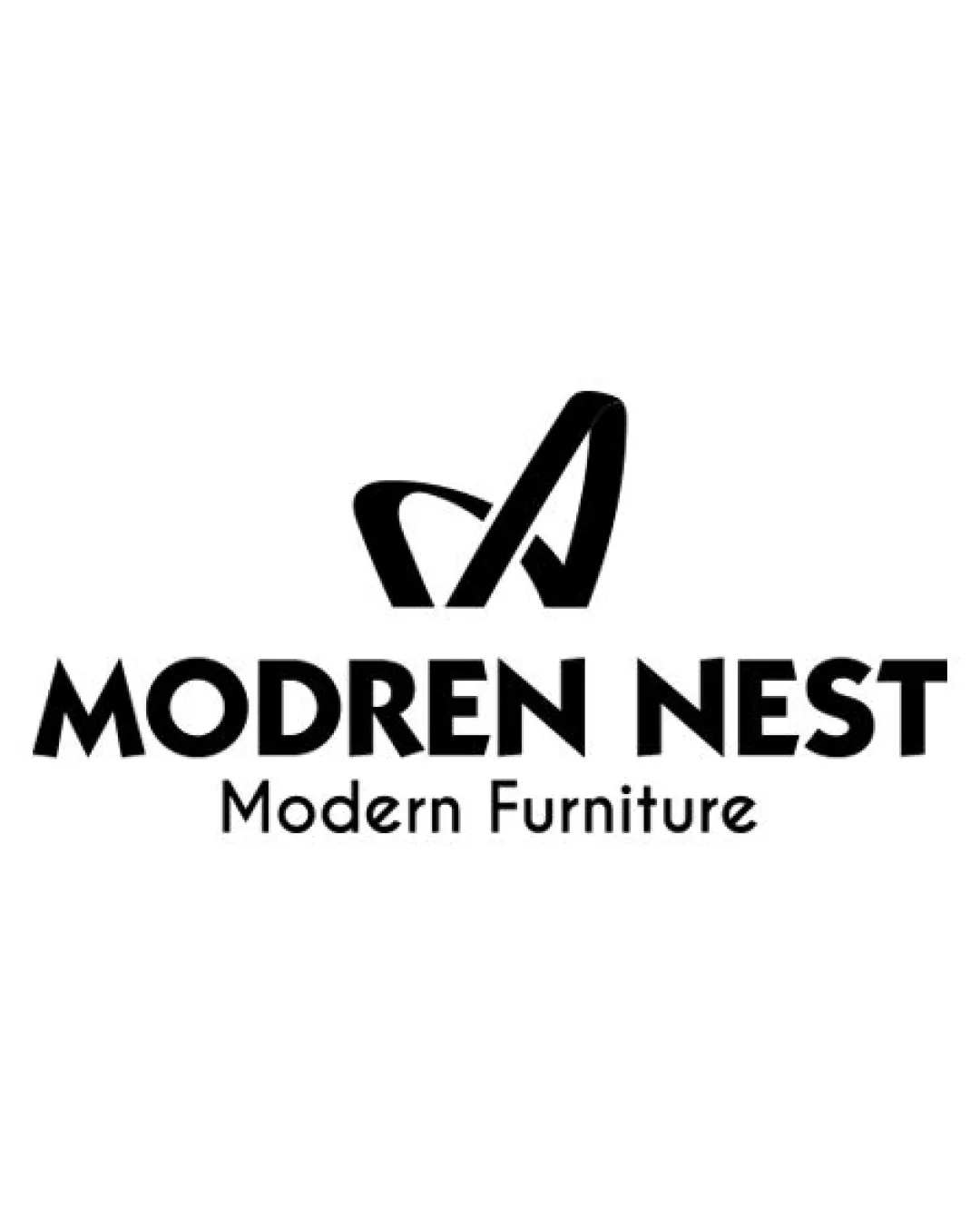
Try it Now!Logo review of MODREN NEST, Modern Furniture
 Logo analysis by AI
Logo type:
Style:
Detected symbol:
Detected text:
Business industry:
Review requested by Mrphone
**If AI can recognize or misinterpret it, so can people.
Structured logo review
Legibility
![]() Text is generally bold and clear.
Text is generally bold and clear.![]() Secondary tagline is readable on white background.
Secondary tagline is readable on white background.
![]() Primary name contains a typo ('MODREN' instead of 'MODERN'), which damages credibility.
Primary name contains a typo ('MODREN' instead of 'MODERN'), which damages credibility.![]() All uppercase letters feel heavy and lack subtlety.
All uppercase letters feel heavy and lack subtlety.![]() Kerning and font selection make the logotype feel slightly dated.
Kerning and font selection make the logotype feel slightly dated.
Scalability versatility
![]() Monochrome logo makes it suitable for many applications (embossing, stamps, print).
Monochrome logo makes it suitable for many applications (embossing, stamps, print).![]() Simple symbol can scale to small sizes.
Simple symbol can scale to small sizes.
![]() Tagline may become illegible at small scales (e.g., business cards or mobile icons).
Tagline may become illegible at small scales (e.g., business cards or mobile icons).![]() Symbol and wordmark will work on signage, but tagline should be separated for small formats.
Symbol and wordmark will work on signage, but tagline should be separated for small formats.
200x250 px
100×125 px
50×62 px
Balance alignment
![]() Logo elements are centered and visually aligned.
Logo elements are centered and visually aligned.![]() Symbol sits well above the text.
Symbol sits well above the text.
![]() Spacing between symbol and wordmark could be increased for better breathing room.
Spacing between symbol and wordmark could be increased for better breathing room.![]() Difference in font weights between main name and tagline causes slight imbalance.
Difference in font weights between main name and tagline causes slight imbalance.

Originality
![]() Abstract symbol hints at both 'M' initial and modern furniture themes.
Abstract symbol hints at both 'M' initial and modern furniture themes.![]() Symbol stands out as not completely generic.
Symbol stands out as not completely generic.
![]() Overall combination of abstract mark and geometric sans-serif text is common among modern brands.
Overall combination of abstract mark and geometric sans-serif text is common among modern brands.![]() Symbol could be further refined to better reflect the furniture theme or brand uniqueness.
Symbol could be further refined to better reflect the furniture theme or brand uniqueness.
Logomark wordmark fit
![]() Monogram style matches the bold, modern text.
Monogram style matches the bold, modern text.![]() Visual weight of symbol and wordmark is mostly harmonious.
Visual weight of symbol and wordmark is mostly harmonious.
![]() Slight disconnect in style between the very geometric wordmark and the more organic shape of the symbol.
Slight disconnect in style between the very geometric wordmark and the more organic shape of the symbol.
Aesthetic look
![]() Clean, simple, and visually impactful.
Clean, simple, and visually impactful.![]() Boldness gives a strong first impression.
Boldness gives a strong first impression.
![]() Lacks sophistication due to blunt font choice and lack of finer detailing.
Lacks sophistication due to blunt font choice and lack of finer detailing.![]() Typo in the company name undermines professionalism.
Typo in the company name undermines professionalism.
Dual meaning and misinterpretations
![]() No inappropriate or confusing double meanings detected.
No inappropriate or confusing double meanings detected.
Color harmony
![]() Strong contrast between black and white ensures clarity and professionalism.
Strong contrast between black and white ensures clarity and professionalism.![]() Minimal use of color increases versatility across media.
Minimal use of color increases versatility across media.
Black
#000000
White
#FFFFFF