Wondering how your logo performs? 🧐
Get professional logo reviews in seconds and catch design issues in time.
Try it Now!Logo review of Momentsa
 Logo analysis by AI
Logo type:
Style:
Detected symbol:
Negative space:
Detected text:
Business industry:
Review requested by Sisikanan
**If AI can recognize or misinterpret it, so can people.
Structured logo review
Legibility
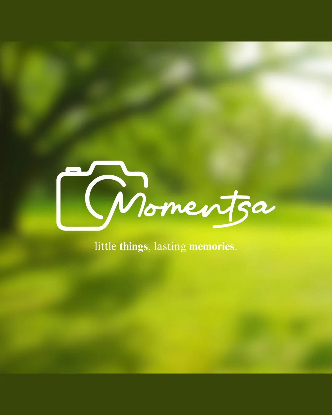
The wordmark 'Momentsa' is generally clear and stylistically appropriate.
The supporting tagline is readable with decent contrast.
The script font can cause slight confusion with the connection between 'M' and 'o', especially at small sizes.
Tagline contrast might be lost against busy photo backgrounds.
Scalability versatility
Simple line art allows for resizing without major loss of detail.
Can work well on digital media, business cards, or watermarks.
Thin lines may become illegible or disappear at very small scales (e.g. embroidery, favicons).
Background-dependent: white design won't stand out on light surfaces unless adapted.

200x250 px

100×125 px

50×62 px
Balance alignment
The camera outline and script text are cohesively integrated and visually balanced.
Good text alignment beneath the symbol.
The flowing 'M' slightly pulls visual weight to the left, making the design feel mildly off-center against the tagline.


Originality
Incorporating the 'M' into the camera icon is a creative touch.
Combination of handwritten script and camera shape shows personalization.
Camera outlines are a heavily used photography cliché, reducing uniqueness.
The solution, while effective, is not highly distinctive within the industry.
Logomark wordmark fit
The stroke weight and style of the camera outline match the fluidity of the script wordmark.
There is a logical and visual linkage between the logomark and the 'M' in the wordmark.
Slight imbalance if logo needs to be used with the wordmark stacked below in confined spaces.
Aesthetic look
Modern, fresh, and user-friendly feel.
Script adds warmth and approachability.
Slightly generic due to overuse of camera icons in the photography sector.
Some design elements could be tighter to boost sophistication.
Dual meaning and misinterpretations
No inappropriate or confusing dual meanings noted.
Design maintains professional integrity.
Color harmony
White logo contrasts well with the green background, creating a calming and pleasant visual.
Color palette evokes nature and warmth, fitting with photographic themes.
Logo is currently color-locked to white – versatility in different color scenarios not demonstrated, especially for dark backgrounds.
White
#FFFFFF
Olive Green
#7B944D
Light Green
#C3D37D

