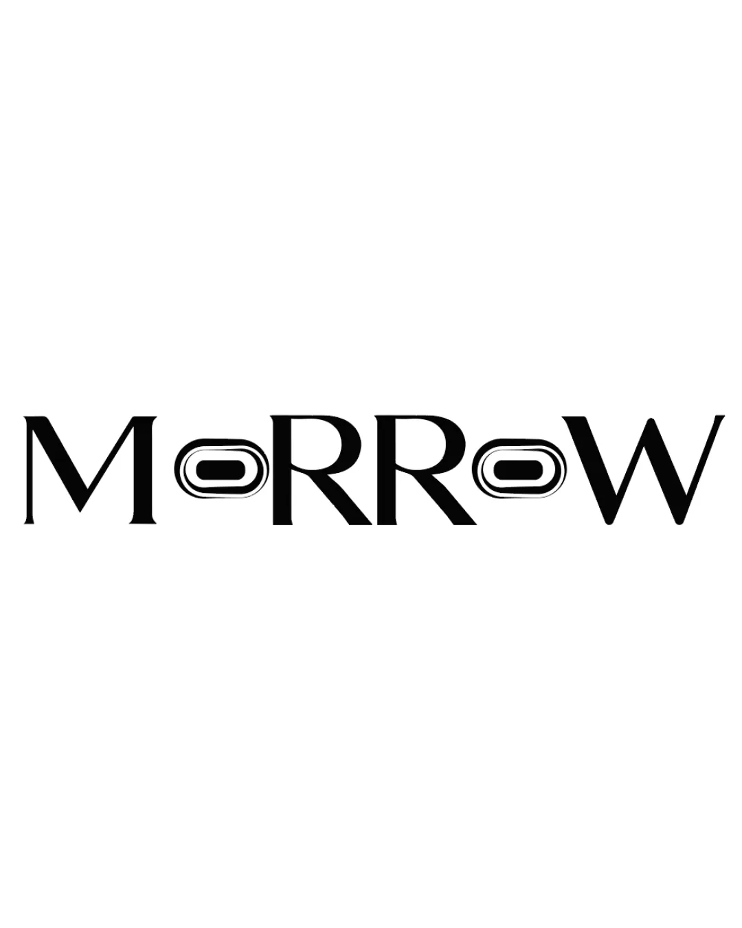
stylized 'O's
Test wordmark legibility at reduced sizes and consider simplifying or slightly opening the forms of the 'O's for clarity.
Logo preview unavailable. The written feedback is still available on this card.
The stylized 'O's, while eyeglass-inspired, are somewhat abstract and may cause a brief pause in readability, especially at smaller sizes.
How to check
See the category review Print or display at smaller scales and ask readers to quickly recognize the brand name.