MR. MAGICIAN logo review
3/5
Logo score
Logo review of

Mr. Magician

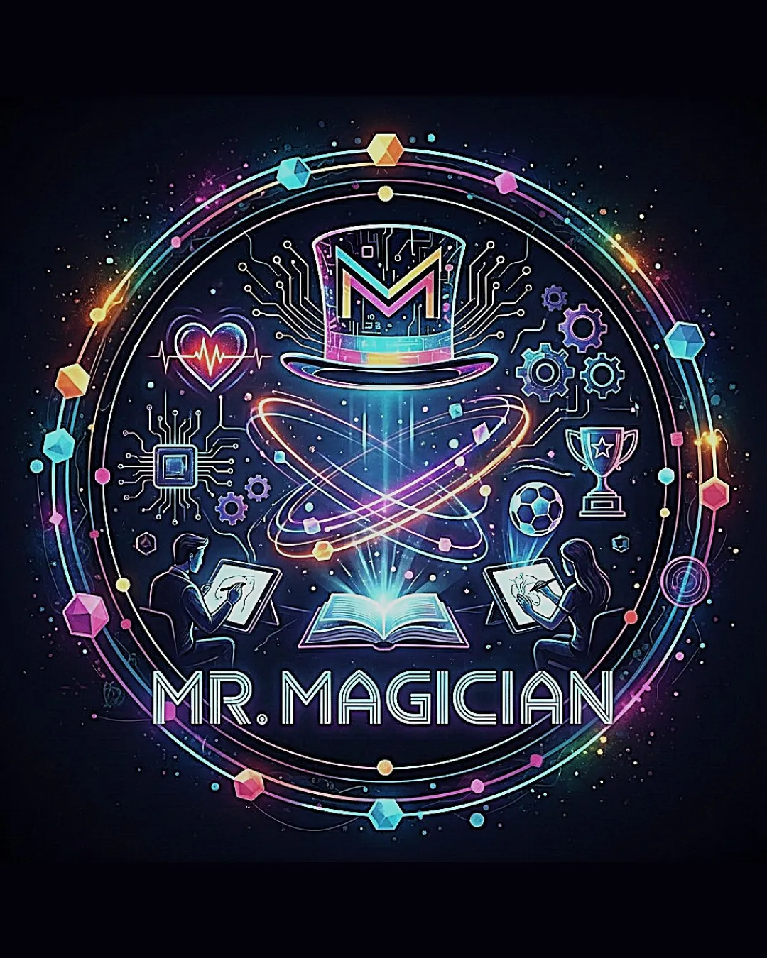
A visually exciting emblem with memorable branding potential, but needs text clarity and simplification for full versatility.

Emblem Futuristic Neon Illustrative Emblem Education/entertainment/technology
3/5
Legibility
4/5
Originality
5/5
Misread
3/5
Balance
2/5
Scale
Your next steps

What to fix first

Focus on the changes that matter. Keep what makes the logo work.

1

wordmark text

Increase the opacity or weight of the wordmark outline or adjust glow for higher contrast.

Visible issue High priority Low effort
Area to inspectApproximate location

The neon glow and geometric letter styling reduce contrast with the background, risking reduced legibility at smaller sizes or for users with visual impairments.

How to check

Preview the logo at reduced sizes and in grayscale to assess legibility.

See the category review
2

overall emblem detail

Create a simplified or secondary version of the emblem for small-scale applications.

Visible issue High priority Medium effort
Area to inspectApproximate location

Numerous fine lines, icons, and gradients make the logo busy and fragile when reduced, risking detail loss and visual clutter.

How to check

Test the logo at 64px and below to identify key details that disappear.

See the category review
Detailed review

Logo performance breakdown

4/5

Brief & logo match

Based on an inferred industry
Compared with

A brand identity for an entertainment, educational, or technology-related brand leveraging magic/science motifs.

The logo visually expresses a fusion of magic and technology, matching a magician/edutainment positioning, but would struggle in more conservative or minimalist contexts.

  • Magic/technology Theme

    The illustration successfully merges elements of magic, science, and learning, aligning closely with a magician/tech brand.

  • Memorability/impact

    The vibrant neon effect and detailed emblem ensure strong immediate visual impact, which is suited for entertainment/edutainment contexts.

3/5

Legibility

  • Distinctive font style
  • Sufficient text size in main version
  • The neon glow and geometric letter styling reduce contrast with the background, risking reduced legibility at smaller sizes or for users with visual impairments.

    Visible issue wordmark text

    Try: Increase the opacity or weight of the wordmark outline or adjust glow for higher contrast.

    Check: Preview the logo at reduced sizes and in grayscale to assess legibility.
    Area to inspectApproximate location
4/5

Originality

  • Unique fusion of magic and tech motifs
  • Unconventional neon illustration
4/5

Color harmony

  • Cohesive neon palette
  • Energetic contrast
Cyan#19F3FF
Pink#FF42B4
Yellow#FFD200
White#FFFFFF
Dark Blue#1D2330
Lime Green#00FF85

Estimated colors. Use the original design file for exact values.

Create a full color palette using these colors

Create new palette
3/5

Balance alignment

  • Strong central anchoring
  • Circular format provides general order
  • The geometric border is slightly denser at the top and right, which disrupts overall symmetry and focus.

    Optional refinement upper emblem/geometric border

    Try: Evenly distribute border elements and assess visual weight.

    Check: Overlay guides or reflect the border to check for balance.

Uploaded logoAlignment guide overlay

Inspect spacing with the guide. Optical balance may differ from geometric centering.

2/5

Scalability

  • Visually impressive at large sizes
  • Numerous fine lines, icons, and gradients make the logo busy and fragile when reduced, risking detail loss and visual clutter.

    Visible issue overall emblem detail

    Try: Create a simplified or secondary version of the emblem for small-scale applications.

    Check: Test the logo at 64px and below to identify key details that disappear.

    Area to inspectApproximate location
Uploaded logo at 200 pixels wide
200 × 250 px
Uploaded logo at 100 pixels wide
100 × 125 px
Uploaded logo at 50 pixels wide
50 × 63 px

Compare the detail at different sizes. Labels show the full image dimensions.

5/5

Misinterpretations

  • No obvious negative or unintended readings
4/5

Symbol & text fit

  • Integrated mark and name
  • Unified neon motif

Black & white

Does the shape still work without color?

These tests are available only for logos uploaded in vector (SVG) format.

Background contrast

Find the surfaces where your logo stays clear.

These tests are available only for logos uploaded in vector (SVG) format.

Blur & silhouette

A 3px blur softens fine details so you can check whether the overall shape stays recognizable. If key gaps close or elements merge, the logo may rely too heavily on detail.

These tests are available only for logos uploaded in vector (SVG) format.

Try your own review

Wondering how your logo performs?

Get a clear logo score, key risks, and priority fix ideas before your client or audience sees it.

Review my logo