Wondering how your logo performs? 🧐
Get professional logo reviews in seconds and catch design issues in time.
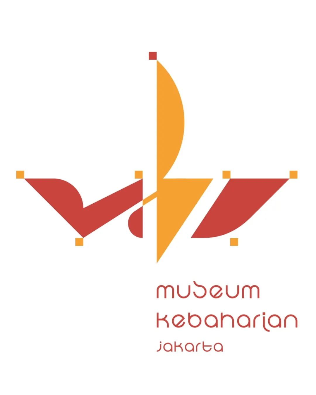
Try it Now!Logo review of museum kebaharian jakarta
 Logo analysis by AI
Logo type:
Style:
Detected symbol:
Negative space:
Detected text:
Business industry:
Review requested by Malikalsyaa
**If AI can recognize or misinterpret it, so can people.
Structured logo review
Legibility
![]() Text is evenly spaced and maintains a visual connection with the geometric style of the symbol.
Text is evenly spaced and maintains a visual connection with the geometric style of the symbol.
![]() Custom typeface is quirky but sacrifices readability, especially with similar letterforms ('u/m', 'k/e', 'a/r').
Custom typeface is quirky but sacrifices readability, especially with similar letterforms ('u/m', 'k/e', 'a/r').![]() The stylized lowercase text can be hard to decipher at smaller sizes or a distance.
The stylized lowercase text can be hard to decipher at smaller sizes or a distance.![]() Contrast between logo and background is good, but the unique forms may hinder instant recognition.
Contrast between logo and background is good, but the unique forms may hinder instant recognition.
Scalability versatility
![]() Simple geometric shapes may retain recognizability at larger sizes such as banners or signage.
Simple geometric shapes may retain recognizability at larger sizes such as banners or signage.![]() Flat color scheme supports different print and digital backgrounds.
Flat color scheme supports different print and digital backgrounds.
![]() Thin lines and detailed anchors at corners won’t render well at small sizes (bad for favicons, embroidery).
Thin lines and detailed anchors at corners won’t render well at small sizes (bad for favicons, embroidery).![]() Text will likely become illegible at small scales.
Text will likely become illegible at small scales.![]() Logo lacks a simple monogram or icon version for compact use cases.
Logo lacks a simple monogram or icon version for compact use cases.
200x250 px
100×125 px
50×62 px
Balance alignment
![]() Good visual symmetry within the ship motif with balanced left and right elements.
Good visual symmetry within the ship motif with balanced left and right elements.![]() Vertical alignment of sail and text offers cohesive column structure.
Vertical alignment of sail and text offers cohesive column structure.
![]() Minor imbalance in color distribution—dominant yellow draws focus away from the red ship body.
Minor imbalance in color distribution—dominant yellow draws focus away from the red ship body.![]() Lower left geometric piece is heavier than its counterpart.
Lower left geometric piece is heavier than its counterpart.

Originality
![]() Distinct abstract ship form using geometric elements sets it apart from standard maritime icons.
Distinct abstract ship form using geometric elements sets it apart from standard maritime icons.![]() Unique custom typography echoes the geometric design, further boosting identity.
Unique custom typography echoes the geometric design, further boosting identity.
![]() Use of squares at anchor points is somewhat artificial and doesn't add meaning.
Use of squares at anchor points is somewhat artificial and doesn't add meaning.![]() Ship motif is relevant but not conceptually groundbreaking.
Ship motif is relevant but not conceptually groundbreaking.
Logomark wordmark fit
![]() Typography and geometric symbol are stylistically consistent, both following minimalist and modular aesthetics.
Typography and geometric symbol are stylistically consistent, both following minimalist and modular aesthetics.![]() Visual weight and spacing between symbol and wording are well proportioned.
Visual weight and spacing between symbol and wording are well proportioned.
![]() Slight style clash between the symbol’s hard points/corners and the rounded mono-line text.
Slight style clash between the symbol’s hard points/corners and the rounded mono-line text.
Aesthetic look
![]() Geometric, modular look supports a contemporary, approachable brand image.
Geometric, modular look supports a contemporary, approachable brand image.
![]() Logo could feel overly abstract for some viewers; risk of lacking immediate maritime association.
Logo could feel overly abstract for some viewers; risk of lacking immediate maritime association.![]() Extra anchor points may clutter aesthetic without functional value.
Extra anchor points may clutter aesthetic without functional value.
Dual meaning and misinterpretations
![]() No inappropriate shapes or unintended meanings detected.
No inappropriate shapes or unintended meanings detected.
Color harmony
![]() Limited and harmonious color scheme supports clarity and cultural vibrancy.
Limited and harmonious color scheme supports clarity and cultural vibrancy.![]() Red and orange contrast effectively while feeling cohesive.
Red and orange contrast effectively while feeling cohesive.
Cinnabar
#D8442B
Orange Peel
#F7A721
White
#FFFFFF


