Wondering how your logo performs? 🧐
Get professional logo reviews in seconds and catch design issues in time.
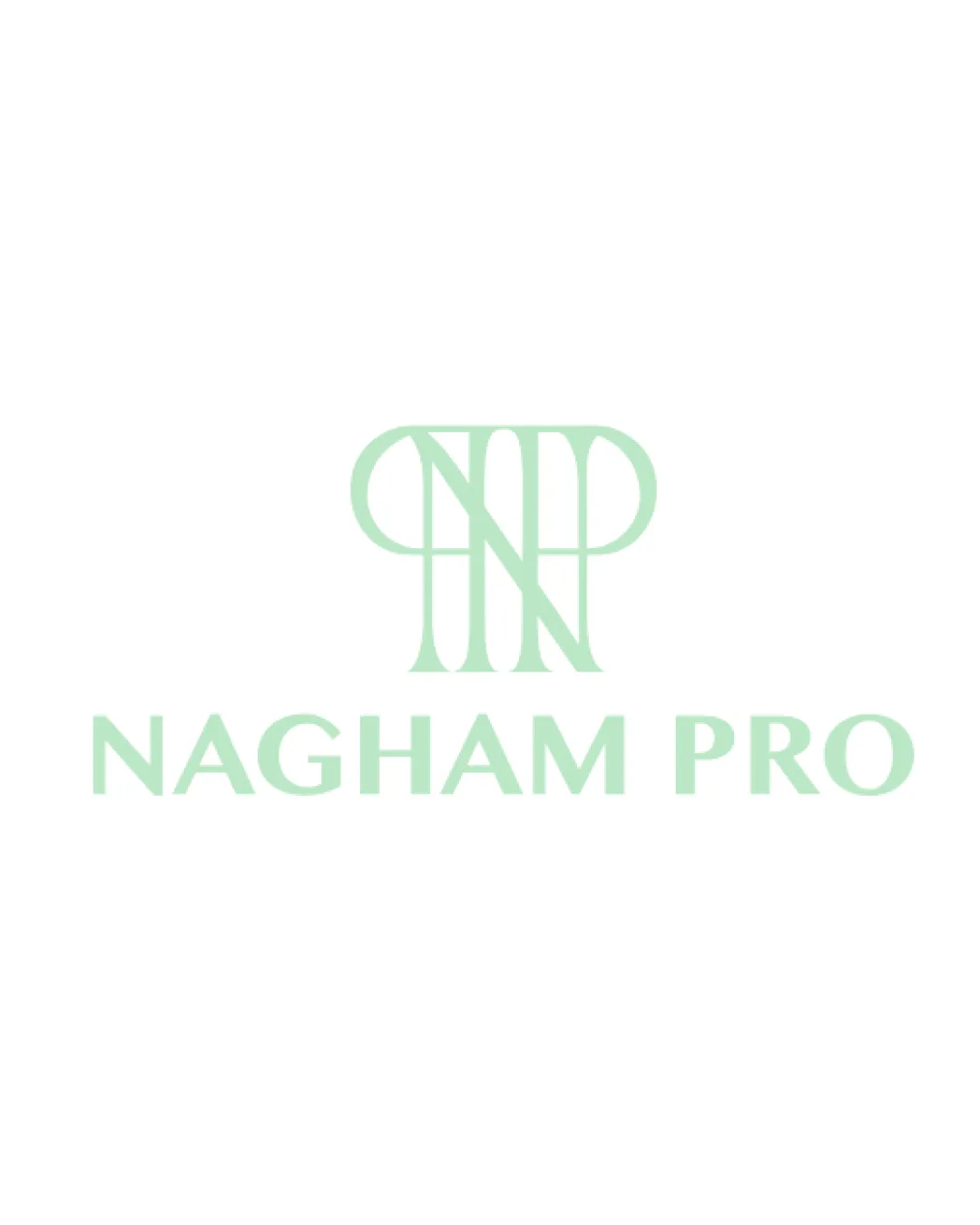
Try it Now!Logo review of NAGHAM PRO
 Logo analysis by AI
Logo type:
Style:
Detected symbol:
Detected text:
Business industry:
Review requested by Rama1998
**If AI can recognize or misinterpret it, so can people.
Structured logo review
Legibility
![]() The 'NAGHAM PRO' wordmark is clear and easy to read due to ample spacing and a clean font.
The 'NAGHAM PRO' wordmark is clear and easy to read due to ample spacing and a clean font.![]() Letterforms are consistently shaped with no distortion.
Letterforms are consistently shaped with no distortion.
![]() The monogram 'NP' may be slightly difficult to decipher at a glance due to overlapping lines and abstract approach.
The monogram 'NP' may be slightly difficult to decipher at a glance due to overlapping lines and abstract approach.
Scalability versatility
![]() Simple and minimal style helps maintain recognizability on medium-sized formats like social media or print headers.
Simple and minimal style helps maintain recognizability on medium-sized formats like social media or print headers.![]() Monochromatic color scheme aids adaptability on various backgrounds.
Monochromatic color scheme aids adaptability on various backgrounds.
![]() Thin, elongated lines of the monogram can lose integrity at small scales (favicons, embroidery).
Thin, elongated lines of the monogram can lose integrity at small scales (favicons, embroidery).![]() Wordmark may not be visible on busy or dark backgrounds without contrast adjustments.
Wordmark may not be visible on busy or dark backgrounds without contrast adjustments.
200x250 px
100×125 px
50×62 px
Balance alignment
![]() Monogram and wordmark are vertically aligned and centered.
Monogram and wordmark are vertically aligned and centered.![]() Good spacing between elements creates an organized look.
Good spacing between elements creates an organized look.
![]() The vertical weight of the monogram feels slightly heavier than the wordmark, causing a modest imbalance.
The vertical weight of the monogram feels slightly heavier than the wordmark, causing a modest imbalance.

Originality
![]() The monogram design is somewhat unique with its intersecting, geometric lines.
The monogram design is somewhat unique with its intersecting, geometric lines.![]() Combines letterforms in a creative and cohesive way.
Combines letterforms in a creative and cohesive way.
![]() Letter-based monogram approach is still somewhat common; does not push boundaries for distinctiveness.
Letter-based monogram approach is still somewhat common; does not push boundaries for distinctiveness.
Logomark wordmark fit
![]() Both elements share a similar weight and geometric style, creating a harmonious pairing.
Both elements share a similar weight and geometric style, creating a harmonious pairing.![]() The minimalism ties the components together visually.
The minimalism ties the components together visually.
![]() A slight misalignment in vertical proportions—the monogram feels marginally oversized compared to the wordmark.
A slight misalignment in vertical proportions—the monogram feels marginally oversized compared to the wordmark.
Aesthetic look
![]() Clean, modern aesthetic with consistent typographic treatment.
Clean, modern aesthetic with consistent typographic treatment.![]() Pleasant color palette and smooth curves make the logo visually appealing.
Pleasant color palette and smooth curves make the logo visually appealing.
![]() The monogram could look overly simplistic or generic for some creative-focused industries.
The monogram could look overly simplistic or generic for some creative-focused industries.
Dual meaning and misinterpretations
![]() No apparent inappropriate shapes or awkward dual meanings.
No apparent inappropriate shapes or awkward dual meanings.![]() Monogram reads as abstract lettering only.
Monogram reads as abstract lettering only.
Color harmony
![]() Soothing, unified palette; pale green is calming and not overpowering.
Soothing, unified palette; pale green is calming and not overpowering.![]() Consistent tone throughout logo and background.
Consistent tone throughout logo and background.
![]() Low contrast between logo and background could be problematic for visibility in some spaces.
Low contrast between logo and background could be problematic for visibility in some spaces.
Celeste
#BCE2CF
White
#FFFFFF