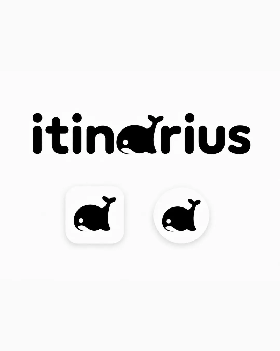
itinarius logo review
4.0 / 5
Logo score
Logo review of

Itinarius

Distinctive and playful, requiring only polish for professional presentation.

Combination Mark Playful Minimalist Travel
4/5
Legibility
4/5
Originality
5/5
Misread
4/5
Balance
5/5
Scale
Action plan

What to fix first

The most important fixes to handle before polishing the full presentation.

1

Refine the whale-to-letter transition to achieve a slightly better baseline balance.

Medium priority

Current 'a' as a whale is slightly heavier than other letters.

Impact: Improves Overall Harmony And Polish. · Effort: Medium

2

Consider secondary brand colors or usage system for differentiation.

Low priority

Current monochrome is clean but may lack vibrancy for use cases.

Impact: Expands Brand Flexibility. · Effort: Low

Detailed review

Logo performance breakdown

4/5

Legibility

Checkmark icon Text is clear and easy to read despite playful style.

Warning icon The whale replacing 'a' may cause a slight pause in readability for first-time viewers.

4/5

Originality

Checkmark icon Clever use of a whale as a letterform; memorable.

Warning icon Concept of animal-letters has been explored in similar industries.

4/5

Color harmony

Checkmark icon Simple black-and-white scheme, visually clean.

Warning icon Monochrome could limit brand expression without a secondary palette.

Black
#000000

White
#FFFFFF

Your palette is close. Refine the color roles and combinations before updating the logo.

Build brand colors
4/5

Balance alignment

Checkmark icon Consistent baseline and spacing throughout the wordmark.

Warning icon Whale integration causes slight weight imbalance compared to the regular letters.

logo 200x250 pixels scalability test alignment grid overlay
5/5

Scalability

Checkmark icon Strong, simple shapes are highly scalable and work in monochrome.

logo 200x250 pixels scalability test

200x250 px

logo 100x125 pixels scalability test

100×125 px

logo 50x62 pixels scalability test

50×62 px

5/5

Misinterpretations

Checkmark icon No obvious misinterpretations or inappropriate readings.

Beta

No AI design signals found

Likely designed by a human

Letter integration and composition appear thoughtfully crafted with human design sensibility.

  • Smooth, coherent whale/letter construction
  • Consistent visual rhythm without generative artifacts

Visual assessment; not definitive proof of authorship.

5 / 5

Logo structure & brief match

Checkmark icon Mark and wordmark are visually consistent and interchangeable.

Checkmark icon SaaS Travel Planner: Playful whale motif adds personality, fitting for travel brands that want to feel approachable and fun.

Try your own review

Wondering how your logo performs?

Get a clear logo score, key risks, and priority fix ideas before your client or audience sees it.

Review my logo