Standalone mark
Test distinctiveness against top shipping logos in region.
The ship and wheel/compass motif is common in the maritime industry and may blend in with category peers.
Compare silhouette and components to common industry trademarks.

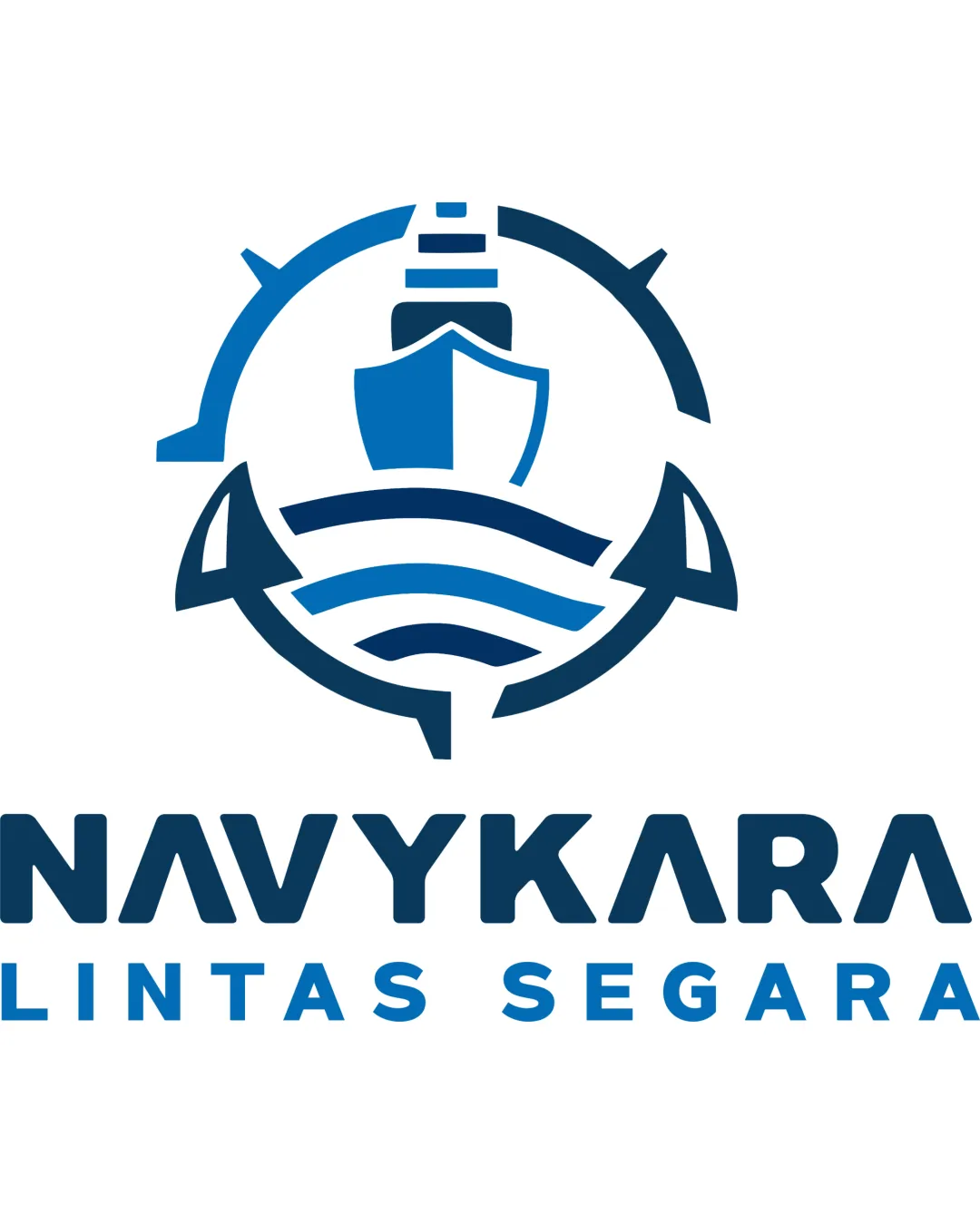
Strong, clear logo for a shipping business, but should be tested for distinctiveness due to common nautical icons.
Focus on the changes that matter. Keep what makes the logo work.
Standalone mark
The ship and wheel/compass motif is common in the maritime industry and may blend in with category peers.
Compare silhouette and components to common industry trademarks.

Standalone mark
Logo preview unavailable. The written feedback is still available on this card.
Fine lines in the outer compass/wheel might lose clarity at small sizes or low print quality.
Test mark legibility at reduced sizes (e.g., business cards).
Shipping and logistics with an emphasis on cargo, reliability, efficiency, and maritime expertise.
Design visually communicates the maritime shipping sector and trust, matching the supplied brief well, though originality is slightly generic.
The ship, compass/wheel, and wave elements instantly signal the brand's shipping and logistics focus.
The clean, bold typography and blue palette evoke reliability and efficiency, matching the client's values.
The ship and wheel/compass motif is common in the maritime industry and may blend in with category peers.
Try: Test distinctiveness against top shipping logos in region.
Check: Compare silhouette and components to common industry trademarks.

Estimated colors. Use the original design file for exact values.
Create a full color palette using these colors
Create new palette

Inspect spacing with the guide. Optical balance may differ from geometric centering.
Fine lines in the outer compass/wheel might lose clarity at small sizes or low print quality.
Try: Simplify details or thicken lines for small-scale use.
Check: Test mark legibility at reduced sizes (e.g., business cards).
Logo preview unavailable. The written feedback is still available on this card.


Compare the detail at different sizes. Labels show the full image dimensions.
Does the shape still work without color?
Find the surfaces where your logo stays clear.
A 3px blur softens fine details so you can check whether the overall shape stays recognizable. If key gaps close or elements merge, the logo may rely too heavily on detail.
Get a clear logo score, key risks, and priority fix ideas before your client or audience sees it.
More credits needed
Add credits to continue without losing your work.
Then $7/month. Cancel anytime.