Wondering how your logo performs? 🧐
Get professional logo reviews in seconds and catch design issues in time.
Try it Now!Logo review of NEW DAY HOME GROUP
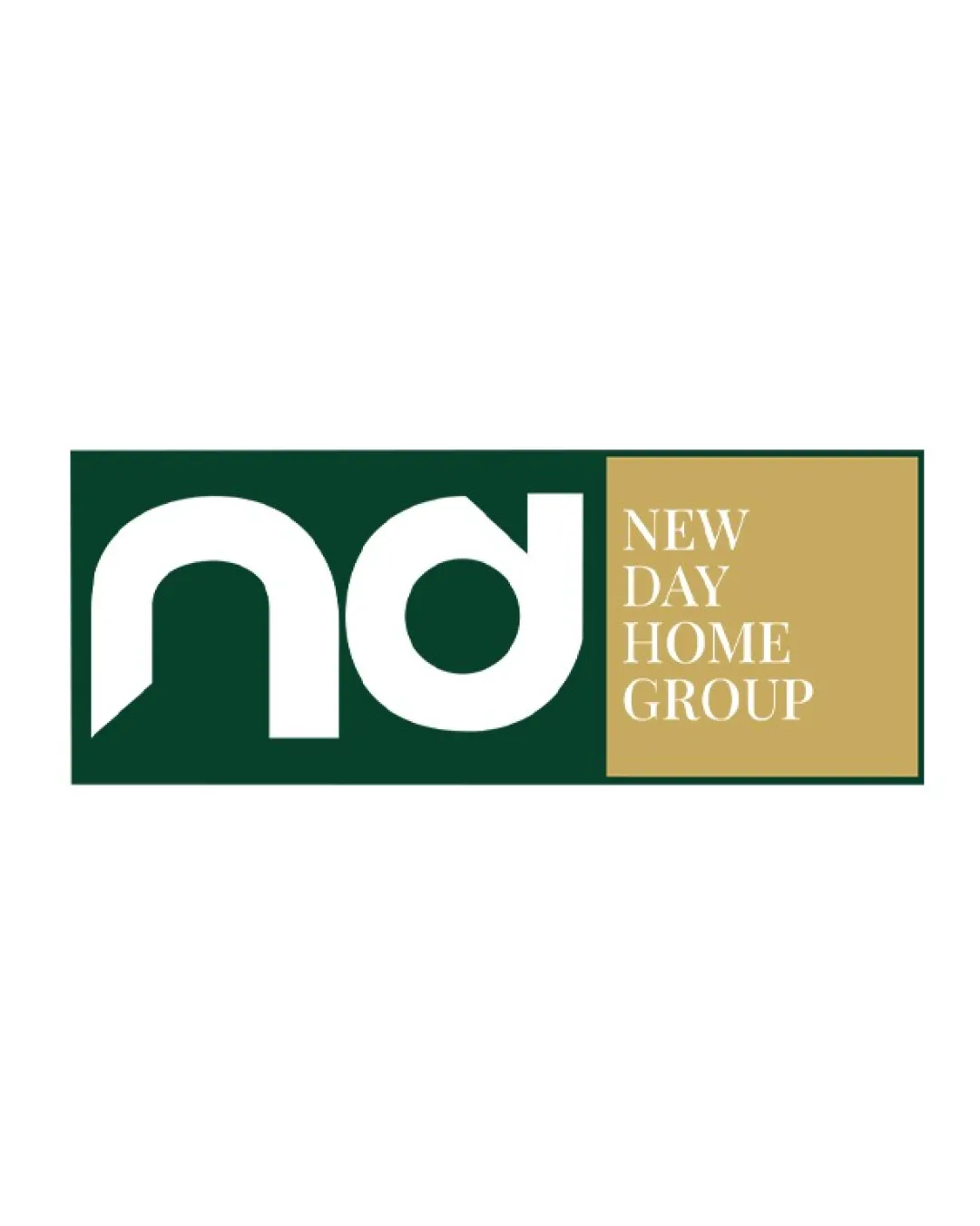
 Logo analysis by AI
Logo type:
Style:
Detected symbol:
Detected text:
Business industry:
Review requested by Agentimage
**If AI can recognize or misinterpret it, so can people.
Structured logo review
Legibility
Wordmark uses a clean, readable serif typeface.
High contrast between type/color boxes aids text legibility.
The 'nd' monogram may not be instantly recognizable as letters, especially at smaller sizes.
Scalability versatility
Rectangular and bold design can work well for signage and digital use.
Minimal gradients or intricate details, aiding readability for print.
The 'nd' monogram's fine negative spaces may close up at very small scales, especially in embroidery or favicon usage.
Boxed layout may not adapt well for vertical or circular formats.

200x250 px

100×125 px

50×62 px
Balance alignment
Grid alignment is clean—left and right areas are proportionate.
Text is visually anchored.
The monogram feels heavier on the left compared to the dense text block on the right, causing mild imbalance.
Spatial gap between elements feels abrupt—lacks visual flow.


Originality
Geometric monogram offers some visual interest over plain text.
Good use of bold negative space in monogram.
The use of an 'nd' monogram in a boxed format is somewhat generic.
No unique or industry-specific symbol present to greatly distinguish the brand.
Logomark wordmark fit
Both elements use a modern, formal style.
Color palette and spacing keeps visual language coherent.
The difference in font style between monogram (rounded/blocky) and the serif ('NEW DAY HOME GROUP') makes the transition less seamless.
Aesthetic look
Minimal, formal presentation matches real estate industry expectations.
On-trend color palette and well-defined typographic area.
Boxed execution feels typical—lacks a memorable or striking visual hook.
Dual meaning and misinterpretations
No inappropriate or confusing double meanings detected.
Color harmony
Gold and deep green evoke a sense of luxury and trust—ideal for real estate.
Limited color scheme keeps branding sharp and versatile.
DeepGreen
#14382B
Gold
#C7B07B
White
#FFFFFF

