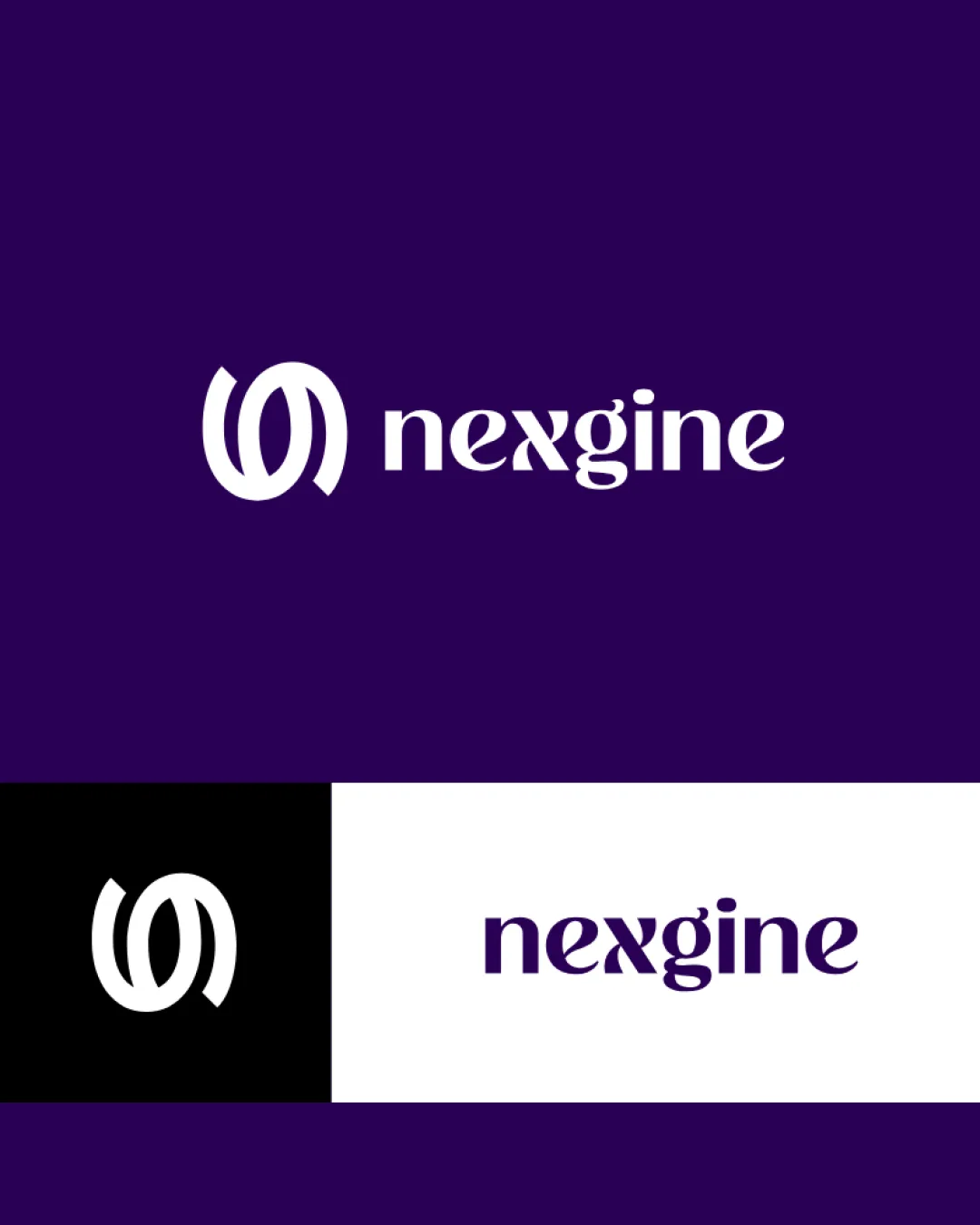
nexgine logo review
4.5/5
Logo score
Logo review of

Nexgine

Review the detailed scores below to see what is working and what should be refined first.

Combination Mark Modern, Geometric, Stylized Sans-serif Technology
4/5
Legibility
4/5
Originality
5/5
Misread
5/5
Balance
4/5
Scale
Detailed review

Logo performance breakdown

4/5

Legibility

  • The custom typeface is unique yet clear enough for brand recall.
  • The word 'nexgine' is readable at standard sizes.
  • The stylized 'x' and 'g' may be ambiguous or confusing at smaller sizes or quick glances.
  • Stylistic cuts may slightly hinder instant readability in very small applications.

4/5

Originality

  • The interwoven circular ribbon is distinctive and not a common tech motif.
  • Custom letterforms in 'nexgine' provide unique brand identity.
  • Abstract ribbon/loop motifs are somewhat prevalent in tech, so a further twist could boost differentiation.
5/5

Color harmony

  • Monochrome palette ensures excellent contrast and versatility.
  • Purple conveys a sense of innovation and sophistication.
Midnight Purple#2B0750
White#FFFFFF
Black#000000

Estimated colors. Use the original design file for exact values.

Create a full color palette using these colors

Create new palette
5/5

Balance alignment

  • The spacing between the logomark and the wordmark is well-proportioned.
  • Both elements feel visually balanced, with good horizontal alignment.
Uploaded logoAlignment guide overlay

Inspect spacing with the guide. Optical balance may differ from geometric centering.

4/5

Scalability

  • The symbol holds up well when scaled down and maintains visual clarity.
  • Logo suite examples for horizontal, mono, and icon uses indicate good flexibility.
  • Appropriate for digital products, apps, and print.
  • The moderate line weights may lose definition at tiny sizes (e.g., small favicons, embroidery).
  • Stylized font elements could get muddy when heavily minimized.
Uploaded logo at 200 pixels wide
200 × 250 px
Uploaded logo at 100 pixels wide
100 × 125 px
Uploaded logo at 50 pixels wide
50 × 63 px

Compare the detail at different sizes. Labels show the full image dimensions.

5/5

Misinterpretations

  • No inappropriate or confusing dual meanings detected.
  • Symbol avoids unintentional references or suggestive shapes.
5/5

Symbol & text fit

  • The curvature and dynamic lines of the logomark complement the flowing style of the wordmark.
  • Both elements share similar weights and visual tone.

Black & white

Does the shape still work without color?

These tests are available only for logos uploaded in vector (SVG) format.

Background contrast

Find the surfaces where your logo stays clear.

These tests are available only for logos uploaded in vector (SVG) format.

Blur & silhouette

A 3px blur softens fine details so you can check whether the overall shape stays recognizable. If key gaps close or elements merge, the logo may rely too heavily on detail.

These tests are available only for logos uploaded in vector (SVG) format.

Try your own review

Wondering how your logo performs?

Get a clear logo score, key risks, and priority fix ideas before your client or audience sees it.

Review my logo