Wondering how your logo performs? 🧐
Get professional logo reviews in seconds and catch design issues in time.
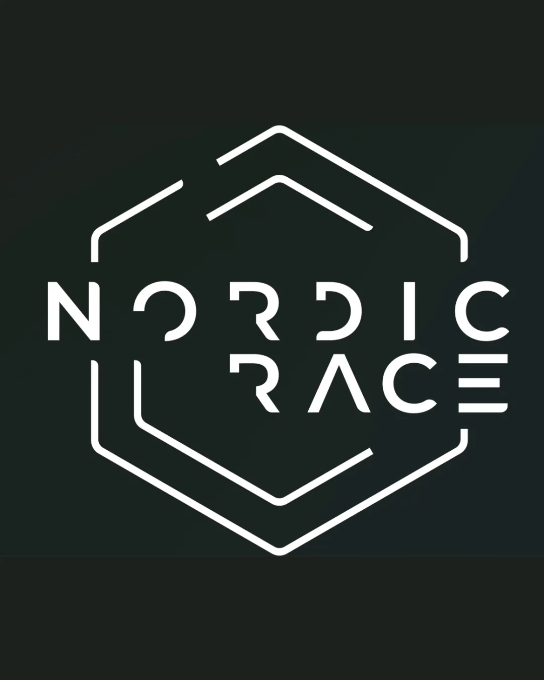
Try it Now!Logo review of NORDIC RACE
 Logo analysis by AI
Recognized style:
Logo type:
Detected symbol:
Detected text:
Business industry:
Review requested by MarieG
**If AI can recognize or misinterpret it, so can people.
Structured logo review
Legibility
![]() Distinctive and modern font with clear readability.
Distinctive and modern font with clear readability.
![]() The geometric style could slightly complicate letter recognition at first glance.
The geometric style could slightly complicate letter recognition at first glance.
Scalability versatility
![]() Clean lines and simple shapes ensure versatility across various sizes and media.
Clean lines and simple shapes ensure versatility across various sizes and media.
200x250 px
100×125 px
50×62 px
Balance alignment
![]() Well-balanced design with symmetrical alignment.
Well-balanced design with symmetrical alignment.

Originality
![]() Unique integration of text and shape provides distinction.
Unique integration of text and shape provides distinction.
![]() Hexagonal shapes are relatively common, reducing some originality.
Hexagonal shapes are relatively common, reducing some originality.
Logomark wordmark fit
![]() The symbol and text complement each other well.
The symbol and text complement each other well.
Aesthetic look
![]() Stylish and modern feel appropriate for the brand.
Stylish and modern feel appropriate for the brand.
Cultural sensitivity dual meaning
![]() No cultural sensitivity issues detected.
No cultural sensitivity issues detected.
Color harmony
![]() High contrast between colors ensures visibility.
High contrast between colors ensures visibility.
![]() Limited to black and white, which may lack vibrancy for some applications.
Limited to black and white, which may lack vibrancy for some applications.


