nuós logo review
4/5
Logo score

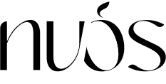
nuós

Essential logo review

A meaningful, creative logo that summarizes the brand's purpose—strong concept, but needs minor refinement for universal clarity.

Wordmark Modern Minimal Contrast, Typographic With Graphic Twist Home Decor / Keepsakes / Maternity
4/5
Legibility
4/5
Originality
3/5
Balance
3/5
Scale
@creative498062
Your next steps

What to fix first

Focus on the changes that matter. Keep what makes the logo work.

1

wordmark

Test the logo across reduced sizes and solid background colors to ensure legibility and identity retention.

High priority Worth testing Medium effort

The complex interplay of white/black in the stylized 'ó' risks losing clarity or legibility at smaller sizes, especially the accent and inner shape.

See the category review


2

wordmark

Subtly adjust the slash or type spacing to better harmonize the two word segments.

Medium priority Optional refinement Low effort

The strong diagonal slash through the 'ó' creates visual tension and slight imbalance between the left and right halves of the wordmark.

See the category review
Detailed review

Logo performance breakdown

5/5

Brief & logo match

The design directly supports the brand's focus and applications through its elegant, memorable, and thematically aligned form.

4/5

Legibility

  • Custom letterforms are mostly readable.
  • Accent and belly form offer clear maternity reference.
4/5

Originality

  • Pregnant belly motif in ó is conceptually appropriate and visually integrated.
  • While the pregnant belly symbolism is apt, the overall geometric concept could risk similarity to other fashion or wellness brands using minimal sans-serif styles and slashes.

    Optional refinement wordmark

    Try: Evaluate the uniqueness of the belly/diagonal approach versus similar brands; consider adding a subtle secondary detail or alternate mark for distinction.

    Check: Survey comparable brands in the category for similar executions and explore small originalizing adjustments.

4/5

Color harmony

  • Black, white, and gray palette is elegant and high-contrast.
Black#000000
White#FFFFFF
Gray#808080

Estimated colors. Use the original design file for exact values.

Create a full color palette using these colors

Create new palette
3/5

Balance alignment

  • Modern, visually engaging treatment.
  • The strong diagonal slash through the 'ó' creates visual tension and slight imbalance between the left and right halves of the wordmark.

    Optional refinement wordmark

    Try: Subtly adjust the slash or type spacing to better harmonize the two word segments.

Uploaded logoAlignment guide overlay

Inspect spacing with the guide. Optical balance may differ from geometric centering.

3/5

Scalability

  • Central mark is memorable in medium sizes.
  • The complex interplay of white/black in the stylized 'ó' risks losing clarity or legibility at smaller sizes, especially the accent and inner shape.

    Worth testing wordmark

    Try: Test the logo across reduced sizes and solid background colors to ensure legibility and identity retention.

5/5

Misinterpretations

  • No unintended negative shapes detected.

Black & white

Does the shape still work without color?

Preparing artwork...

Background contrast

Find the surfaces where your logo stays clear.

Compare the mark and lettering on each surface.

Blur & silhouette

A 3px blur softens fine details so you can check whether the overall shape stays recognizable. If key gaps close or elements merge, the logo may rely too heavily on detail.

Original
3px blur

Look for clear separation between shapes and a distinctive outline.

Try your own review

Wondering how your logo performs?

Get a clear logo score, key risks, and priority fix ideas before your client or audience sees it.

Review my logo