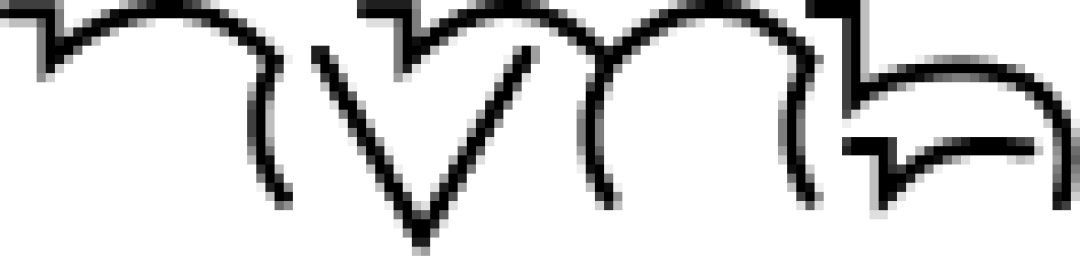
nvnb logo review
3.5/5
Logo score Wordmark category

nvnb

creative765381 Essential logo review

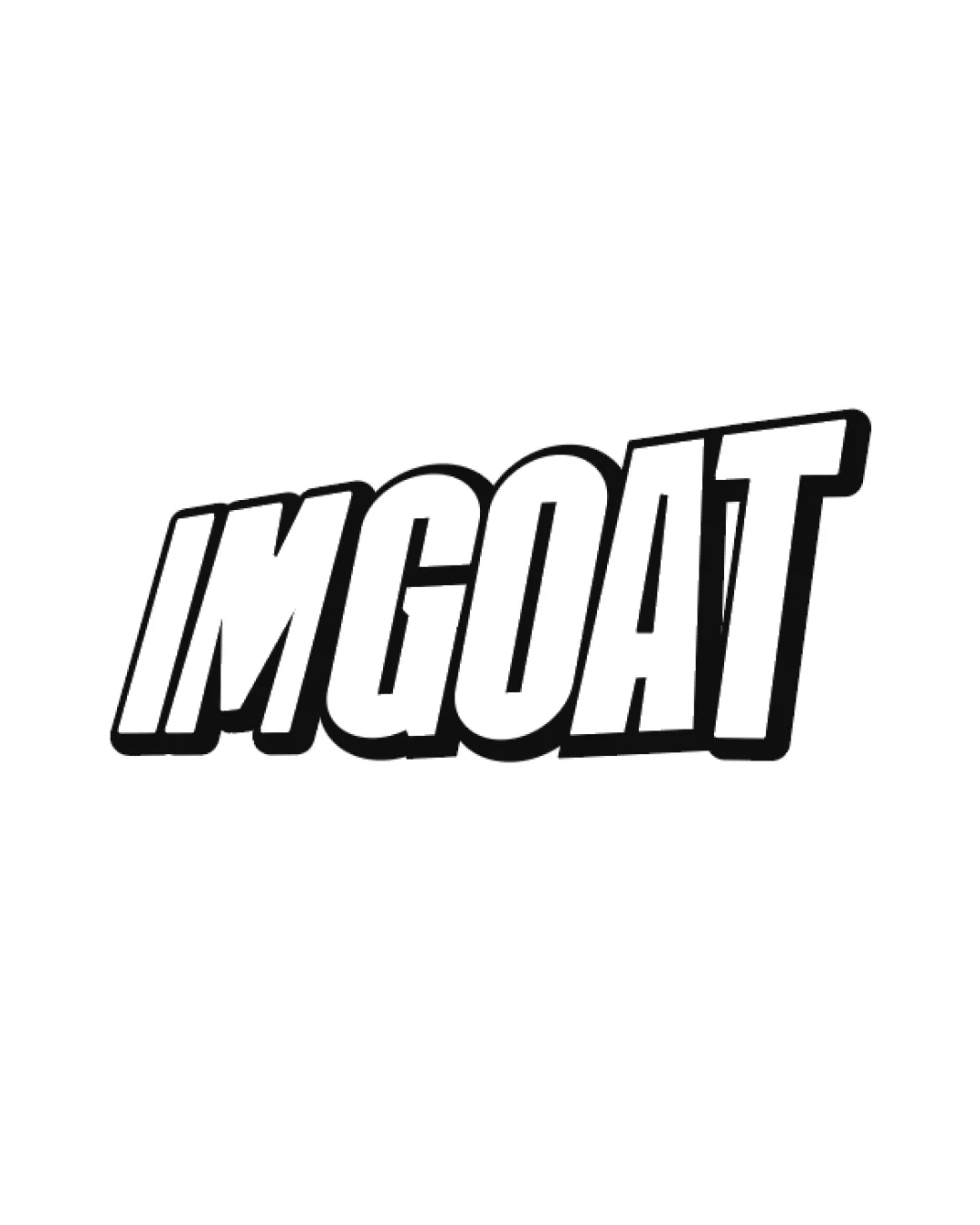
A distinctive and modern-looking wordmark that aligns with Gen Z tastes but needs improved legibility for broader effectiveness.

Legible text:
nvnb
Wordmark Futuristic/geometric Outline Fashion/clothing
2.5/5
Legibility
4/5
Originality
4/5
Balance
3/5
Scale
Your next steps

What to fix first

Focus on the changes that matter. Keep what makes the logo work.

Concept & direction

A geometric, minimalist wordmark with mirrored and angular letter forms suggesting a modern, fashion-forward identity.

Spelling & grammar

Confirm the wording

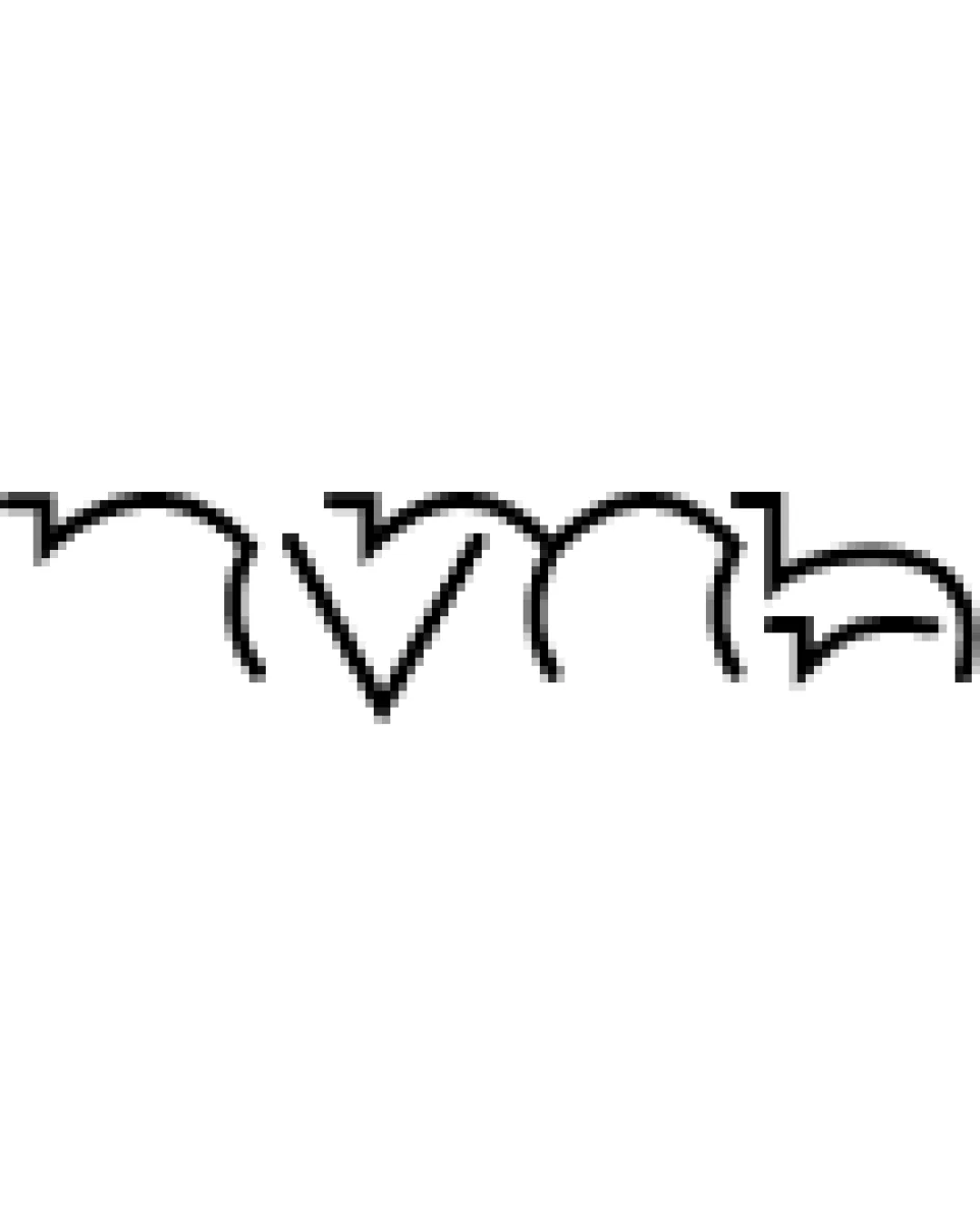
Letterforms are highly stylized and could be misread; 'nvnb' or similar.
1

wordmark

Adjust certain letterforms for better instant recognition while retaining a modern style.

High priority Visible issue Medium effort

Heavily stylized letters make the word difficult to decode at a glance, risking brand recall and accessibility.

See the category review
2

wordmark

Slightly thicken strokes or offer a filled/sturdy variant for small-scale or embroidery use.

Medium priority Optional refinement Low effort

Thin, outline-based lines may lose integrity at small sizes or on textured apparel surfaces.

See the category review
Detailed review

Logo performance breakdown

4/5

Brief & logo match

The logo embraces modern, Gen Z-oriented design but risks clarity for new audiences.

2.5/5

Legibility

  • Unique form stands out.
  • Heavily stylized letters make the word difficult to decode at a glance, risking brand recall and accessibility.

    Visible issue wordmark

    Try: Adjust certain letterforms for better instant recognition while retaining a modern style.

4/5

Originality

  • Distinct geometric silhouettes create brand character.
4/5

Balance alignment

  • Good rhythm and alignment between letters.
Uploaded logoAlignment guide overlay

Inspect spacing with the guide. Optical balance may differ from geometric centering.

3/5

Scalability

  • Simple structure enables resizing.
  • Thin, outline-based lines may lose integrity at small sizes or on textured apparel surfaces.

    Optional refinement wordmark

    Try: Slightly thicken strokes or offer a filled/sturdy variant for small-scale or embroidery use.

5/5

Misinterpretations

  • No obvious unintended shapes or connotations.
Try your own review

Wondering how your logo performs?

Get a clear logo score, key risks, and priority fix ideas before your client or audience sees it.

Review my logo