View review
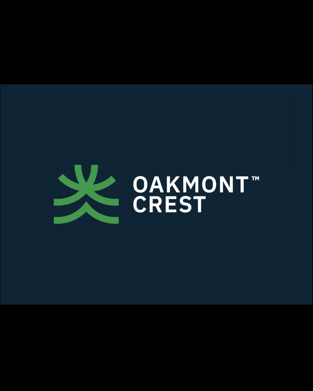
Logo review ofOakmont Crest
Review the detailed scores below to see what is working and what should be refined first.
Logo performance breakdown
Legibility
Text is highly readable and uses a clean, bold sans-serif typeface.
Good contrast between text and background ensures clarity.
Originality
Abstract crest/tree adds a slightly unique touch and relates to the brand name.
The abstract shape, while clean, is not particularly distinctive and resembles common geometric plant/tree/crest icons seen frequently in real estate and property brands.
Color harmony
Well-coordinated use of green, blue, and white.
Strong contrast between mark, background, and text.
Color symbolism (green for growth, blue for trust) is appropriate for real estate.
Green
#276D45
Blue
#122335
White
#FFFFFF
Balance alignment
Strong left alignment between the logomark and wordmark.
Visual weight is distributed evenly.
There is a slight disconnect between the vertical spacing of the symbol and the stacked text; adjusting the vertical alignment could increase unity.
Scalability
Simple form enables clarity at multiple scales.
Would translate well onto signage, business cards, and most digital formats.
Thinness of the green symbol’s arms may lose some definition in very small or embroidered applications, such as on a pen clip or small apparel tag.
200x250 px
100×125 px
50×62 px
Misinterpretations
No dual-meaning or inappropriate visual interpretations detected.
Abstract crest/tree is safe and inoffensive.
Symbol & text fit
Modern style is consistent between the geometric mark and the sans-serif typography.
Both elements feel professional and appropriate for the industry.
The symbol’s organic curves contrast slightly with the rigidity of the text, producing mild stylistic tension. Consider subtle text customization to better integrate the two.
Wondering how your logo performs?
Get a clear logo score, key risks, and priority fix ideas before your client or audience sees it.