 View review
Logo score
Logo review ofÖmer Ali̇ Toprak
Review the detailed scores below to see what is working and what should be refined first.
Legibility
Originality
Misread
Balance
Scale
Detailed review
Logo performance breakdown
Legibility
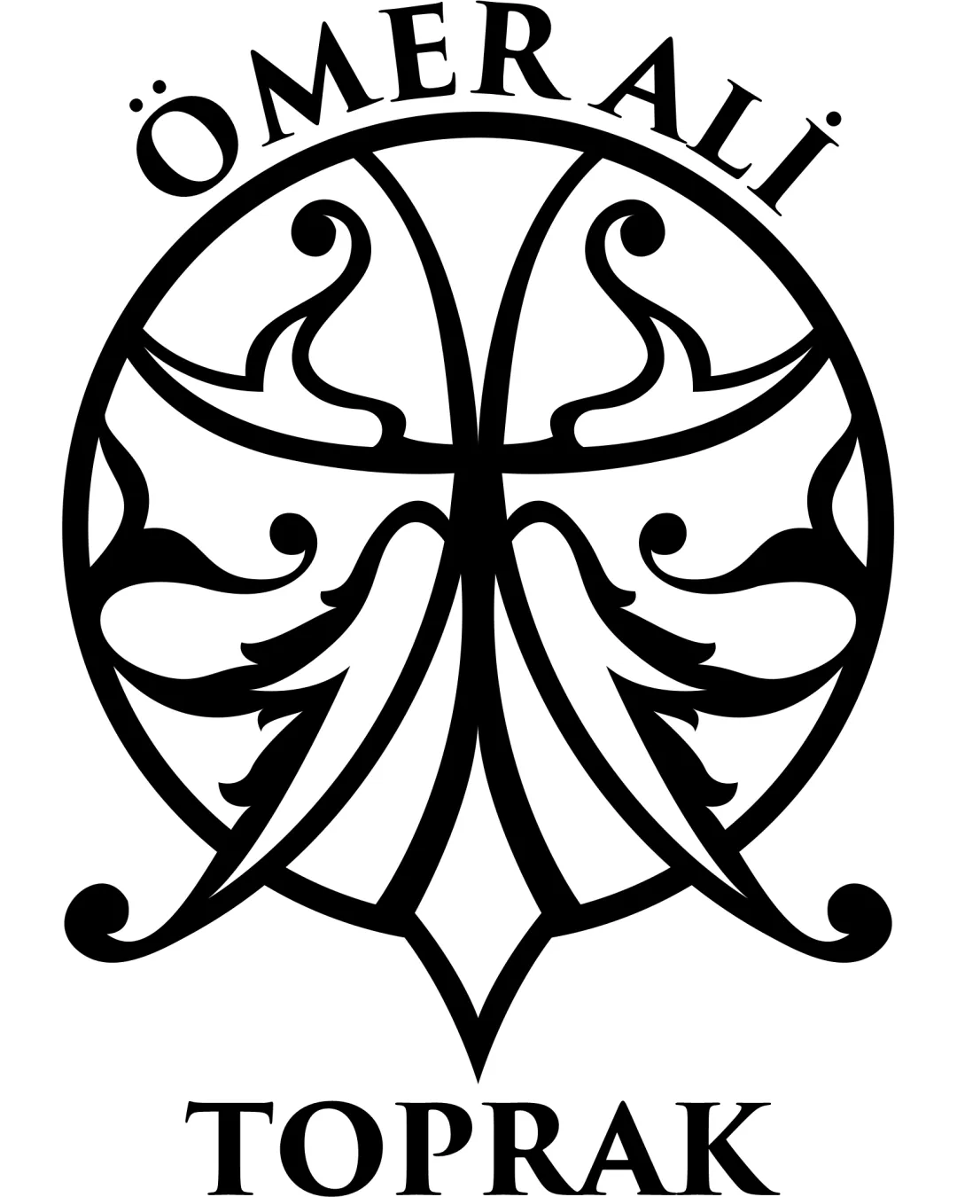
![]() Text is in a serif typeface with good spacing, making it easily readable.
Text is in a serif typeface with good spacing, making it easily readable.![]() High contrast between black text and white background enhances clarity.
High contrast between black text and white background enhances clarity.
![]() Curved placement of top line adds some distortion that may slightly affect quick reading.
Curved placement of top line adds some distortion that may slightly affect quick reading.![]() The extensive negative space around the letters at the top could be tightened for better cohesion.
The extensive negative space around the letters at the top could be tightened for better cohesion.
Originality
![]() Strong attempt at classic Turkish or Central Asian ornamental symbolism, which is not commonly used in modern personal branding logos.
Strong attempt at classic Turkish or Central Asian ornamental symbolism, which is not commonly used in modern personal branding logos.![]() Unique crest execution.
Unique crest execution.
![]() Ornamental crest style is reminiscent of traditional motifs, making it potentially less distinctive in a global context.
Ornamental crest style is reminiscent of traditional motifs, making it potentially less distinctive in a global context.![]() There is no clear original twist or concept within the symbol—relies heavily on historical forms.
There is no clear original twist or concept within the symbol—relies heavily on historical forms.
Color harmony
![]() Single color palette; black and white always harmonize and are universally compatible.
Single color palette; black and white always harmonize and are universally compatible.
Black
#000000
White
#FFFFFF
Balance alignment
![]() Logo is visually symmetrical creating a sense of stability and harmony.
Logo is visually symmetrical creating a sense of stability and harmony.![]() Text is centered above and below the symbol, balancing the composition.
Text is centered above and below the symbol, balancing the composition.
![]() The upper text arch could be more precisely calibrated to follow the top curve of the symbol for even greater visual integration.
The upper text arch could be more precisely calibrated to follow the top curve of the symbol for even greater visual integration.![]() Minor imbalance if the crest is not perfectly centered relative to text lines.
Minor imbalance if the crest is not perfectly centered relative to text lines.

Scalability
![]() Overall shape and simplicity of black-and-white color scheme are adaptable for print and digital uses.
Overall shape and simplicity of black-and-white color scheme are adaptable for print and digital uses.
![]() Thin linework and intricate ornamental details will not reproduce well at small sizes such as business cards or social icons.
Thin linework and intricate ornamental details will not reproduce well at small sizes such as business cards or social icons.![]() Excessive flourish loses distinction on embroidery or tiny labels.
Excessive flourish loses distinction on embroidery or tiny labels.![]() Delicate elements could become muddy when resized.
Delicate elements could become muddy when resized.
200x250 px
100×125 px
50×62 px
Misinterpretations
![]() No inappropriate or misleading shapes; visual metaphor is contained and intentional.
No inappropriate or misleading shapes; visual metaphor is contained and intentional.
Symbol & text fit
![]() Serif font and regal arch are in stylistic harmony with the ornate crest shape.
Serif font and regal arch are in stylistic harmony with the ornate crest shape.
![]() Combined layout feels unified and purposeful.
Combined layout feels unified and purposeful.
![]() Minor style contrast—the letters are rigid while the symbol is flowing, which could be unified further by typographic tweaks.
Minor style contrast—the letters are rigid while the symbol is flowing, which could be unified further by typographic tweaks.
Try your own review
Review my logo
Wondering how your logo performs?
Get a clear logo score, key risks, and priority fix ideas before your client or audience sees it.
Keep exploring


