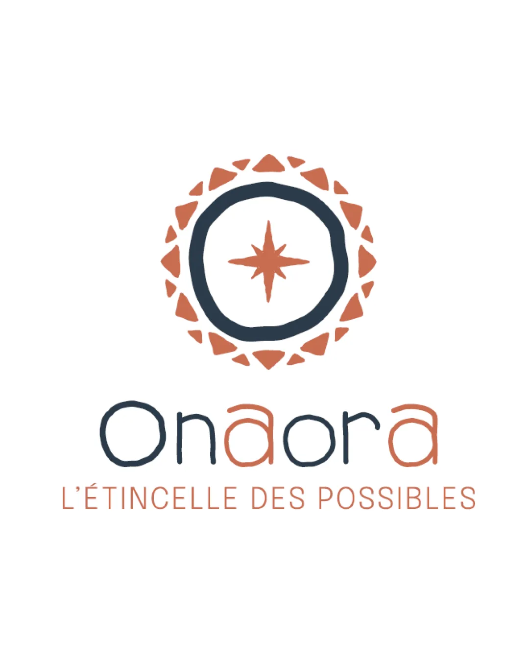
Onaora L'ÉTINCELLE DES POSSIBLES logo review
4/5
Logo score
Logo review of

Onaora L'étincelle Des Possibles

Distinctive, friendly and on-message with minor refinements needed for scalability and polish.

Combination Organic, Hand-drawn, Approachable Coaching / Consulting / Creative Services
4.5/5
Legibility
4/5
Originality
5/5
Misread
3.5/5
Balance
3/5
Scale
Your next steps

What to fix first

Focus on the changes that matter. Keep what makes the logo work.

1

Standalone mark (central emblem)

Test mark at favicons or small print sizes and refine lines for scalability if detail loss occurs.

Optional refinement High priority Medium effort
Area to inspectApproximate location

The hand-drawn, irregular circle and fine star details may lose clarity at small sizes.

How to check

Try logo at ~24px and below for clarity.

See the category review
2

wordmark (main text)

Subtly refine letter stroke consistency while preserving the handcrafted feel.

Optional refinement Medium priority Medium effort
Area to inspectApproximate location

Letterforms have playful irregularities but uneven curves (notably in 'a' and 'r') that may distract in large formats.

How to check

Check legibility and visual rhythm at headline and print sizes.

See the category review
Detailed review

Logo performance breakdown

4/5

Brief & logo match

Based on an inferred industry
Compared with

Services related to creativity, coaching, or personal development (inferred from tagline and visual metaphor).

Logo conveys a creative and guiding spirit, fitting well for a business centered on unlocking potential.

  • Approachability And Creativity

    Organic, hand-drawn quality of the emblem and type delivers a welcoming, creative feel.

  • Symbolic Representation Of Guidance/discovery

    Central compass/star motif connotes direction and unlocking potential, matching 'spark of possibilities.'

4.5/5

Legibility

  • Clean, readable wordmark and tagline.
  • Distinct 'a' treatment draws interest.
4/5

Originality

  • Original circular emblem with star and fragmented border; lively type treatment.
4.5/5

Color harmony

  • Warm terracotta and deep blue contrast well and reinforce uniqueness.
DarkBlue#24333B
Terracotta#C9744D

Estimated colors. Use the original design file for exact values.

Create a full color palette using these colors

Create new palette
3.5/5

Balance alignment

  • Playful, inviting curves in lettering.
  • Letterforms have playful irregularities but uneven curves (notably in 'a' and 'r') that may distract in large formats.

    Optional refinement wordmark (main text)

    Try: Subtly refine letter stroke consistency while preserving the handcrafted feel.

    Check: Check legibility and visual rhythm at headline and print sizes.

    Area to inspectApproximate location
  • The tagline is noticeably wider than the wordmark, reducing vertical hierarchy and balance.

    Optional refinement tagline

    Try: Adjust tagline typographic width (tracking, size, or breaking) to better align with wordmark width.

    Check: Compare logo lockup with and without tagline adjustments for cohesion.

Uploaded logoAlignment guide overlay

Inspect spacing with the guide. Optical balance may differ from geometric centering.

3/5

Scalability

  • Mark is distinctive and simple enough for medium sizes.
  • The hand-drawn, irregular circle and fine star details may lose clarity at small sizes.

    Optional refinement Standalone mark (central emblem)

    Try: Test mark at favicons or small print sizes and refine lines for scalability if detail loss occurs.

    Check: Try logo at ~24px and below for clarity.

    Area to inspectApproximate location
Uploaded logo at 200 pixels wide
200 × 250 px
Uploaded logo at 100 pixels wide
100 × 125 px
Uploaded logo at 50 pixels wide
50 × 63 px

Compare the detail at different sizes. Labels show the full image dimensions.

5/5

Misinterpretations

  • No negative secondary readings detected.
4/5

Symbol & text fit

  • Color and hand-drawn style harmonize between mark and wordmark.

Black & white

Does the shape still work without color?

These tests are available only for logos uploaded in vector (SVG) format.

Background contrast

Find the surfaces where your logo stays clear.

These tests are available only for logos uploaded in vector (SVG) format.

Blur & silhouette

A 3px blur softens fine details so you can check whether the overall shape stays recognizable. If key gaps close or elements merge, the logo may rely too heavily on detail.

These tests are available only for logos uploaded in vector (SVG) format.

Try your own review

Wondering how your logo performs?

Get a clear logo score, key risks, and priority fix ideas before your client or audience sees it.

Review my logo