Only Online logo review
3/5
Logo score
Logo review of

Only Online

A functional online-themed logo with effective symbolism, but refinements in spacing, scalability, and color harmony will elevate its professional presence.

Combination Mark Modern, Digital, Illustrative Technology/digital
4/5
Legibility
3/5
Originality
4/5
Misread
3/5
Balance
3/5
Scale
Your next steps

What to fix first

Focus on the changes that matter. Keep what makes the logo work.

1

mark integration at 'O' in 'Online'

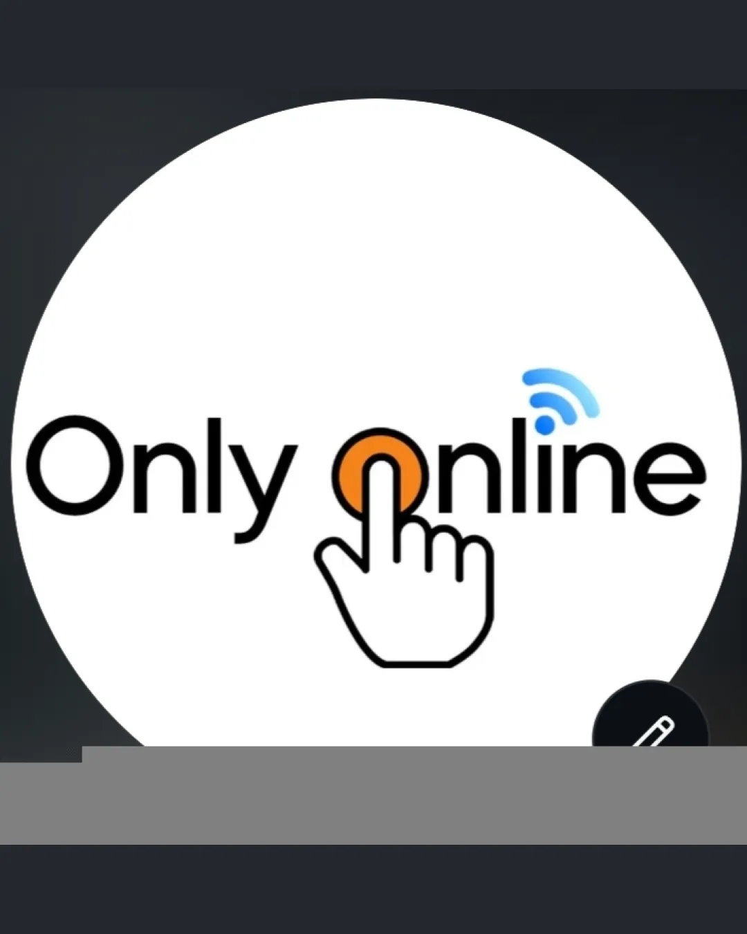
Increase the spacing between the hand graphic and the 'O' to improve clarity and balance.

Visible issue High priority Low effort
Area to inspectApproximate location

The hand graphic appears slightly cramped within the letter 'O', causing a visual imbalance and crowding in this area.

How to check

Review overall negative space and spacing between the hand, 'O', and adjacent letters for optical balance.


See the category review
2

hand icon and Wi-Fi lines

Test the logo at various small sizes to ensure the hand and Wi-Fi signals remain clearly legible.

Worth testing Medium priority Medium effort
Area to inspectApproximate location

Thin outlines of the hand and small Wi-Fi lines may lose detail or visibility at smaller sizes or lower resolutions.

How to check

Print the logo at business card and favicon dimensions to verify icon clarity.

See the category review
Detailed review

Logo performance breakdown

Not scored

Brief & logo match

More context needed

There isn't enough brand context to assess the match.

4/5

Legibility

  • Clean sans-serif font enhances readability
  • Distinct letterforms throughout wordmark
3/5

Originality

  • Clear representation of online/digital themes
3/5

Color harmony

  • Accent colors create focal points
  • The orange circle and blue Wi-Fi use color for emphasis, but these hues do not have strong visual harmony, leading to a somewhat disjointed feel.

    Optional refinement mark and wordmark integration

    Try: Consider refining the color palette for improved color harmony between elements.

    Check: Compare color swatches to assess cohesiveness and visual flow.

Black#000000
Orange#FFA726
LightBlue#42A5F5
White#FFFFFF

Estimated colors. Use the original design file for exact values.

Create a full color palette using these colors

Create new palette
3/5

Balance alignment

  • Well-aligned baseline throughout wordmark
  • The hand graphic appears slightly cramped within the letter 'O', causing a visual imbalance and crowding in this area.

    Visible issue mark integration at 'O' in 'Online'

    Try: Increase the spacing between the hand graphic and the 'O' to improve clarity and balance.

    Check: Review overall negative space and spacing between the hand, 'O', and adjacent letters for optical balance.

    Area to inspectApproximate location
Uploaded logoAlignment guide overlay

Inspect spacing with the guide. Optical balance may differ from geometric centering.

3/5

Scalability

  • Simple main shapes are recognizable at mid size
  • Thin outlines of the hand and small Wi-Fi lines may lose detail or visibility at smaller sizes or lower resolutions.

    Worth testing hand icon and Wi-Fi lines

    Try: Test the logo at various small sizes to ensure the hand and Wi-Fi signals remain clearly legible.

    Check: Print the logo at business card and favicon dimensions to verify icon clarity.

    Area to inspectApproximate location
Uploaded logo at 200 pixels wide
200 × 250 px
Uploaded logo at 100 pixels wide
100 × 125 px
Uploaded logo at 50 pixels wide
50 × 63 px

Compare the detail at different sizes. Labels show the full image dimensions.

4/5

Misinterpretations

  • No realistic risk of unintended secondary meaning
3/5

Symbol & text fit

  • Pointer hand and Wi-Fi conceptually link with the name

Black & white

Does the shape still work without color?

These tests are available only for logos uploaded in vector (SVG) format.

Background contrast

Find the surfaces where your logo stays clear.

These tests are available only for logos uploaded in vector (SVG) format.

Blur & silhouette

A 3px blur softens fine details so you can check whether the overall shape stays recognizable. If key gaps close or elements merge, the logo may rely too heavily on detail.

These tests are available only for logos uploaded in vector (SVG) format.

Try your own review

Wondering how your logo performs?

Get a clear logo score, key risks, and priority fix ideas before your client or audience sees it.

Review my logo