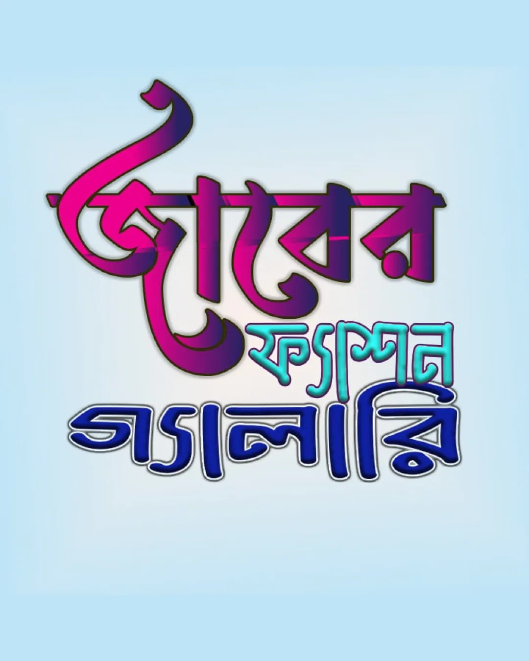
জয়ের ফ্যাশন গ্যালারি logo review
2.7/5
Logo score Wordmark category

জয়ের ফ্যাশন গ্যালারি

creative170470 Essential logo review

A vibrant, culturally appropriate idea, but needs simplification and tuning to work professionally across varied formats.

Wordmark Ornate, Regional, Colorful Display Type Fashion
2.5/5
Legibility
3.5/5
Originality
3/5
Balance
2/5
Scale
Your next steps

What to fix first

Focus on the changes that matter. Keep what makes the logo work.

1

Simplify decorative effects and clarify letterforms for better legibility at different scales.

High priority Medium effort

Heavy styling currently limits versatility and clear recognition.

Improves readability and practical usage of the logo across media.
2

Refine spacing and alignment between text lines and elements.

Medium priority Low effort

Slight crowdedness and uneven structure detract from the logo's sophistication.

Enhances overall balance and professional polish.

Detailed review

Logo performance breakdown

Not scored

Brief & logo match

Culturally resonant and vibrant for a fashion retailer targeting Bengali-speaking customers.

2.5/5

Legibility

  • Unique styling draws attention.
  • Central word is somewhat prominent.
  • Heavy decoration and effects reduce readability, especially at smaller sizes.
  • Letterforms are inconsistent in clarity.
3.5/5

Originality

  • Distinctive Bengali styling with vibrant palette.
  • Memorable in cultural context.
  • Relies on effects rather than pure shape for differentiation.
3/5

Color harmony

  • Energetic and eye-catching palette fits fashion theme.
  • Gradient effects reduce practicality for some uses.
  • Color contrast may hinder clarity.
Magenta#BF116E
Cyan#27BECF
Navy Blue#111F79

Estimated colors. Use the original design file for exact values.

Create a full color palette using these colors

Create new palette

3/5

Balance alignment

  • Dynamic layout adds visual interest.
  • Line weights and element spacing feel uneven; top and bottom lines crowd into each other.
Uploaded logoAlignment guide overlay

Inspect spacing with the guide. Optical balance may differ from geometric centering.

2/5

Scalability

  • Bold forms make large display use feasible.
  • Thin details and internal color transitions will be lost or muddled at reduced sizes.
4/5

Misinterpretations

  • No negative shapes or misreadings detected.
Try your own review

Wondering how your logo performs?

Get a clear logo score, key risks, and priority fix ideas before your client or audience sees it.

Review my logo