Concept & direction
A classic serif wordmark in a vintage arrangement emphasizes tradition and farm heritage.
Spelling & grammar
No obvious issue foundAll text is clearly transcribed; no spelling or grammar issue detected.
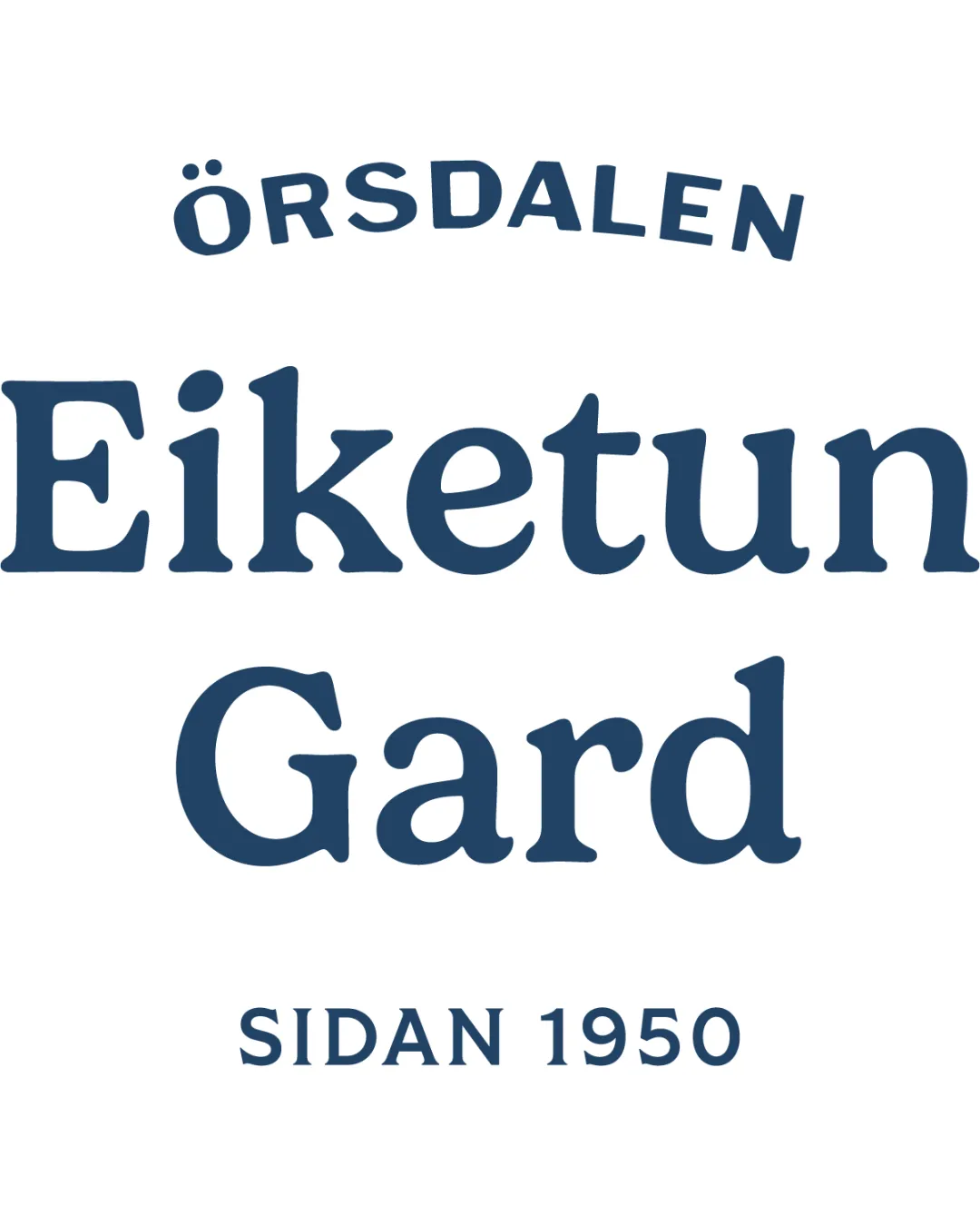
A functional vintage-style wordmark that reads well, but risks blending in without stronger distinguishing features.
Focus on the changes that matter. Keep what makes the logo work.
A classic serif wordmark in a vintage arrangement emphasizes tradition and farm heritage.
All text is clearly transcribed; no spelling or grammar issue detected.
overall logo
The structure and typography are traditional without distinctive or custom flourishes, making it feel generic among vintage farm brands.
Compare the revised logo with other premium farm/estate brands for differentiation.
Logo preview unavailable. The written feedback is still available on this card.
top band (ÖRSDALEN)
The top arching word feels slightly disconnected from the main brand name due to spacing and hierarchy contrast.
See the category reviewVisually supports the vintage and farm heritage context, but could better signal premium or unique brand personality.
The structure and typography are traditional without distinctive or custom flourishes, making it feel generic among vintage farm brands.
Try: Introduce a unique typographic detail or subtle visual device to stand out from similar vintage wordmarks.
Check: Compare the revised logo with other premium farm/estate brands for differentiation.
The top arching word feels slightly disconnected from the main brand name due to spacing and hierarchy contrast.
Try: Adjust arc, letter size or spacing for more visual integration with the main name.
Logo preview unavailable. The written feedback is still available on this card.

Inspect spacing with the guide. Optical balance may differ from geometric centering.
Get a clear logo score, key risks, and priority fix ideas before your client or audience sees it.
More credits needed
Add credits to continue without losing your work.
Then $7/month. Cancel anytime.
Essential logo review with AI
Estimated progress