View review
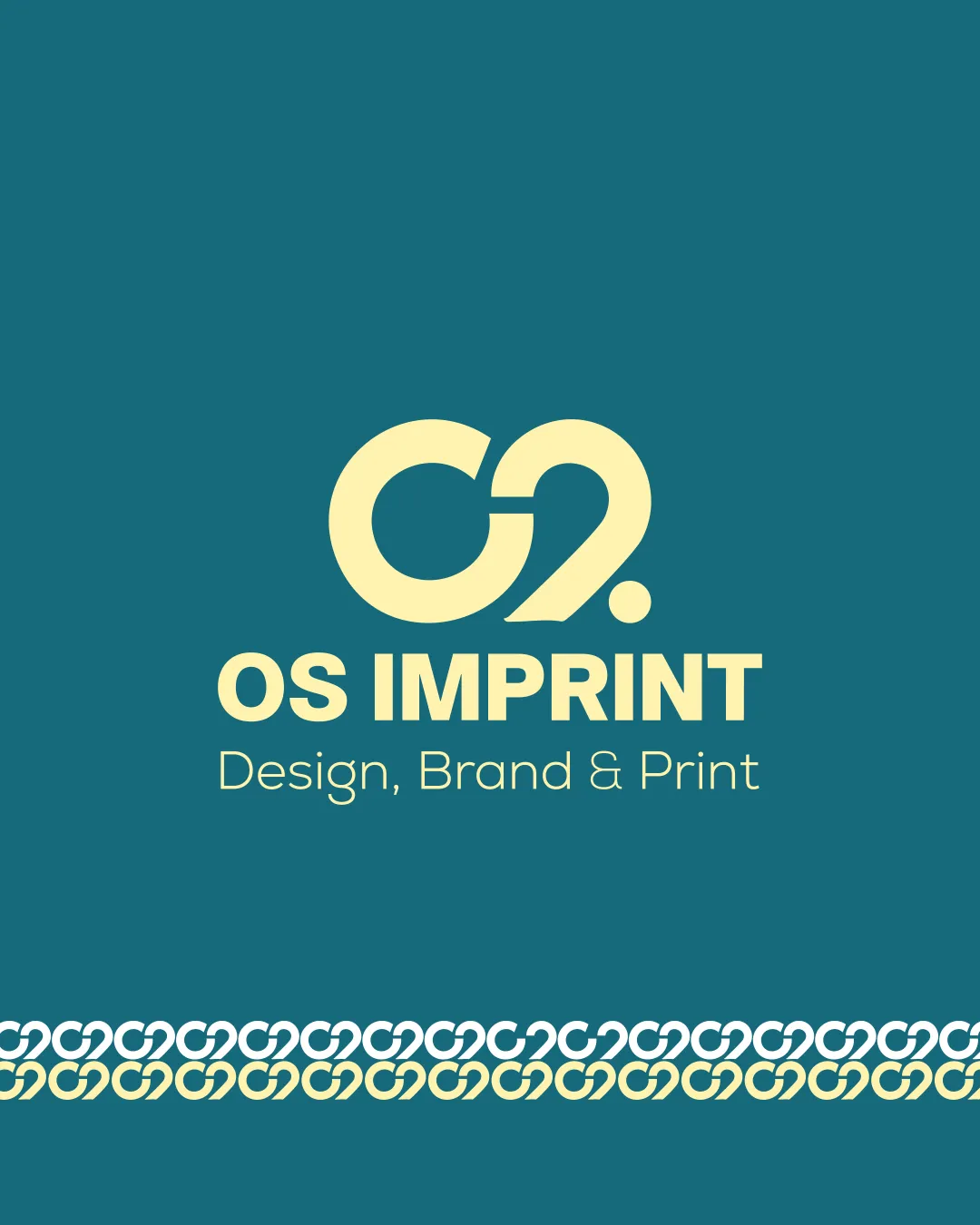
Os Imprint Design, Brand & Print
Functional and attractive but not yet distinctive enough for high-visibility or premium sector use.
What to fix first
The most important fixes to handle before polishing the full presentation.
Refine the monogram to further distinguish it from generic 'OS' marks and ensure maximum distinctiveness.
High priorityThe current monogram, while functional, is stylistically similar to other geometric initial-based marks.
Impact: A More Unique Monogram Would Help Brand Recognition And Reduce Resemblance To Existing Logos. · Effort: Medium
Increase the weight of the subtext slightly to aid clarity at small sizes, especially in print applications.
Medium priorityThin subtext may blur or fade at small scale.
Impact: Improves Readability For Merchandise And Small-format Use Cases. · Effort: Low
Logo performance breakdown
Legibility
Main and subtext are highly readable
Clear typographic hierarchy
Originality
Monogram mark shows some custom form
Geometric 'OS' concept is relatively common in branding
Color harmony
Soft yellow contrasts well with teal background
Limited color palette creates a cohesive look
Lochmara
#339196
Zombie
#EBE1A6
Balance alignment
Centered composition is visually stable
Good spacing between elements
Minor visual tension where monogram joins
Scalability
Simple geometric forms scale well
Few small details prone to loss
Thin subtext may lose clarity at very small sizes
200x250 px
100×125 px
50×62 px
Misinterpretations
No inappropriate or confusing misreadings detected
No AI design signals found
Likely designed by a human
Structure, clarity, and consistency suggest a deliberate, human-led design.
- Well-formed character joins and balanced construction
- Clean, logical monogram detailing with no AI artifacts
Visual assessment; not definitive proof of authorship.
Logo structure & brief match
Monogram and wordmark are well integrated
Slight disconnect in style between bold mark and lighter subtitle
General Branding: Modern, adaptable aesthetic suitable for general branding needs
Merchandise & Print: Strong, simple monogram works well for T-shirts and physical products
Wondering how your logo performs?
Get a clear logo score, key risks, and priority fix ideas before your client or audience sees it.