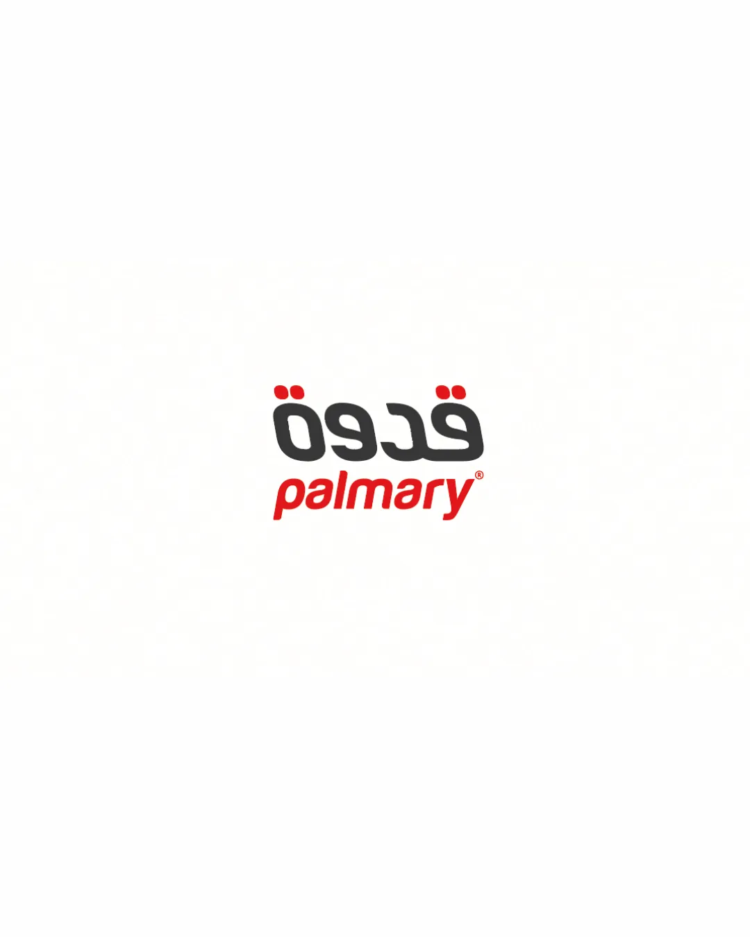
قدوة palmary wordmark logo logo review
3.4/5
Logo score Wordmark category

قدوة palmary wordmark logo

creative961829 Essential logo review

This is a clear, bilingual wordmark that effectively communicates food-industry professionalism, but it needs better vertical cohesion between both versions of the name.

This wordmark has a workable foundation; improving distinctiveness is the clearest next step.

Wordmark Modern Food / Culinary Training
4/5
Legibility
3/5
Originality
3/5
Balance
3/5
Scale
4/5
Color
Your next steps

What to fix first

Focus on the changes that matter. Keep what makes the logo work.

1

arrangement

Adjust the baseline or spacing between lines for stronger visual cohesion.

High priority Visible issue Low effort

There is an awkward gap and lack of clear alignment between the Arabic and Latin lines, creating a slight disconnect in the lockup.

How to check

Test refined lockup for unified brand feel across layouts.

See the category review
Detailed review

Logo performance breakdown

4/5

Brief & logo match

The bilingual wordmark expresses cross-cultural culinary training well, though improved lockup cohesion is needed for a highly professional impression.

5/5

Misinterpretations

  • No unintended readings or misinterpretations visible.
4/5

Legibility

  • Both Arabic and Latin text are clearly readable at standard sizes.
4/5

Color harmony

  • The black and red palette is strong and clear, with good contrast between languages.
Black#232323
Red#E73331

Estimated colors. Use the original design file for exact values.

Create a full color palette using these colors

Create new palette
3/5

Originality

  • Dual-script wordmarks are common, but script pairing is executed cleanly.
3/5

Balance alignment

Available in Advanced logo reviews
3/5

Scalability

Available in Advanced logo reviews

Style consistency

  • There is an awkward gap and lack of clear alignment between the Arabic and Latin lines, creating a slight disconnect in the lockup.

    Visible issue arrangement

    Try: Adjust the baseline or spacing between lines for stronger visual cohesion.

    Check: Test refined lockup for unified brand feel across layouts.
Try your own review

Wondering how your logo performs?

Get a clear logo score, key risks, and priority fix ideas before your client or audience sees it.

Review my logo