Wondering how your logo performs? 🧐
Get professional logo reviews in seconds and catch design issues in time.
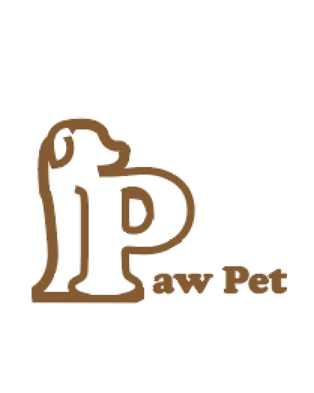
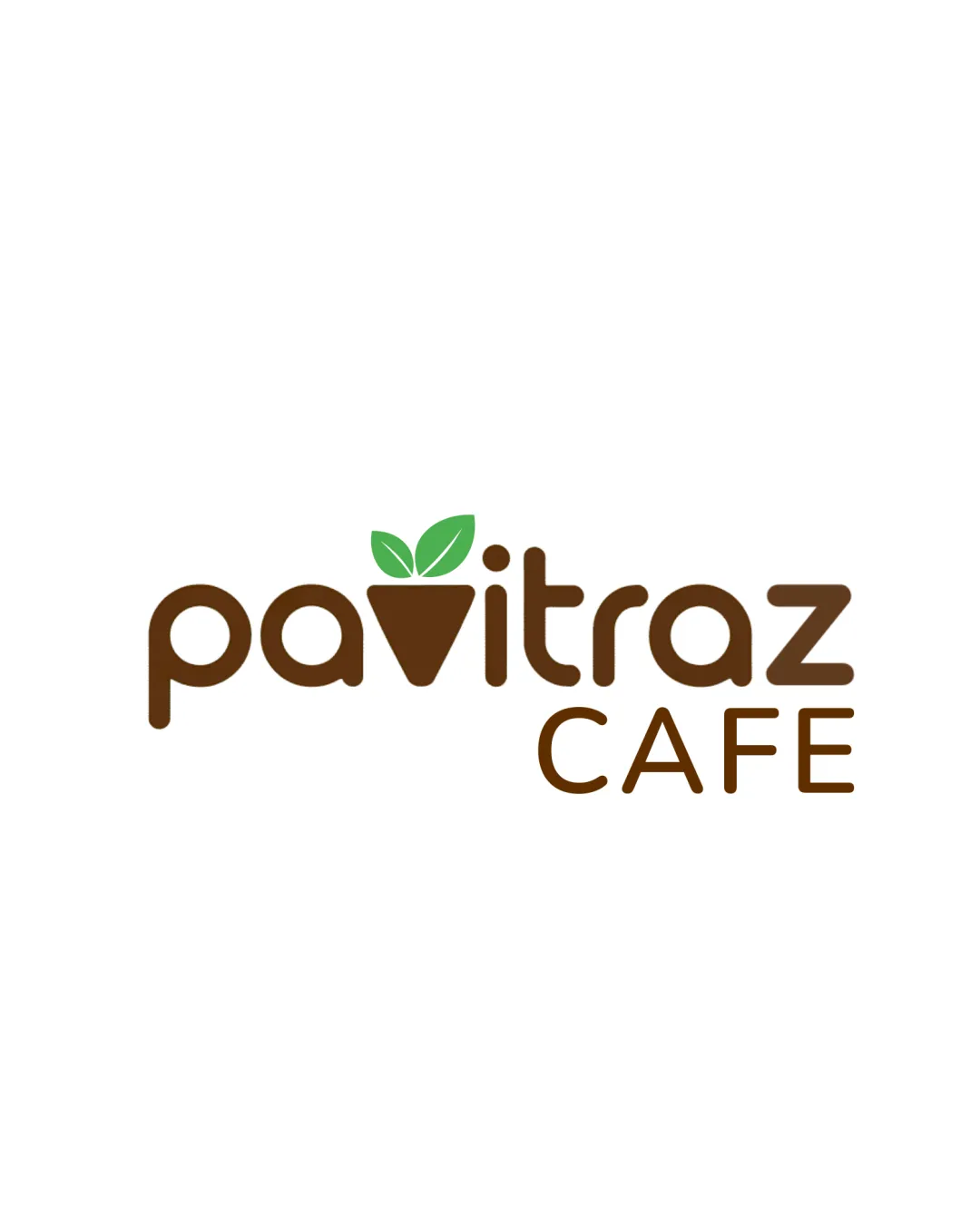
Try it Now!Logo review of pavitraz CAFE
 Logo analysis by AI
Logo type:
Style:
Detected symbol:
Detected text:
Business industry:
Review requested by Rohangehlot
**If AI can recognize or misinterpret it, so can people.
Structured logo review
Legibility
![]() Text is mostly clear and easy to read due to good contrast against a white background.
Text is mostly clear and easy to read due to good contrast against a white background.![]() Font selection is approachable and welcoming, fitting a café environment.
Font selection is approachable and welcoming, fitting a café environment.
![]() The 'v' as a stylized symbol might cause a momentary pause for first-time viewers to interpret it as a letter rather than a pot.
The 'v' as a stylized symbol might cause a momentary pause for first-time viewers to interpret it as a letter rather than a pot.
Scalability versatility
![]() Logo is generally bold and simple, allowing it to scale well.
Logo is generally bold and simple, allowing it to scale well.![]() Minimal details in the pot and leaves retain clarity in medium applications.
Minimal details in the pot and leaves retain clarity in medium applications.
![]() Thin lines in the small leaves and rounded letterforms may begin to lose sharpness at very small sizes, such as embroidery or favicons.
Thin lines in the small leaves and rounded letterforms may begin to lose sharpness at very small sizes, such as embroidery or favicons.
200x250 px
100×125 px
50×62 px
Balance alignment
![]() Main wordmark alignment is consistent, and the pot symbol is well-centered above the text flow.
Main wordmark alignment is consistent, and the pot symbol is well-centered above the text flow.![]() The overall visual weight is relatively even.
The overall visual weight is relatively even.
![]() 'CAFE' placement feels slightly disconnected from 'pavitraz' due to its lighter and more spaced-out font weight, affecting overall harmony.
'CAFE' placement feels slightly disconnected from 'pavitraz' due to its lighter and more spaced-out font weight, affecting overall harmony.![]() Visual hierarchy is slightly disrupted by the pot and leaf symbol interrupting the baseline continuity.
Visual hierarchy is slightly disrupted by the pot and leaf symbol interrupting the baseline continuity.

Originality
![]() Using the 'v' as a pot with leaves is a thoughtful and fitting integration for a cafe logo, subtly referring to freshness and plant-based options.
Using the 'v' as a pot with leaves is a thoughtful and fitting integration for a cafe logo, subtly referring to freshness and plant-based options.![]() Unique modification to the letterform avoids being strictly generic.
Unique modification to the letterform avoids being strictly generic.
![]() Leaf-in-pot motif is somewhat common in health, organic, and café industries—while implemented well, does not set a new creative benchmark.
Leaf-in-pot motif is somewhat common in health, organic, and café industries—while implemented well, does not set a new creative benchmark.
Logomark wordmark fit
![]() The pot with leaves integrates naturally into the wordmark, avoiding an artificial separation between symbol and type.
The pot with leaves integrates naturally into the wordmark, avoiding an artificial separation between symbol and type.![]() The organic, rounded font complements the plant theme.
The organic, rounded font complements the plant theme.
![]() The design could further unify the wordmark and symbol, possibly by adjusting spacing or making 'CAFE' more cohesive with the main lettering.
The design could further unify the wordmark and symbol, possibly by adjusting spacing or making 'CAFE' more cohesive with the main lettering.
Aesthetic look
![]() Friendly approach, soft edges, and clean visual communication create a gentle and inviting style.
Friendly approach, soft edges, and clean visual communication create a gentle and inviting style.![]() Color palette aids the organic/natural café positioning.
Color palette aids the organic/natural café positioning.
![]() Visual split between the main name and 'CAFE' is somewhat jarring and could be handled more elegantly.
Visual split between the main name and 'CAFE' is somewhat jarring and could be handled more elegantly.
Dual meaning and misinterpretations
![]() No inappropriate shapes or accidental symbolism detected. The logo reads as intended—a pot and leaf motif.
No inappropriate shapes or accidental symbolism detected. The logo reads as intended—a pot and leaf motif.
Color harmony
![]() Brown and green create a relevant, organic combination appropriate for a café.
Brown and green create a relevant, organic combination appropriate for a café.![]() Minimal, purposeful color use avoids overload and confusion.
Minimal, purposeful color use avoids overload and confusion.
Deep Brown
#604121
Cafe Brown
#6D3A06
Green
#50B849
White
#FFFFFF