View review
Logo review ofPavwasa
Review the detailed scores below to see what is working and what should be refined first.
Logo performance breakdown
Legibility
Typeface is bold, rounded, and highly readable.
Good contrast between the logotype and background ensures clarity.
Originality
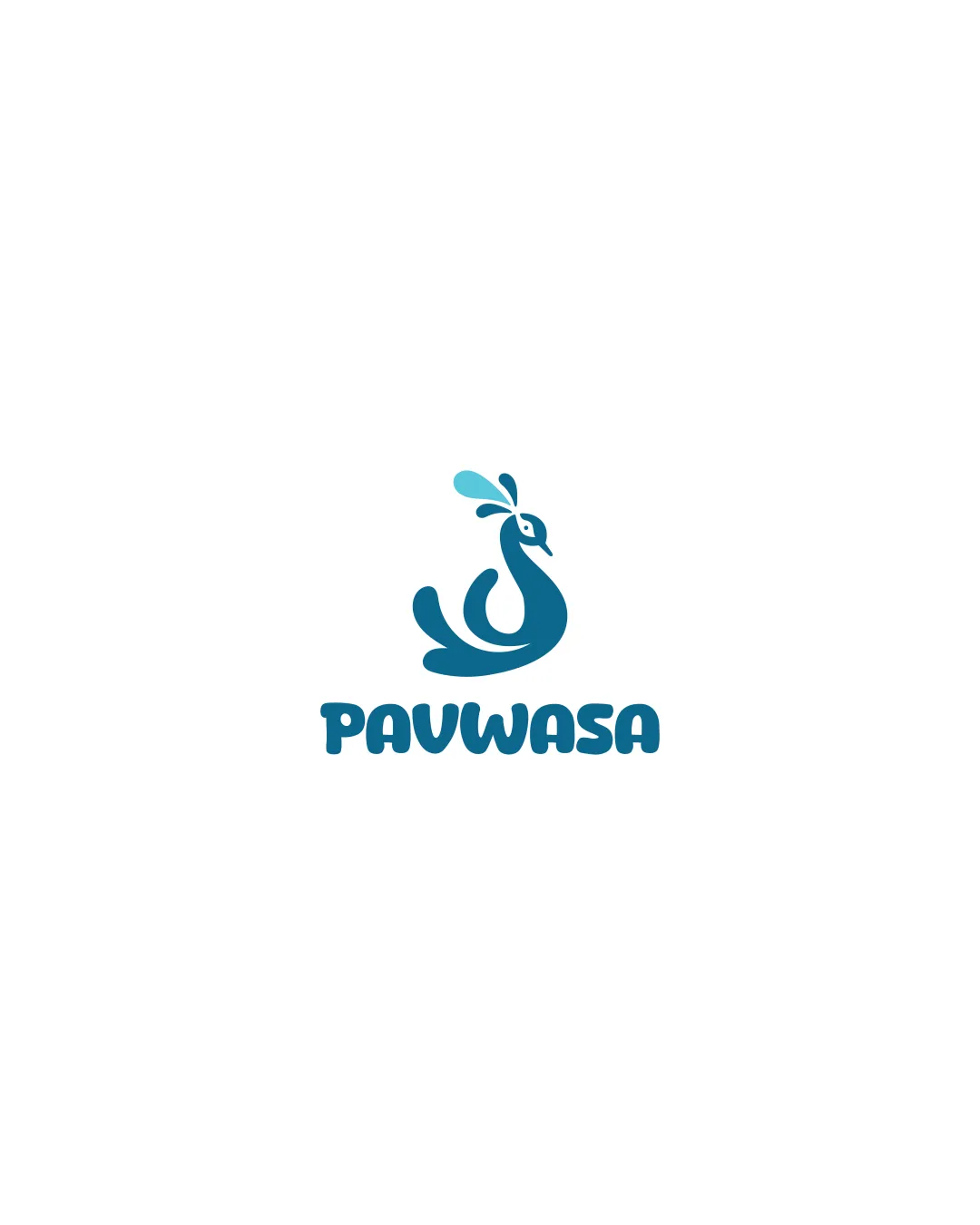
Peacock illustration is abstract and unique, moving away from literal depictions.
Good use of negative space for the drop adds an extra layer of meaning.
Stylized peacocks are not uncommon in logo design, slightly reducing perceived uniqueness.
Color harmony
Color selection is restrained, with good contrast and pleasant harmony.
Logo remains distinguishable in both full color and monochrome versions.
William
#177693
Viking
#6AD2EA
Balance alignment
Logomark and wordmark are centrally aligned with even visual weight.
Organic curves of the symbol are echoed by the round typeface, aiding harmony.
Scalability
Logo uses solid, bold shapes which translate well across small and large sizes.
Simplicity allows for easy adaptation in print, embroidery, app icons, and signage.
Small droplet detail in the symbol might be less clear at very tiny sizes (e.g., favicon, very small merch).
200x250 px
100×125 px
50×62 px
Misinterpretations
No unintended or inappropriate shapes detected.
Abstract nature is easily interpreted as a peacock.
Symbol & text fit
Both symbol and text share the same playful, rounded style, creating a cohesive look.
Logomark size is well-proportioned to wordmark, providing visual stability.
Wondering how your logo performs?
Get a clear logo score, key risks, and priority fix ideas before your client or audience sees it.