wordmark
Clarify the initial letter 'P' while retaining the leash motif.
The 'P' is stylized as a leash loop that may be mistaken for an 'S' or another symbol, which can impact instant readability.
See the category review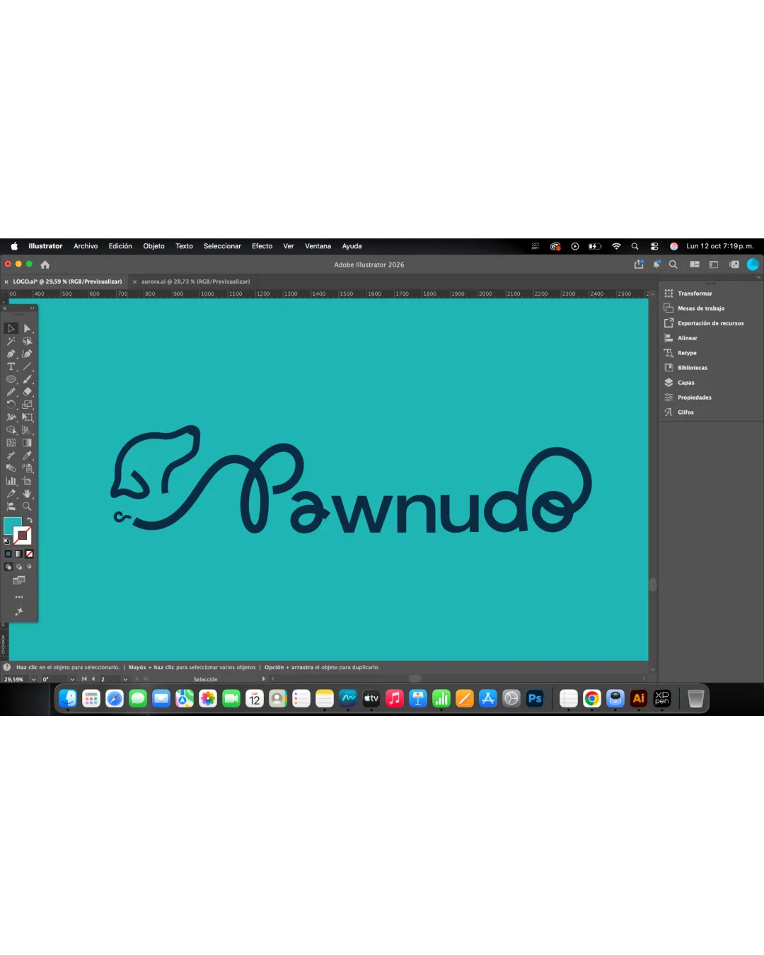
This logo delivers a clever, industry-appropriate concept with good visual harmony, though the initial letter's legibility and subtle imbalance should be addressed for a more robust identity.
This logo lockup shows solid execution, supported by distinctive construction and clarity at smaller sizes; improving visual balance is the clearest next step.
Focus on the changes that matter. Keep what makes the logo work.
wordmark
The 'P' is stylized as a leash loop that may be mistaken for an 'S' or another symbol, which can impact instant readability.
See the category reviewThe logo's single-line approach nods to paracord products and communicates a dog focus well, with minor clarity limitations in the stylized lettering.
Symbol 4/5 · Wordmark 4/5
Dog head and leash motif are familiar in pet branding, though the continuous paracord-inspired treatment adds a fresh twist.
Symbol 4/5 · Wordmark 4/5
Estimated colors. Use the original design file for exact values.
Create a full color palette using these colors
Create new paletteSymbol 4/5 · Wordmark 4/5 · Layout 4/5
Wordmark 3/5 · Layout 4/5
Symbol 3/5 · Wordmark 3/5 · Layout 3/5
Get a clear logo score, key risks, and priority fix ideas before your client or audience sees it.
More credits needed
Add credits to continue without losing your work.
Then $7/month. Cancel anytime.
Essential logo review with AI
Estimated progress