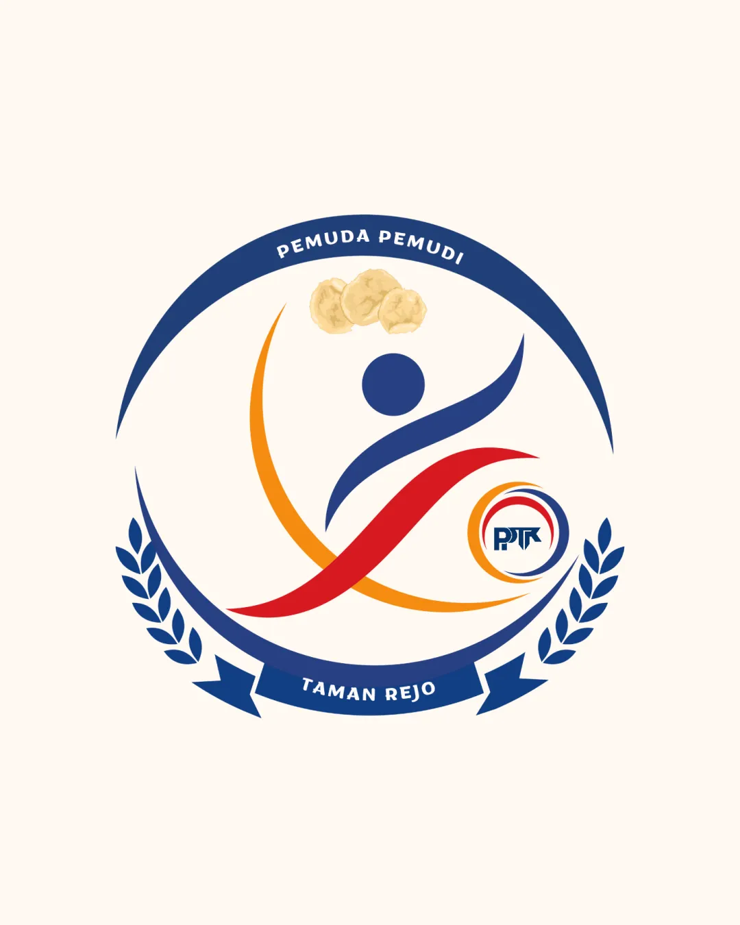
PEMUDA PEMUDI TAMAN REJO PPK logo review
3.0 / 5
Logo score
Logo review of

Pemuda Pemudi Taman Rejo Ppk

Visually coherent and appropriate, but weakened by inconsistent visual language and fine detail. Removing or harmonizing the snack image and clarifying the smaller emblem would elevate it to a stronger professional standard.

Objective AI feedback. Your creative decision.

Emblem Modern Abstract Emblem With Celebratory Motif Community/youth Organization
3.5/5
Legibility
3/5
Originality
4/5
Misread
4/5
Balance
2.5/5
Scale
Action plan

What to fix first

The most important fixes to handle before polishing the full presentation.

1

Remove or restyle top snack element to match emblem illustration or omit for visual coherence.

High priority

Photographic insert feels out of place and weakens polish.

Impact: Improves Overall Balance And Style Fitness. · Effort: Low

2

Simplify or enlarge the small 'PPK' inner emblem for small-scale readability.

Medium priority

Small elements are lost at small scale and limit reproduction versatility.

Impact: Boosts Visibility And Professional Presence At Varying Sizes. · Effort: Medium

Detailed review

Logo performance breakdown

3.5/5

Legibility

Checkmark icon Outer wordmarks are readable and well-placed.

Warning icon Small central letters ('PPK') lack clarity at smaller sizes.

3/5

Originality

Checkmark icon Abstract human figure adds some distinctiveness.

Warning icon Emblem structure and laurel symbolize common visual tropes; overall concept feels conventional.

3.5/5

Color harmony

Checkmark icon Bold blue, red, and yellow palette creates energy and contrast.

Warning icon Top photographic snack does not harmonize with the illustrated style.

DarkBlue
#253a72

Red
#e53f3f

Orange
#eba51b

Cream
#f7eedf

White
#ffffff

Your palette is close. Refine the color roles and combinations before updating the logo.

Build brand colors
4/5

Balance alignment

Checkmark icon Symmetrical laurel branches and circular badge create strong balance.
Checkmark icon Main abstract figure is centered.

Warning icon Top floating element (snack) disrupts visual flow and balance.

logo 200x250 pixels scalability test alignment grid overlay
2.5/5

Scalability

Checkmark icon Main emblem and type are generally clear at moderate sizes.

Warning icon Small 'PPK' emblem and fine laurel details risk losing clarity at small scale.

logo 200x250 pixels scalability test

200x250 px

logo 100x125 pixels scalability test

100×125 px

logo 50x62 pixels scalability test

50×62 px

4/5

Misinterpretations

Checkmark icon No obvious misinterpretation or negative space issues.

3.5 / 5

Logo structure & brief match

Checkmark icon Circular text and main abstract mark integrate cohesively.

Warning icon Smaller inner emblem feels visually crowded and less intentional.

Checkmark icon Community Symbolism: Success in conveying unity and organized activity.

Try your own review

Wondering how your logo performs?

Get a clear logo score, key risks, and priority fix ideas before your client or audience sees it.

Review my logo