 View review
Logo score
Logo review of
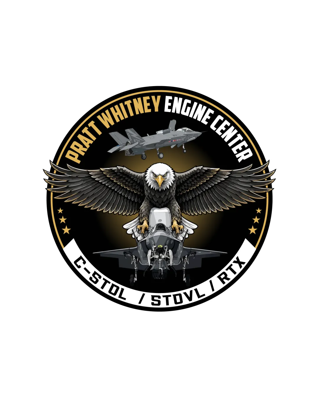
Pratt Whitney Engine Center C Stol / Stovl / Rtx
A detailed and relevant aerospace badge; visually clear at moderate sizes but too intricate for broad application without simplification.
Legibility
Originality
Misread
Balance
Scale
Action plan
What to fix first
The most important fixes to handle before polishing the full presentation.
1
Simplify eagle and jet illustrations for small-scale or single-color versions
High priorityCurrent detail level will not survive at sub-badge sizes or on embroidered/printed materials.
Impact: Improves Practical Use And Reproduction · Effort: Medium
2
Seek opportunities to introduce unique visual elements or style cues
Medium priorityCommon aviation motifs risk blending in among competitive emblems; subtle tweaks could set this apart.
Impact: Boosts Brand Distinctiveness · Effort: Medium
Detailed review
Logo performance breakdown
Legibility
 Primary text (Pratt Whitney Engine Center) is clear and well-spaced Support text (C-STOL / STOVL / RTX) is readable
 Slight visual competition with complex illustration behind main text
Originality
Layering of eagle and jet adds distinctiveness beyond generic badges
Motifs (eagle, jet, circle) are common in aerospace and military patches
Color harmony
Strong, classic contrast (black/gold/white) boosts legibility and gravitas
Color palette feels standard for defense industry; little brand uniqueness
Black
#131313
Orange
#FFA500
White
#FFFFFF
Grey
#C0C0C0
Brown
#584523
Your palette is close. Refine the color roles and combinations before updating the logo.
Build brand colorsBalance alignment
Central eagle and jet provide good symmetry Text alignment and circular border are visually stable
Marginal tension at the bottom where text bands overlap the inner circle

Scalability
Bold outlines assist at moderate sizes
Excessive illustration detail will collapse or blur at small sizes Emblem may not reproduce cleanly as a small mark or single-color print
200x250 px
100×125 px
50×62 px
Misinterpretations
No apparent confusing or inappropriate readings
Logo structure & brief match
Eagle/jet illustration ties conceptually to the exact field described by the text
Industry: Appropriate for aerospace/defense; eagle/jet references are directly relevant.
Tone: Communicates seriousness, patriotism, and technical authority.
Try your own review
Review my logo
Wondering how your logo performs?
Get a clear logo score, key risks, and priority fix ideas before your client or audience sees it.
Keep exploring